Market Myths: Data-Driven Insights on the Bearish Engulfing Pattern
Did you catch what happened in the market last week? Stressed out about the future? Worried about your positions or retirement account? Are you hearing people talk about the ominous weekly candlestick pattern? If so, let me show you how to think about the market.
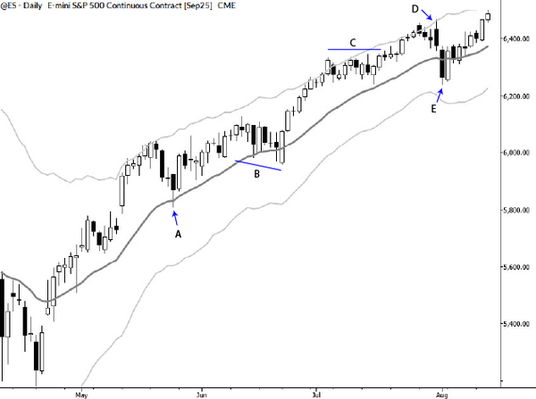
Last week, which ended on July 19, 2024, saw what appears to be a significant reversal in major stock indexes. After trending upward for quite some time, selling pressure came in during the week, and the week closed lower.
Many commentators are wringing their hands over a candlestick pattern called an “engulfing pattern,” which is a variation of the outside bar. The basic outline of this pattern is as follows:
- A bar (which could represent any time period) trades above the previous bar’s high
- And then reverses to close under the previous bar’s low.
This is said to show a major shift of sentiment, and to lead to a selloff. Books authoritatively tell you that this pattern is a reliable end-of-trend indicator and will lead to further selling. Despite the extensive writing on candlestick patterns, authors specializing in these patterns avoid asking one critical question: Does this pattern work?
This post is all about that question.
Testing patterns
The only reasonable guide to the validity of any chart pattern is what has happened in the past. We can (and should) test on a range of data and timeframes, but these patterns are usually presented as if they are equally reliable on all timeframes. (Not to drop a spoiler alert, but they usually are because they have no edge whatsoever. They are equally useless on all timeframes, which is not what pattern specialists would like you to believe.)
Today I want to share with you a thought process that gives you a framework for looking at these patterns. First, we have to deal with the issue of what data and timeframe. Since this is a pattern on the weekly chart of the S&P 500, I will take a look at the pattern’s performance on 50 years of weekly S&P 500 cash index bars. (Yes, the cash index is not tradable, nor was the index tradable for much of that time period. But we’re trying to understand market tendencies here, and this should be sufficient.)
It also makes sense to say that if this pattern has not worked historically on this particular market, we probably don’t need to pay attention to it as we head into the coming week.
Simple bearish engulfing tendencies
Any test of market patterns is a joint test of that particular specification of the test and whatever tendency may or may not be present in the data. In other words, we are only running a test the way we set it up—it’s possible there’s something there that our test missed. We must remain humble!
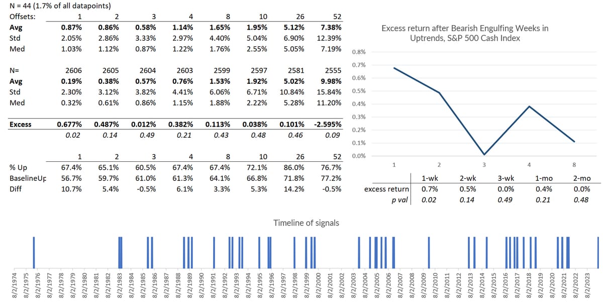
Having said that, let’s take a quick look at the basic bearish engulfing pattern. I captured all weeks that:
- Traded above the previous week’s high
- (Note that this does not mean it opened above the week’s high. That is another pattern called a key reversal, which is rare on weekly charts, and is not what happened last week.)
- Closed below the previous week’s low.
This condition is not particularly rare, occurring on average about twice a year. (However, these reversals have not been evenly distributed throughout market history, as a look at the timeline below will show.)
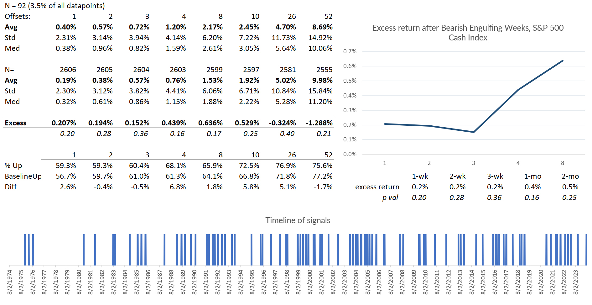
The excess return following this basic reversal was +0.2% for the next week, and +0.46% a month later. One week later, we closed higher 59.3% of the time, and we were higher 68.1% of the time a month later.
Therefore, the basic reversal condition is what we call in the business, a big dud. Absolutely no edge here. The tendency is slightly positive, which is exactly the opposite of what the candlestick books tell you to expect. However, that edge is so small that it’s not statistically significant and could just be noise in the data.
At any event, it has not reliably forecasted a crash or even market weakness in the past.
Adding a trend filter
Take a look at the weekly chart of the market below.
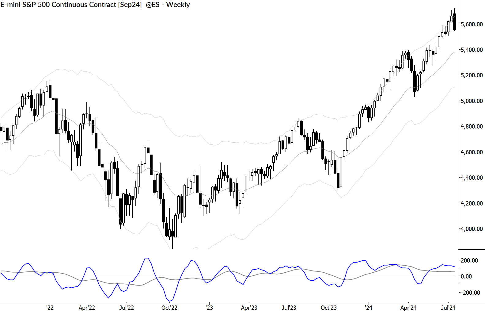
A few salient points jump out to me:
- This market has been in an uptrend.
- The reversal bar was not small. It was at least an average week’s range.
Let’s consider each of these conditions, in addition to the engulfing pattern. Though our eye easily grasps an uptrend, we must describe it precisely for a test. In this case, I’ll simply add this condition to the test:
- The week before the reversal closed in the upper 25% of the Keltner Channels or higher.
Adding this to the test will, of course, reduce the number of events. Before you go on, what do you expect from this test? We have probably identified areas of overextension with some of these points, so maybe there’s a better reversal coming.
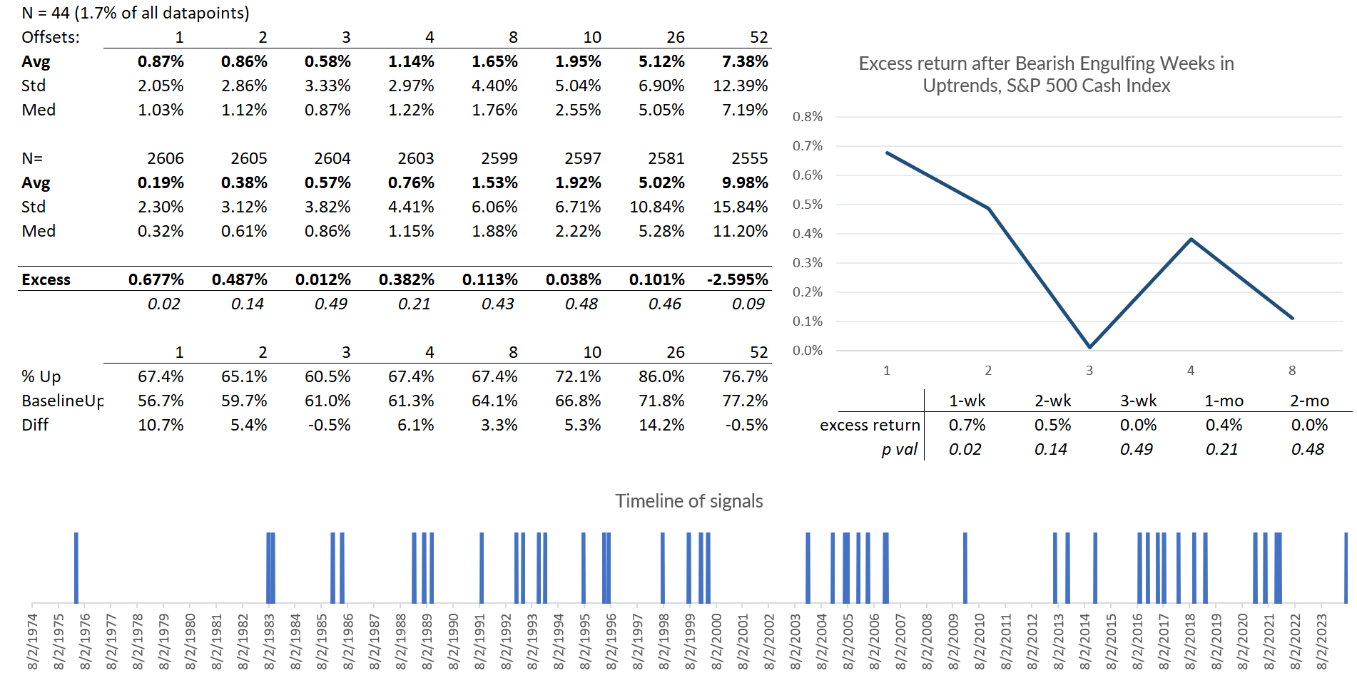
Turns out, this is not the case at all. We’ve reduced the number of events to 44 (less than one a year, on average), but the positive tendency is even stronger in the near term. A week later, we’re up an excess of 0.67%, and closed the next week higher 67.4% of the time. (56.7% of weeks in the dataset closed positive with no filters at all.)
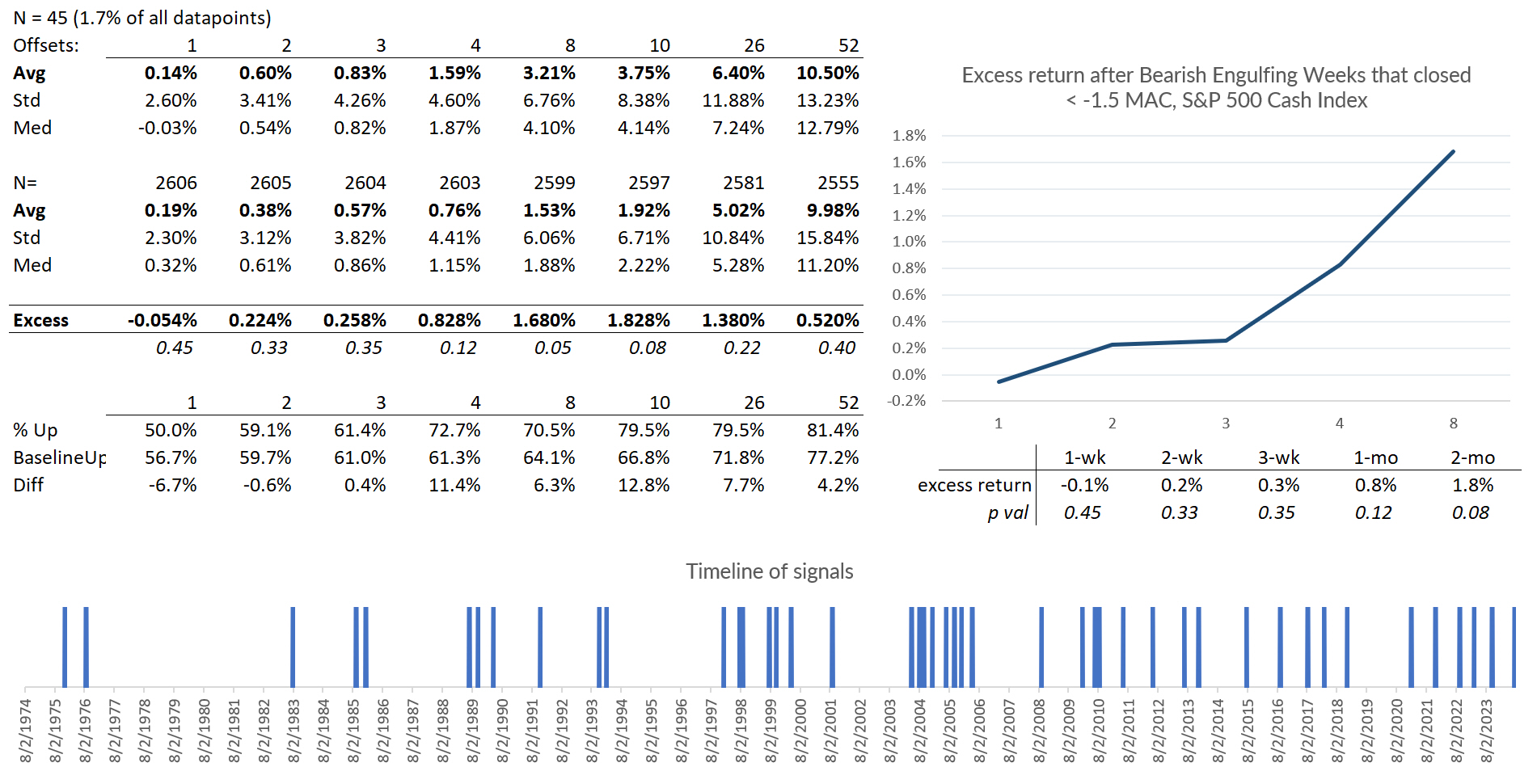
What about the “big bar” filter?
Big bar filter
I can tell you I had a good idea what’s coming before running this test. In general, mean reversion is a strong force in stock indexes. This means that whatever we recently did is likely to be reversed. If we had a strong downward close in an index, there’s a decent tendency for reversal in the next period.
I would therefore expect this to be an upward influence on the pattern. This is counterintuitive. Chartreaders will see big downward closes and think doom is coming because someone upset the apple cart, smart money is exiting, or use whatever explanation works for you.
In this case, I used our MAC spike to only grab weeks that closed at least -1.5 times an average weekly close lower. This resulted in 45 events, and another test that has no statistical significance. So… nothing to see here.
Danger, danger!
Ok, now we enter treacherous waters. One of the big risks with a test like this is that each pass through the data gives us ideas. This can be good—a certain amount of this is learning.
But the danger is that it’s easy to overspecify a test, to refine the test until we get the answer we want. Hold my beer a second…
By adding a few more filters I can create a test that looks like this:
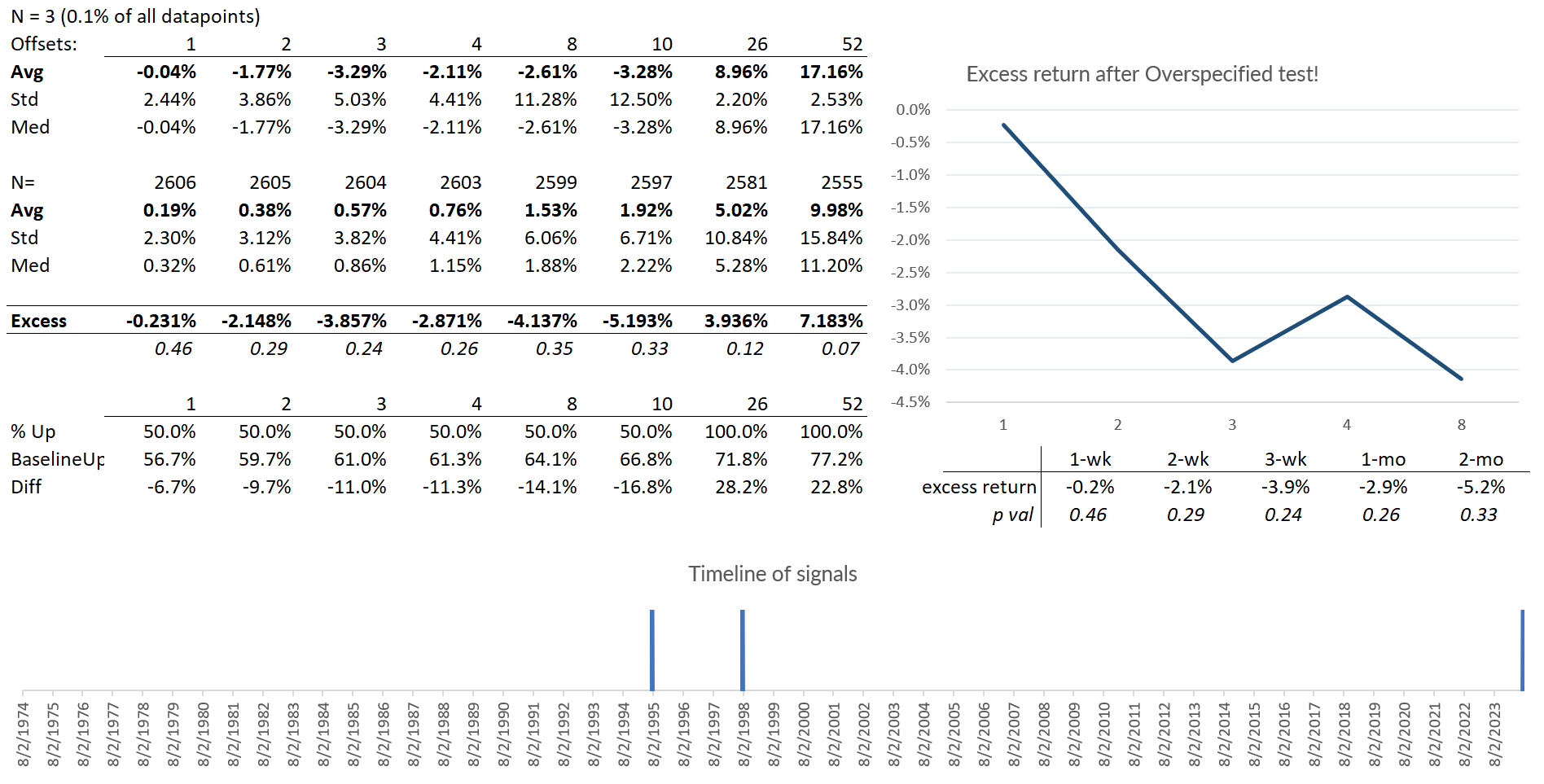
Now, right away we notice the sample size is ridiculously small: We haven’t had an event since 1998, so there’s probably not enough data to draw conclusions.
The real problem lies in the process through which I created these results. I ran a few more tests (including adding a seasonal filter for the month of July, which, admittedly, does add a bearish edge), and kept the results that showed what I wanted through each iteration.
As I sliced away more data, my results looked better, but they probably became less reliable. Think about this carefully, because many a quant trader has wrecked on these shoals. In this case, I knew I was performing a stunt and did not attach meaning to the results. But it’s also very possible to do this unknowingly, in the process of research or system development.
So, what does this mean?
It pays (literally) to think about these issues with precision. I wrote this blog to illustrate a thought process, showing you how to think about and test quantitative market questions, with the goal of helping us properly frame market questions.
We found no edge here. This does not mean the market is going up next week. In fact, there’s a non-zero chance that we just made a long-term major high in the market and it will never look back. What it means is that we cannot be bearish based on this pattern. We should work to vigorously remove things that have no edge from our thought process. When the bell rings Monday morning, you should not be thinking about last week’s bearish engulfing candle.
Further directions
If you’ve read this far, thank you! Thinking about these issues is not easy and it takes focus. You are probably asking many questions and thinking about things I might have missed. Good. This is part of the process.
At a minimum, I would think about:
- Maybe it was a mistake to just test the weekly timeframe.
- Maybe it was a mistake to use the cash index.
- Maybe the S&P is altogether the wrong index.
- I looked at data back to 1974. Does that make any sense? I should probably at least take a separate look at more recent data.
- Maybe my technical tools and specifications (Keltner Channels and MAC Spikes) make no sense.
- Should we consider macro conditions for context?
- Are there other filters we should add?
- Was there some other important market feature I missed that does have an edge?
These are the kinds of questions that lead you to where the treasure is buried. This is how successful traders think.
I put this kind of analysis to work every day for our MarketLife members. In this case, we've been bullish for a long time, and we are still bullish, but we were cautious and greatly reducing long exposures into the decline. We got it right. Of course, no one gets it right all the time, but putting statistically-driven insights to work in a discretionary context makes for a powerful combination. You can check out my work and daily analysis with a $7 trial. Start today and see what my work can do for your trading.