[et_pb_section][et_pb_row][et_pb_column type=”4_4″][et_pb_tabs admin_label=”Tabs”][et_pb_tab title=”Bars or Candles?”]
Though not strictly an indicator, this is often the first choice in chart display. Our charts will use either bars or candles with pretty much no preference. Candles can give a little more intuitive sense of buying and selling pressure, while bars allow more data to fit on a chart–maybe more useful for longer-term perspective. One important point is that the traditional candlestick patterns do not test out well statistically, so we do not use those in their standard, accepted applications.
[/et_pb_tab][et_pb_tab title=”Keltner Channels”]
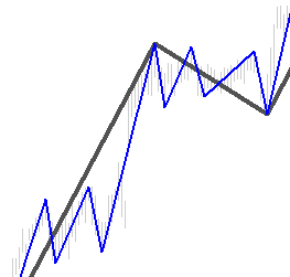
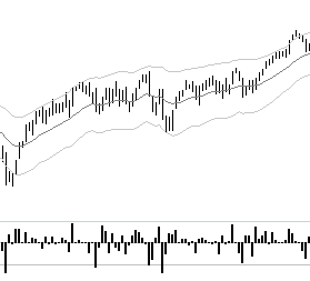
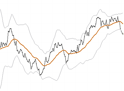
Most of our charts include Keltner Channels set 2.25 ATRs (Average True Ranges) above and below a 20 period exponential moving average (EMA or XMA). There are a number of ways to use these channels, but the key point is that they identify a point where the market is stretched far from the moving average. These can be inflections to fade (the points marked A in the chart) or another common way to use bands is to enter on a pullback after the market has been outside the bands (the points marked B). There are other channels or bands in common use such as Bollinger Bands or Moving Average Percentage Channels. Make sure you understand the nuances of every tool you use, but most channels can be used similarly.

[/et_pb_tab][et_pb_tab title=”MACD”]
Moving average convergence/divergence (MACD) was one of the early technical tools developed by Gerald Appel in the mid-1970s. The standard MACD consists of four elements: a fast line (the MACD proper), a slow line (the signal line), a zero line for reference, and a histogram (bar chart) that shows the difference between the slow and fast lines. The standard MACD is constructed from exponential moving averages, but this modified version uses simple moving averages and dispenses with the MACD histogram altogether, resulting in a cleaner indicator.
The fast line of the MACD measures the distance between a shorter-term and a longer-term moving average, and can be taken as a measure of the market’s momentum. (More properly, it measures the second derivative, the rate of change of the rate of change, of prices.) The slow line (sometimes called the signal line) of the MACD, is simply a 16-period moving average of the fast line. There are several ways to use the slow line, but the general concept tying them all together is that it reflects the trend on an intermediate-term time frame.

[/et_pb_tab][et_pb_tab title=”AlgoSwings®”]
This is tool that automatically marks swings in the market. This allows us to algorithmically delineate market structure, with no room for human error. The algorithm looks for pivot points, for reversals from those pivot points, and then qualifies them with a volatility filter. Though this sounds complicated, conceptually it is simple: it filters out smaller, less significant moves and only highlights the larger elements of market structure. We use this tool in a few ways, but one of the most important is that it allows quantitative testing of ideas such as retracement ratios, wave structures, and trend changes. It also can be useful when taking a very long term (10+ year) look at a major market to understand the price movement and volatility regimes that market may have gone through. Like other wave-based tools, AlgoSwings® is backward-looking and does usually present trading opportunities or inflections in real time.
[/et_pb_tab][et_pb_tab title=”SigmaSpikes®”]
This is a tool to express each bar’s return against a volatility-adjusted baseline, as a standard deviation of the last 20 bars’ returns. This highlights significant moves that might or might not be apparent based on visual chart inspection. It is also a useful tool for traders monitoring many markets on a daily basis, as measurements under, say, 1.5 or 2.0 on this tool can usually be considered normal fluctuations, and very large readings will demand immediate attention. It is important to note that, though this measure uses standard deviations, no claim is being made that the data follows a normal distribution. This means that the standard statistical rules of thumb (e.g., roughly 95% of values are within +/- 2.0 standard deviations) do not apply to this tool.
[/et_pb_tab][et_pb_tab title=”Spread Charts”]
When we want to consider the relative performance of one market against another, there is at least one bad way and a few good ways to do this. The bad way, which unfortunately is in common use, is to simply put them on the same chart with two different vertical axes for each market. A better way is to “index” them to a starting value (typically 0 or 100) and then track the percent change of each market from that reference point. Another way, and the way we most often do it, is to track the ratio of the two markets as a spread. We often present these in charts with a moving average and +/- 2.0 standard deviation bands to give a reference point for the trend of the relationship and a measure for extremities that could suggest significant shifts in market dynamics.
[/et_pb_tab][/et_pb_tabs][/et_pb_column][/et_pb_row][/et_pb_section]