Good tools can help us sort through the mass of market data each day to focus on what matters. Of course, there are many things we might want to filter for, and that’s one of the first questions to consider. For my work, one important category of markets are those that have made big moves. Filtering out only those “big moves” is a good first step.
But what is a big move? We must define everything we do with precision, and the results we get will say as much about our tool as about the market.
Sigma spikes
For many years, I’ve used a tool I call Sigma Spikes. This tool converts each day’s (bar, formally, but let’s assume daily timeframe for the duration of this post) movement to a percent change. This is called a “return.” We then calculate the standard deviation of those returns and compare the current day’s move to that standard deviation. (There’s one more small refinement: the baseline ends yesterday and does not include the current day’s move. This is not important for the current discussion, though.)
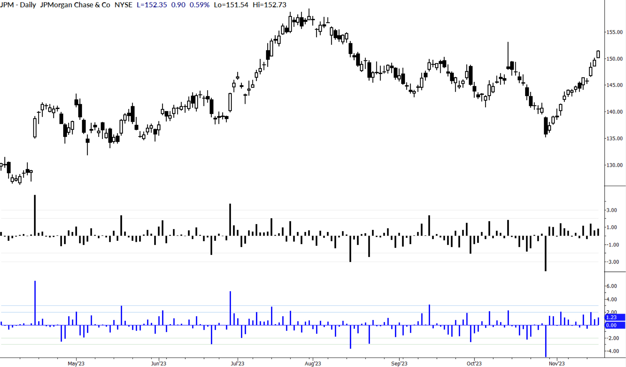
I use this measure in several ways. First, it can be put on the chart and used to call out big moves. Yes, we can usually see big moves in the price structure, but a measure like this offers a disciplined perspective. Sometimes, we might overestimate the impact of multiple big moves, or perhaps we miss a move that doesn’t jump out on the chart but might have had a large surprise factor. Plotted under the price, Sigma Spikes looks like this:

Problems with sigma spikes
But there are some issues. First of all, what exactly is a “3 sigma” move? Does this mean that this is a move three times bigger than the average day’s move? Not really. This tool says something quite precise: a three sigma move is a bar for which the return is three times the standard deviation of a moving window of the asset’s returns.
Not only is that a mouthful, it’s not very intuitive! Even traders who struggle to be precise will find themselves thinking, “It’s about three times the average move.” This might be okay, but it also could be misleading.
There is another issue. If you’ve had a math class, you might be thinking “95% of the data falls within 2 standard deviations of the average, and 99.7% of the data falls within 3 standard deviations…” So you might be surprised if I were to tell you that the stock above, JPM, had 18 days in the last year (N = 252) that were outside of +/- 2 sigma, 7.1% of the data. Or that 2.3% of days were +/- 3 stdev. You might really be alarmed to find out that there were 3 days outside of 4 standard deviations. And when you discover, as I write this blog, we find a stock that is up over 11 sigma, you would probably decide my math is just wrong.
Some slippery math
You’d be right, except for two things. First of all, we are looking at only a very small window for our baseline. Twenty days was chosen because it gives us a baseline for current market conditions, but it doesn’t say anything about the longer-term history of the market. The way I think of any measure like this is that it highlights the “surprise factor” of any single bar.
This is why tools like this are very useful for options traders, but they will also inflate the value of big moves relative to the longer history of the market. However, there’s another serious issue: using standard deviation naturally invites assumptions about distributions, and market data is anything but normally distributed.
So, we’ve used this tool, but had to give constant caveats such as “we use the word sigma, but the rules of thumb for normal distributions don’t apply here. A five sigma move doesn’t mean what you think it does. And no, it also doesn’t mean that the day’s move is five times the average day’s move…”
These issues are more issues of communication than anything else—they don’t invalidate the tool or its usefulness. It’s very useful for highlighting big surprise moves. (No options pricing regime can handle a +/- 4 sigma move without serious distortions, and these are opportunities for traders.) Markets do tend to operate in high and low volatility regimes for considerable lengths of time. There are ways to use this tool for screening candidates that can align options traders more effectively with opportunity and risk in the marketplace.
Searching, searching, searching…
None of these issues invalidate the use of the tool, but I kept looking for something that was a little more parsimonious, something that would not require disclaimers about assumptions and norms. Ideally, the new measure would also have some preferable quantitative qualities, but it was okay if there were no actual quantitative improvement.
I looked at many variations over the years, and I immediately realized a few things: first, the sigma spike measure really is useful. Even with the issues outlined above, if you do nothing beyond just paying attention to large sigma spikes, you’re already focusing your attention in constructive ways. Second, the sigma spike measure is used in industry. I invented this for my own work in the early 2000s, when I had no real idea what anyone else was doing. Since then, at least one major author of options book championed the exact same measure I was using, and major institutions (investment banks, hedge funds, brokers, and prop firms) are also using it.
So, there’s nothing wrong with sigma spikes, but I still wanted something simpler and cleaner. And I found it.
A better answer
After quite a bit of work, I have settled on a measure I am calling Mean Absolute Change Spikes (“MAC Spikes”). Here are the steps to calculate it:
- Convert each day’s closing price to a change (difference) by subtracting it from the previous day’s closing price.
- Take the absolute value of that change.
- Average the past 20 days absolute values to create the baseline.
- Divide today’s change by yesterday’s baseline. (Still offsetting by one day.)
How does this measure compare to Sigma Spikes? First, it’s very similar. Here are both on the same chart, with MAC Spikes in blue:
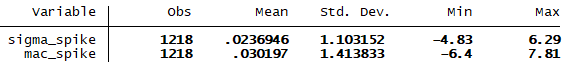
Second, MAC Spikes, at the extremes, are consistently larger (smaller, for downward moves) than Sigma Spikes. Here are some summary stats for both measures, looking at the past 5 years of JPM’s daily data. Note that the range is wider for MAC Spikes.
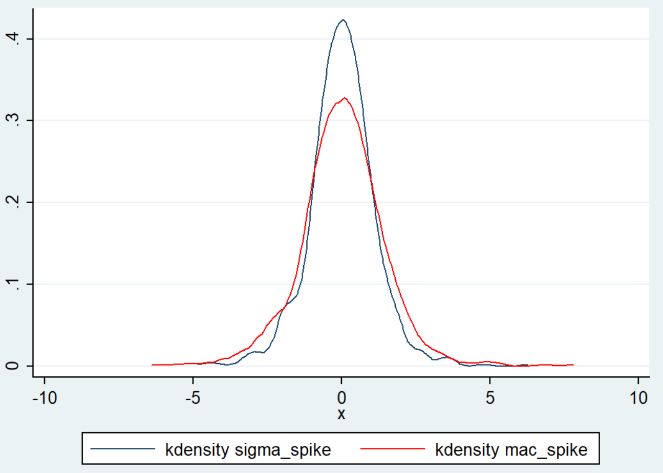
For values closer to zero, the difference is not as consistent. A look at the distributions of the two measures will highlight some of the key differences. Here’s a look, again, at the last 5 years of JPM’s trading history:
We have been using this piece in daily screens, scans, and trading systems for the past few months, with very solid results. (Turns out, there are some quantitative advantages to the MAC Spike, but they are subtle.)
The biggest advantage we’ve gotten from this change is that, first, the calculation is much easier to explain. Standard deviation is not complex, but standard deviation of returns can highlight outliers in ways that are not immediately intuitive to all readers. Second, a MAC Spike of five is now exactly what you think it is: that market just made a move that is five times its average daily move.
Take a look at this tool and see if it might be more useful in your own work and thinking about markets.