I’ve looked deeply into ratios, levels, and their application to market data. I won’t rehash all of that work here, but, after literally years of research, the bottom line is that I cannot find a shred of evidence that any of the common ratios or levels (Fibonacci, pivots, round numbers, volume-derived levels) are any better than a coin flip. I’ve also shown some good examples of the kind of cognitive bias that I expect drives the conviction that there’s something real here, and I share my friend Andreas Clenow’s conviction that heavy use of Fibonacci numbers is “for the mathematically challenged.”
And yet, I’ll use some ratios in my own trading and chartreading–I’ll set stops and targets based off a visual assessment of the chart pattern, which is nothing more than applying a subjective level to the chart. My levels will often align well with those you might calculate from the Fibonacci levels. I’ve been thinking a lot lately about how and why I use the tools I do. I think the answers point us toward some important truths about chartreading and technical trading—and what’s actually going on when we read a chart. Let’s start with a few examples.
A quick quiz
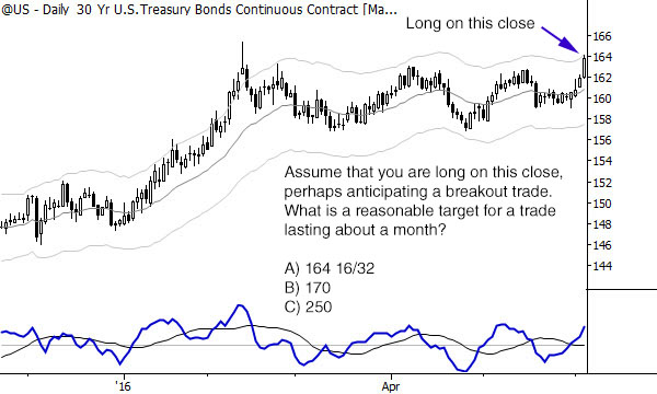
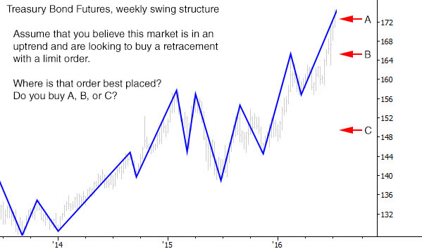
Take a quick look at the two charts below. Don’t overthink; these are not trick questions. What is your first impression of the best answer for each trade, assuming that you think the underlying trade ideas were solid? (Whether the idea is good or not is not the point—your placement of targets for market movements is the point.)
What your answers tell us
I’m willing to bet that nearly everyone taking this quiz answered B) for both charts. In both cases, the middle value probably seemed most reasonable or felt right. Why is this?
I think the answer points to some pretty sophisticated processing going on behind the scenes. When you look at a chart, you probably automatically make some assessment of volatility—you look at the size of the bars, of the swings, of the gaps, and get a good idea of “how much the thing usually moves.” All of this may seem maddingly subjective to quantitative types, but subjectivity does not invalidate the analysis. In fact, embracing the wisdom of your subjective sense can unlock a deeper understanding of market action.
In the first chart above, the first profit target probably seemed almost stupidly close. When you looked at the third choice and realized how much space you’d have to add to get that number on the price axis, it probably looked “optimistic” to put it kindly. Note that I included a time element in the trade: I said to assume you were holding a trade for a month. (To see a month quickly, just look at the hash marks on the time axis.) Yes, given enough time we might eventually reach C, but it’s not likely it will happen in a month—and, in trading, a solid understanding of “not likely” vs “likely” is the root of understanding probabilities in the market.
Measured move objectives
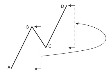 This is why the measured move objective works—it’s simply a quick and dirty way to project what a reasonable move for a market might be, based on how the market has moved in the recent past. Of course, nothing is perfect: tomorrow’s volatility can be much higher than today’s and price can blow through your target or stop. Tomorrow’s volatility might dry up, and we might drift sideways, basically never getting to the profit target. Or the trade can fail altogether. Though this simple tool isn’t perfect, nothing is, and this simple tool will keep you aligned with the average volatility of the market.
Buying pullbacks
One of the common uses of ratios is to buy at a Fibonacci level and put your stop beyond another Fibonacci level. For instance, we could measure a swing and buy at the 38.2% retracement with a stop beyond the 61.8% level. I can tell you from personal experience of doing hundreds of trades like this that this approach doesn’t really work as advertised–you could use pretty much any level with about the same results. (This is why you need to keep good trade records and do some analysis—in the early years of my trading I believed what I read and thought that this was the key to profits. When I started reviewing trades, I discovered that this wasn’t true.)
In fact, if you take an objective look at retracements, you’ll start to see something interesting. Retracements can “kinda stop anywhere” in the previous swing, but, on average, they retrace “about half, maybe a little more”. In all my years of trading, I haven’t found a more reliable rule than that, and it’s also borne out in quantitative testing. The chart below shows the results of a test looking and hundreds of thousands of swings across all major asset classes, measuring the retracement as a percentage of the previous swing:
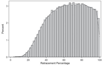
This chart shows swing retracements across the horizontal axis. (E.g., 60 means that the swing retraced 60% of the previous swing.) You can see that the peak is somewhere around 60%, with a very wide margin of error. (Technically, it’s about 63% with a standard deviation of 21%. If you want more detail on this test, here’s the post.)
I’m also willing to bet that most of you thought the pullback around B), somewhere in the middle of the previous swing, was probably the best point to buy. Your simple guess here, again, hid a lot of wisdom and truth about how the market really moves. The interesting thing is that when I repeat experiments like this with different groups of traders, including people who are just starting out, the answers are the same. You did not make the choices you did based on years of experience of seeing thousands of patterns. You did not make these choices based on deep knowledge of how Treasury futures traded. Rather, you made the decision based on good, solid common sense–simply projecting the swings of the market forward in time and making some reasonable assumptions.
Good chartreading is a powerful heuristic. Though it might appear to be quick and sloppy, this “common sense” processing does many things that sophisticated quantitative models seek to imitate–at a glance, you can assess the volatility of a market and make some very educated guesses about where the market might travel in the future.
How to use this information
Why do we care about this? First, it should reassure you a bit about the power of your own analysis. Especially in a world where more and more computing power is brought to bear on financial markets, it’s hard for some traders to have faith in the old Mark 1 Eyeball. Trust your eye, because there are some things it does very well.
However, the other lesson, to me, is to respect our limitations and the limitations of our methodology. If you use a calculated retracement ratio, just be aware that there’s no magical power to the ratio. If you are buying at 61.8034% of the previous swing, that might be a little silly when the data says that anywhere between ~40% and ~80% is just about equally as likely. If you’re setting a stop or a target to a precise point based on these levels, perhaps you should be willing to adapt to other information and be willing to make some adjustments as needed.
I suppose the irony is this: using the common Fib ratios probably do put you somewhere in the ballpark of what’s right. So do pivot points and other levels, simply because they place lines somewhere in the reasonable expectations of market movements. You could do the same without them. To many traders, moving away from these levels is an important step in embracing the power of their own analysis, but, as long as our tools respect the volatility of the market and typical swings, we have powerful tools for managing risk and trades in markets.
Talking about heuristics, the current trend is to say that we humans see patterns everywhere, even when they don’t exist. For example, in random price data. You have turned the argument on it’s head. Interesting post!
Great Post ! I agree with the ideas.
on a Lighter Note ! But with regards to the question ” In both cases, the middle value probably seemed most reasonable or felt right. Why is this? “. The answer might be the decoy effect (or asymmetric dominance effect) https://en.wikipedia.org/wiki/Decoy_effect
Good article and I agree with most of it, except: «Retracements can “kinda stop anywhere” in the previous swing». Price never, ever, stops in the middle of nowhere. There is always a reason price stops at the exact tick it stops at. It is up to the careful observer to find why that is, and be able to predict it with high probability.