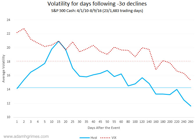
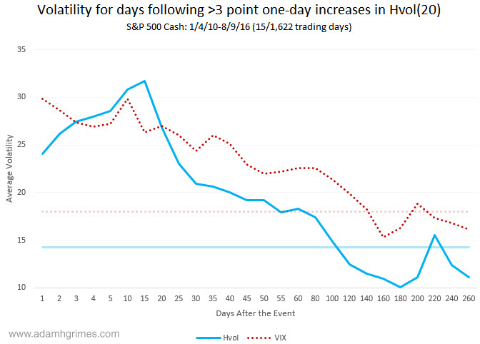
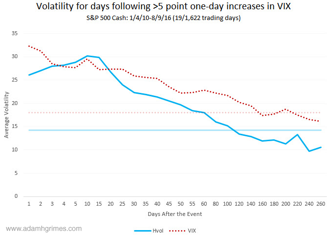
I ran a quick study this morning to look at what happens to stock market volatility following large single day volatile events. Note that we are looking at market volatility here, not direction, because the directional message is simpler and clear: historically, large volatile events in stocks have come after declines. Since stocks mean revert, these have quite consistently been good buying opportunities. That’s a surprising message for the people who would have you think the VIX, the FEAR GAUGE, is the harbinger of doom–when the VIX goes up a lot you should be buying stocks.
I defined volatility events in three ways: as large single day declines in the S&P 500 cash index (using SigmaSpikes as a measure), as large one day point increases in the VIX or 20 day historical volatility. Charts attached to this post show a few interesting points:
- Shocks in volatility tend to decay. One analogy is the ripples in a pond after you throw a large rock in the middle–volatility behaves something like this. (And this is an element caught in GARCH models.)
- How we measure those volatility events does not seem to matter a lot.
- There does appear to be a short-term increase in historical volatility, at the same time the VIX decays over the near term. Options traders might find something useful there.
A few counterpoints and things to be aware of:
- Sample sizes are small, though the effects do appear to be persistent over time.
- These charts just show averages and hide a wide range of outcomes. If you are doing the same work yourself you might also segregate charts into events which happen in low and high vol regimes.
- All measures of volatility are subject to various measuring artifacts. It’s entirely possible the “knuckle” in HVol is mostly due to the right edge of the 20 day evaluation window.
Just some food for thought that might give us some guidelines to the weeks ahead.


Does this mean as options traders, we should intelligently selling premium following a move such as Friday’s?
Well in general and on principle yes the market tends to overprice fear. Selling naked premium into a move like that can be profitable but it can also be a good way to find an exciting career in a field unrelated to trading after you blow out your account. 🙂 As you said “intelligently” is the key word and risk management is critical.
Specifically, I suspect measurement artifact is the main driver of that knuckle in the charts above so take it with a grain of salt.
maybe we should use seasonal pattern here since we are enter high vol period now.
Thanks Adam,
What kind of move did we have last Friday? -3 sigma, >3pt. hvol, >5pt. VIX?
And am I reading this right, but your charts are saying that ‘Average Volatility’ ( I assume an average VIX over the entire period ) did not return to longer term averages until approx. 160ish days following the event?
Great analysis.
It would be interesting to compare this with the analysis of how volatility moves when the VIX is currently in a given range of VIX (eg 15-18%, 18-21% etc), irrespective of whether it is after a spike or not. I’ve done some rough analysis on this before and there is a tendency (after a spike or not) for the VIX to return toward some central measure. In fact, this is what GARCH tells us.
Pingback: Dash of Insight| Weighing the Week Ahead: Time for the Bond Correction?
Pingback: Is a Bond Selloff Expected? - TradingGods.net
Does this mean that, in the short-term, implied volatility continues to go down whilst realized volatility continues to increase following the event ?
This is probably because option prices are bid up as everyone scrambles to buy puts for protection or short covering.
Call prices also shoot up as market makers who sell puts & short stock, buy calls for upward protection.
Did I understand this correctly ?
Pingback: Dash of Insight| 2016 Silver Bullet Awards Part Two
Pingback: Silver Bullet Award Winners for 2016 - TradingGods.net