Reader Greg asks this question:
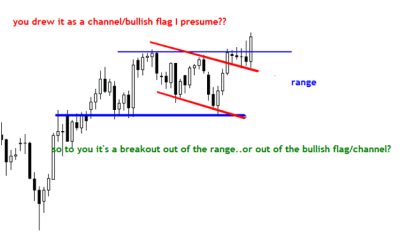
[dc]R[/dc]egarding your Chart of the day: Bullish Pattern in Aud/Jpy, which as you predicted broke out to the upside. My question is simple…why did you draw it like a flag and not like a range… and how did you spot it?? I mean what drew your attention to this formation and how did you single it out??
Hi Greg. This is a good question, and the short answer is that it doesn’t matter—either of the scenarios you outlined would have led me to the same conclusion, which was that I wanted to look for strength in the AUDJPY. There are always so many ways to define patterns and draw lines on charts, and many of those ways make perfect sense. Rather than focusing on details of how to define patterns, I tend to focus more on what is going on in the market. This is a good time to take a quick look at how I read the bigger picture in a market like this.

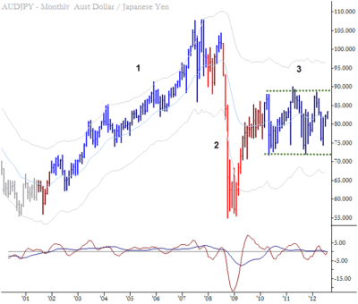
First of all, take a look at the monthly chart (showing about 12 years of price data) of this currency cross for a big-picture perspective. I see 3 glaring features that deserve attention: 1) a strong uptrend. 2) a volatile collapse and 3) a fairly narrow sideways range. Of course, much deeper analysis is possible, but we’re just looking for the big picture here. Let’s move on the weekly chart:

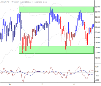
Market analysis does not have to be complicated. Sometimes, particularly on higher timeframes, all we’re looking for are the most obvious structural features. In this case, the weekly chart shows a market in a wide range with large, messy areas of support and resistance (indicated by the green boxes on the chart.) This is normal for support and resistance; think of them usually as large zones or areas rather than precise lines on charts. If the market was engaging one of those zones, perhaps we’d have something to say based on this chart, but we don’t. When a market is squarely in the middle of a range, it’s hard to find useful technical information on a chart of that timeframe. One more small factor to consider is that there does appear (to the naked eye) to be some cyclical factors at work here. I wouldn’t really bake that into a trading decision unless you trade on cycles (see Cybernetic Analysis for Stocks and Futures, if you’re interested.)

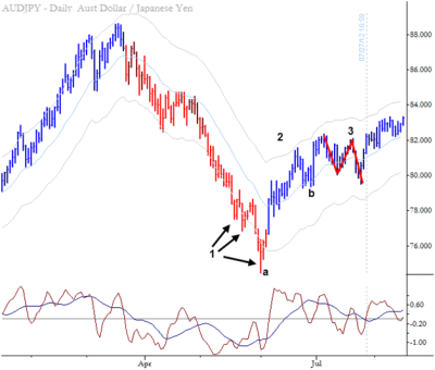
Now, let’s look at the daily chart. Remember, what I am doing here is trying to recreate my thought process when I look at this chart. You may read it another way, but here is what I see:
1) An established downtrend ends with 3 pushes down, the last of which (a) was a parabolic climax below the bands on this timeframe, and into the support area on the higher timeframe. This is the kind of trade that, in retrospect, marks an ideal buy spot, but it would be very difficult to buy this pattern consistently. The value comes not from it being a tradable pattern, but in the ability of these patterns to define market structure.
2) A strong uptrend develops which carries near the upper channel boundary. This shows a significant change of character and shift in market dynamics. The first pullback in this nascent uptrend (b) is short-lived and ends with a sharp rally.
3) A complex pullback now develops. This is a somewhat complicated trading pattern that can be challenging, so I devote many pages and sections of the book to trading plans and examples of complex pullbacks. This is one of the most powerful trading patterns I know, so I’m always on lookout for it in the correct contexts.
With that background, let’s take a look at the chart you sent me:

So you ask me a question with an “or” here (range or flag), and I’ll just answer, “yes!” They’re both correct and both lead to the same conclusion. I think the range (your blue lines) was probably more obvious a few days after I published my chart, but they’re both essentially the same pattern. To me, it’s far more important to understand market structure, and how that story of supply and demand plays out in the market, than to focus on details of specific patterns.
I hope this helps. Thanks for the great question.
” examples of complex pullbacks. This is one of the most powerful trading patterns I know,” Linda Raschke callsit ABC formation as far as I remember and my stats show a win ratio of over 80% for the cp pattern in my intraday trading. Right, used well it is really a great setup.