How bad was October 2018, and what comes next?
There’s been a lot of discussion and stats thrown around recently, much of it centered around the idea of “like we just had the worst October ever.” I thought it might be interesting to crunch some numbers to see how bad it really was, and if we can draw any conclusions about what’s likely to happen next. There’s a third objective to this blog, and that is to show the thought process behind using statistics to investigate a market question.
First of all, it makes more sense to me to look at rolling windows rather than the calendar month. It’s easy enough to do the analysis both ways, but I’ll use rolling 20 (trading) day windows for the work here.
Measuring weakness with moving windows
I created a variable (we can call it CumRet20 (cumulative return of 20 days)) that simply sums the percent change (return) for the S&P 500 cash index from 12/1/1998 – 11/1/2018 for each of 20 trading days. Because this window is recalculated every day, it is called a rolling window.
This is a very simple measure, but simple is good. Let's see if we can use this to investigate strength and weakness in the market.
We likely have no intuition about what this variable looks like. (Why would we?) So it makes sense to take a look at some summary stats for this measure.
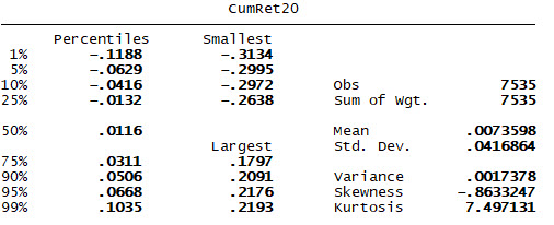
I'm interested particularly here in the mean and median to see if the variable matches what I think I know about the market. (Does it make sense that the average "month" (rolling 20 days) would have a 0.7% return? Yes.) The second question is where to place our cutoffs for "large losses".
Many times, people just jump in and make up arbitrary numbers, but there's a better way; we can use percentiles. In this case, let's set the initial trigger in the 1st percentile, so we will capture all events where the CumRet20 is <= 11.88%. What happens after we see those conditions? (In the first graph, the horizontal axis is trading days after the event triggers.)
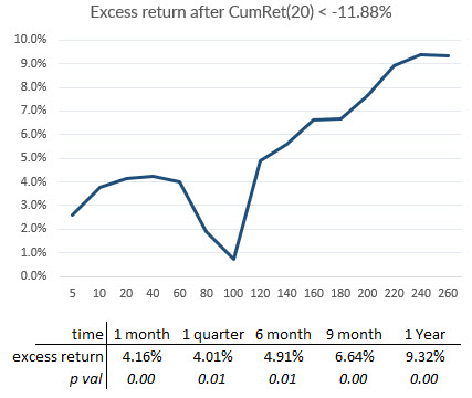
Well, this is interesting, and it seems to support the general idea of mean reversion in stocks: after bad performance, stocks tend to do better. Note that the figures given are excess performance, and the yearly baseline is over 9%. So stocks are up about 18.7% after a very large decline. Interesting datapoint--hold on to that for a minute.
Great. Are we done? Not so fast. It might be a good idea to see when these signals occur. And, we were hoping to see if the current October was the bloodbath everyone thinks it was:

By this measure, the recent period doesn't even register. We can, of course, move the threshold higher so we are capturing more days. (Doing this will show a smaller effect, but preserves the general shape of the subsequent returns. For reference, October 2018 did see a -9.99% reading on this measure.) Rather than doing that, let's look at the problem another way.
Measuring volatility-adjusted returns
In the timeline above, the events were mostly clustered in a few very large crisis periods--periods in which volatility was very high. (Check the intuition here: we would expect to see the largest percentage changes when the market is very volatile.)
Another idea would be to consider volatility-adjusted returns, and our Sigma Spikes provides a good measure. Let's create another variable, CumStd20, which is the sum of sigma spikes over the past 20 trading days, and run the same moving window analysis. Here are summary stats for that measure:
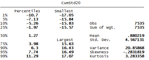
Again, we can note the average of this measure is a small positive, and it's perhaps surprising that it seems to be fairly symmetrical. Let's re-create the test using the 1st percentile of the CumStd20 as the trigger:
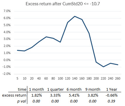
Now we start to see something very different. The market snaps back, but then seems to collapse into weakness somewhere around 9 months. At the very least, this is a significantly different return profile. Let's take a look at the timeline:

By this measure, the recent period does register. In fact, the three smallest values of this measure in the entire record come from the past weeks! (It's easy to lose this point in the rush of numbers: by this measure, October was a catastrophe!)
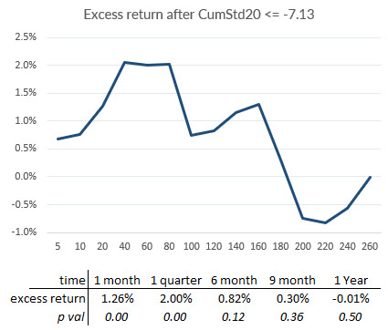
Widening the parameters to include the lower 5th percentile shows the shape of the effect is more or less consistent, but the magnitude is considerably smaller.
Counting Down Days
Simple binary counting variables are often more powerful than we might expect. In this case, let's create a variable (DownCount20) that simply counts the number of days that closed lower over the previous 20 trading days. (20 would mean all days closed down. The average of this measure is 9.4, reaffirming the intuition that stocks are slightly more likely to close up than down.)
The largest value in the dataset is 16, and here's what happens afterward. Note in advance, when the market gods appear to give us a statistical gift, we should be suspicious!
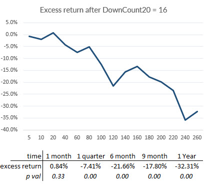
Wait. What? A -32.3% excess return following this event? This is, literally, too good to be true, and a look at the timeline shows us what's going on:

There are 5 events in the timeline, and four of them are clustered around the dotcom crash. In fact, they are the dotcom crash! Perhaps it should give us pause for thought when we notice that the fifth event was 10/29/18--this certainly seems to reaffirm the idea that October 2018 was a bloodbath in the market.
We do not have a statistical test here, despite the p value of about 0.000006. Statistical significance should always be filtered by common sense, and what we have done here is simply to observe that the market went down about 22% during the dotcom crash.
Let's widen the parameters a bit, and catch the events where this variable was >= 14.
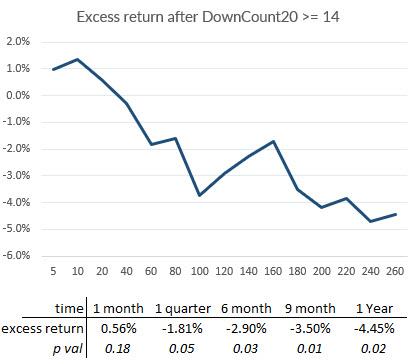

We've now picked up many more events, and see a similar effect, but smaller.
We could also ask if we should remove the dotcom event from this sample as an outlier. (Doing so would remove the effect entirely.) We could make an argument in both directions, but successful trading is often a game of outliers. Perhaps the question we are asking is if the recent weakness in October, which was significant, portends an event such as the dotcom crash or another major selloff.
Conclusions
The point of this blog has not been to draw simple conclusions, but to show some of the complexity that goes into a statistical investigation. (Note that the stats are not complicated; we're just adding some things and averaging some things.)
One point is clear: October 2018 was bad. By some measures, it was historic weakness.
If we can step slightly beyond the scope of this statistical investigation, it is the kind of weakness that has preceded major periods of stress and declines in stocks. There is ample reason for caution here, but this particular investigation has not given us a clear roadmap.
As a last word, it's very easy to be misled by statistics. In fact, when I first started working with this data I thought I had a much stronger and more persistent effect than I ended up with. In some sense, this is a blog that highlights at least a minor failure of a statistical investigation, but better to find a statistical failure--something not working or not as strong as expected--than to put money on a flawed trading ideas based on bad stats.


