What we learned about price levels
This is part 2 of a two part blog. Read the first part here.
Quick summary: to test the validity of price levels in markets, we created a test in which we showed a bunch (1,535) of traders 20 panels of charts. Each panel included two charts which were essentially the same price data with different “levels” drawn on the chart.
The price data was drawn from EURUSD and S&P 500 futures, 5 minutes intraday. The levels for the EURUSD were “round number” levels. For the S&P 500, the levels were the previous day session’s high and low and the Globex (overnight) high and low.
Each panel showed the same price data, but the data was shifted on one panel. Since there were no numbers on any axis and the trader could not refer to any previous day’s data, this had the effect of shifting the price levels, relative to the price bars. We called the unshifted data, which a trader would have seen in real time “real”, and the shifted levels “fake” levels.
The test asked each trader to identify the levels he or she found most significant.
Assumptions
We must begin any test like this with the baseline assumption that the price levels are random and meaningless. What we look for, then, are results that contradict that assumption.
We further assumed that if levels were valid and real, if they somehow influenced prices, then traders should be able to tell the difference between the “real” and “fake” levels. If the levels had no influence on prices, then traders should not show a preference. Of course, any individual chart could be highly convincing (and potentially misleading), so these results must be understood in a statistical framework, and will only be valid over a large sample size.
This is important, so it bears repeating: imagine doing this test with only one chart. That chart could show anything, and any random line could very important (or not). The shifted data could look more “real” than the real data, and we can imagine any other number of confounding conditions. Our sample size, 20 tests, was relatively small, and probably is not large enough to draw any firm conclusions. (We elected for a smaller number of questions because we did not want to try the patience of our test-takers! Each of the 20 questions received less results (1,463 for the first question, compared to 1,185 for the last. The test began with one question assessing the trader’s experience, and about 100 traders did not complete the first chart question beyond that experience question.)
These results will only be valid in the aggregate, but what we have found is interesting.
Results
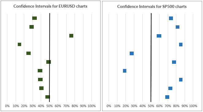
This table shows 95% confidence intervals for traders identifying the correct, real data as “real”.
Here is a table presenting the percentage of correct choices for each category. This table is ranked from max to min:
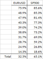
We can see that many more traders chose correctly in the S&P 500 tests. Even more significant was the magnitude of preference. Note that the confidence intervals for the S&P 500 are all, for every chart, well clear of 50%. (50% would mean that half the traders chose each chart, suggesting that one did not look more convincing than the other.) In fact, only one of the confidence intervals even touches a +/-10% band around 50%. Traders showed strong preferences and opinions about the S&P 500 data.
For the EURUSD, five of the tests had confidence intervals that fell within that 50% +/- 10% band, and two of the tests touched 50%. From a significance testing perspective, we can see the S&P 500 data gives much stronger evidence for rejecting the null hypothesis. Traders showed a clear preference for the S&P charts in most cases.
We should also remember that chance played a part in the construction of this test too. Had we carefully chosen chart examples, we could have manipulated any result we wanted from this test. The only way to remove experimenter influence was to randomize as much as possible—the days chosen were randomized, meaning that some pretty bad examples crept into the test. Look at these charts:
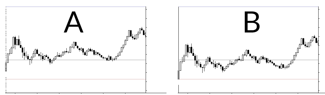
These are two S&P 500 charts, and 86% of the respondents said the levels in ‘A’ looked better. In fact, it’s hard to make a case for ‘B’, but ‘B’ is the real chart here. (This was 2/6/2018.) It was still interesting to see such strong preference, but we should also remember that purely random lines will look good on most charts and utterly convincing on some charts. The only real solution to this issue would be collecting much more data, perhaps hundreds of charts per test run, but that probably cannot be done online with any degree of reliability.
What does this mean?
I (Adam) found these results surprising. The investigation sounded interesting, but I fully expected to be writing a blog for you in which I tried to find interesting ways to say “we looked at a lot of data and didn’t find anything interesting. We didn’t really prove that the levels don’t work, but we didn’t find evidence they do…” Well, that’s not the blog I’m writing for you today.
These results are not conclusive, but I find them strongly suggestive—suggestive enough that they will shape my approach to trading and teaching with new confidence. Simply put:
- We have strong evidence that “something” non-random is going on around previous highs and lows, and previous session highs and lows in the S&P 500.
- We have no evidence that round numbers are significant in the EURUSD.
What should you do with this? Well, if you’re trading the S&P, you should probably do what I did every day when I was actively daytrading these: make sure you know your previous session high and low, and the overnight high and low, and that you monitor those levels throughout the day. What you do at and around those levels may be shaped by market dynamics for that particular session, but you should at least be aware of those levels. (For instance, taking partial profits into a level like that is probably a good idea, as a matter of practice.)
If you short-term trade the EURUSD, I would carefully re-think your approach to round numbers. I know many traders swear by these, but try taking the gridlines off your chart. Can you identify the round numbers without the gridlines? (I’d bet you can’t…) You are very likely falling prey to cognitive bias. Eliminating these lines, and all thoughts of price action around round numbers, will probably not hurt your trading, and might help it.
If you want to take the test again and see which answers you get right or wrong, you can take it here.
Thank you so much for all of you who participated in this project. I think I have understated the importance of the results here, but I think we’ve learned something truly significant and have advanced the state of knowledge for intraday traders working with price levels.