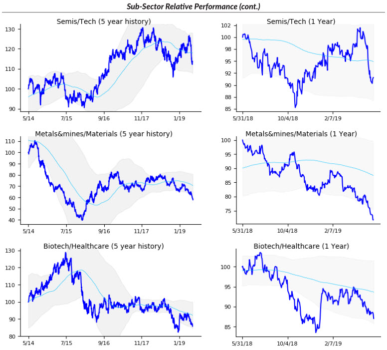
Visualizing sector performance
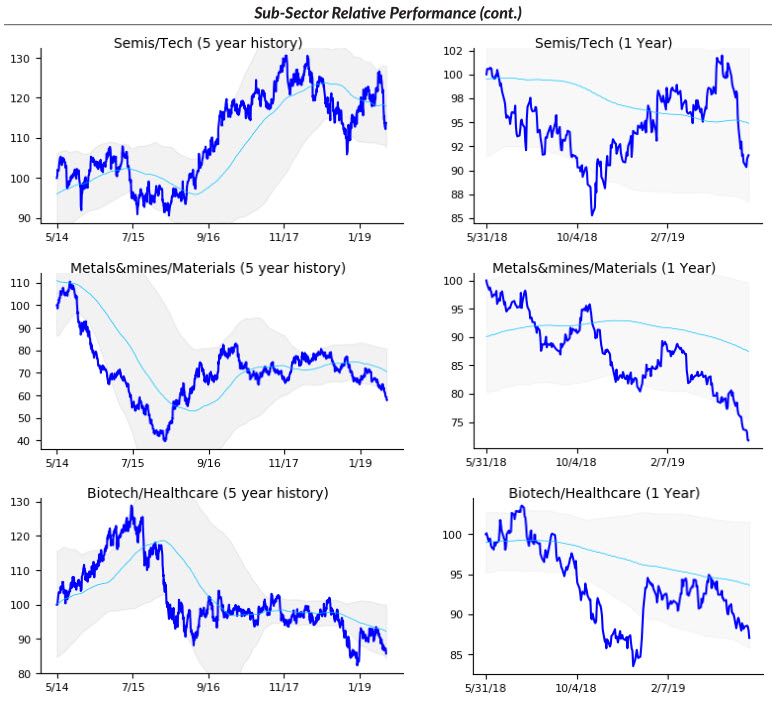
As I continue to share some of the tools I use, I want to look at sectors and sector performance today.
I don't think there's much value in looking at a price chart of say, XLE or XLF. The reality is all indexes are pretty strongly correlated and directional technical analysis has limited power--even your great sector long pattern will lose if the index gets hit. (I know there's an argument for finding turns by looking at predictive patterns in sectors. It's a nice concept, but correlation always wins in the end.)
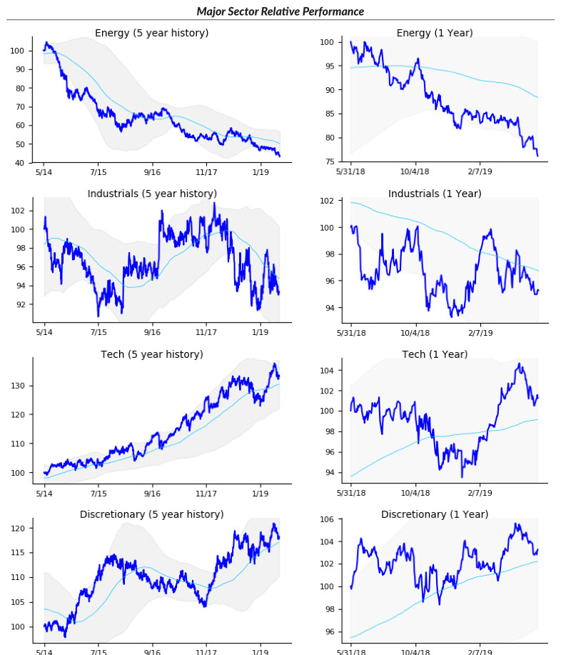
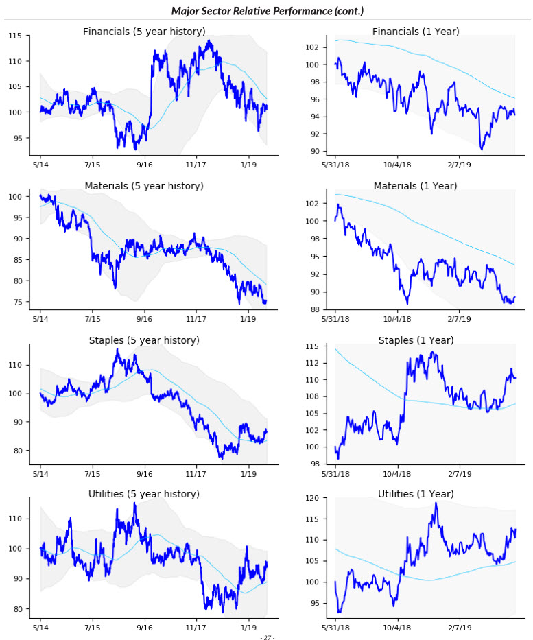
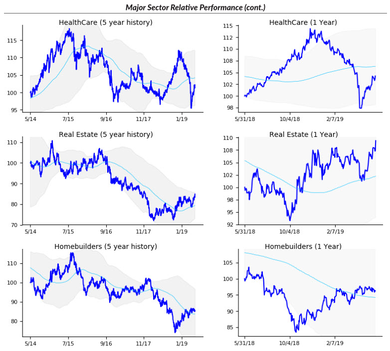
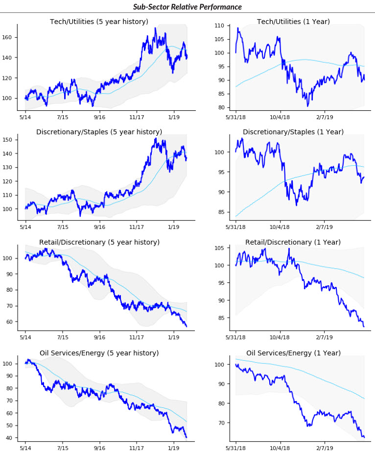
What we really care about are which sectors are leading or lagging. There are many ways to look at this: you can create simple tables showing return over different time windows, you can graph percent change charts with a fixed lookback period, but there's one, in particular, that I've found most powerful.
This is to graph the sector spread to the broad market. Example: you graph XLE/SPY. Put a few analytics on the spread (a moving average and a variation of Bollinger Bands), and you have a tremendously powerful way to visualize sector flows.
Here are the current charts for major sectors and subsectors. This is one of the cornerstones of my weekly homework process, and has kept me on the right side of sector moves and shifts for many, many years.