Understanding intermarket relationships with scatterplots
Please read my last post first, before you begin this one.
I ended the last post by suggesting that we were probably more interested in changes than in price levels. If this isn’t immediately intuitive, then think about it like this: when you put on a position, it’s the market movement (changes) that creates your profit or loss. When we think about two markets together, we care about if and how they move together.
So, the first step is to take price data and convert it to changes. Two obvious possibilities present themselves:
- We can subtract yesterday’s price from today’s price, and use the difference between the two to show how much the market moved (in whatever currency the market is denominated.)
- We can look at today’s price as a percentage of the previous price.
- (There’s a third option that might be the best for some applications, but don’t get sidetracked on this: we could convert to continuously compounded returns (log returns), but this is considerably less intuitive and obvious.)
The advantage of using percentages (henceforth called “returns” in this post) is that it normalizes for price level. If we have a $10,000 stock and a $2 stock, comparing the dollar changes from day to day is probably going to be confusing, but percentages put everything in comparable terms.
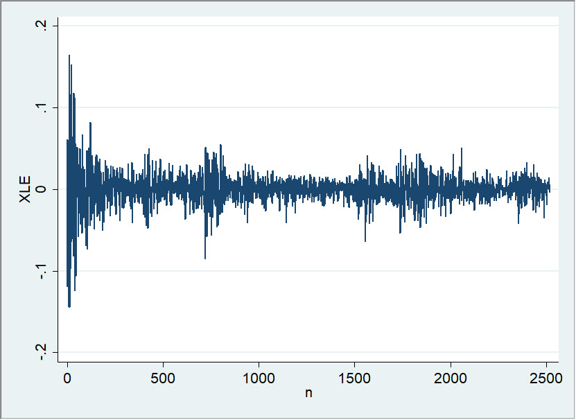
The chart above shows a timeline of daily returns for XLE. By itself, it’s not terribly informative. Maybe we can see some of the more and less volatile periods in the XLE through the size of the plot, but I can’t even tell from this plot of the XLE went up or down over this period. (In another post, I’ll show you some useful things we can do with a plot like this if we rearrange it a bit.)
However, something very interesting happens if we plot returns for two markets together. Look at this:
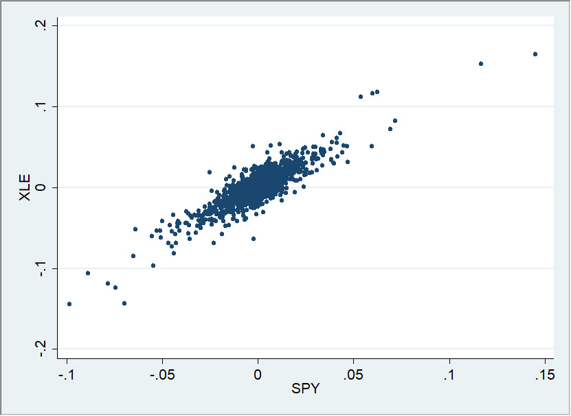
Each dot on that graph is a single trading day. The position along the Y axis (vertical) is determined by the return of XLE on that day, and the position along the X axis is the SPY return. If you haven’t seen a graph like this before, take a few minutes to think through it: what would happen if the returns for both were very large that day? Where would the point go? (Upper right corner.) Very small for both? What if the XLE was positive and the SPY was negative? What if both were about zero?
It’s easy to gloss over the details, but there’s a lot of information on that graph, and each point represents a tremendous amount of buying and selling, analysis, emotion—all the aspects of market action boiled down to a closing price, and then the relationships between those two markets.
We can also draw a “best fit” line through the cloud of points, and this line can sometimes tell us some things about the relationships between the two markets:
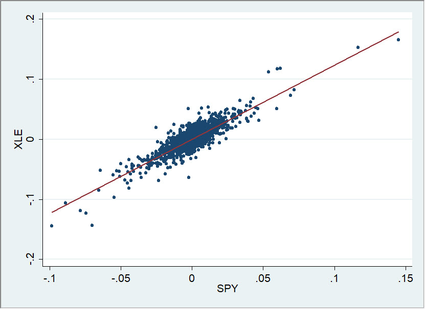
This is what a “positive correlation” looks like on a scatterplot, and you can see what it means very quickly and intuitively: the XLE and SPY tend to move together. There are, in fact, no cases in this sample (10 years of daily closes) in which the SPY had a big up day and XLE had a big down day. They seem to be pretty tightly connected (and they are.)
Be careful. All we can really say from this graph is how they have moved together in the past. We can probably reasonably expect they will continue to move together in the future similarly, that the future will look something like the past. But this is an assumption we should think about and check—don’t make it lightly!
We also cannot say that movements in one market cause movements in another, nor even, properly, that one market influences another. This may, in fact, be true, but once we make these claims we are stepping beyond the data and making assumptions. The exercise of being strictly true to the data is an important one for structuring our thinking.
I’ll follow up with one more post on this topic, but let me leave you with this. We can create these kinds of scatterplots for many different markets. Here are a few on the same page:
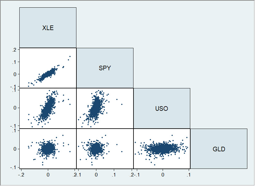
Here's how you read this. Each graph is a plot similar to the one I’ve shown in this post. The label above is the Y axis, and the label out to the side is the X axis. So, we have the XLE/SPY graph (which you've already seen in this post) on top. On the bottom right, we have the relationship between USO (vertical) and GLD (horizontal axis). We can use a graph like this to inspect the daily, historical relationships between XLE, SPY, USO, and GLD. Spend a few moments thinking about what information you can get from this plot. There's a ton of information presented in a very compact format.
I’ll follow up with another post on this topic soon. We’ll look at how technical analysts typically get this work wrong, and how you can get it right.
