'Tis the season... or is it? A deeper look at seasonality in stocks.
This is a followup to my previous post that included a visualization of seasonal tendencies for about 90 years of the US stock market. A visualization like that is a good way to see some patterns in the data, and to maybe get some ideas for further exploration. Today, let's dig into the numbers.

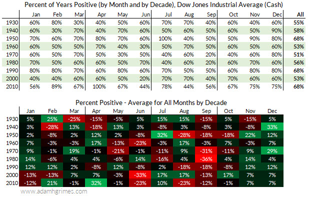
The table above presents the data in the visualization in numerical format, in two slightly different ways. The top table is easy to understand; it just shows the percentage of time each month was positive within the decade. (E.g., 1930 = 1930 - 1939, inclusive. (Note that 2010 stops in November, for reasons that I hope are obvious!))
The bottom table subtracts the average for all months within that decade from the average for that specific month. This is one way of adjusting for a baseline. Think about it like this: what if we had a whole decade that was extremely positive for stocks? If so, we might see most of the months close upward, so noting that we had a lot of positive Decembers in that decade might not tell us that much. We're really interested in how much more likely December is to be positive than any other month--this is how we tease out the seasonal influence. Of course, it also makes sense to look at the absolute number, but the relative performance tells us some things the simple, absolute number cannot.
When we look at the table, we do see that December is consistently green. In my previous post, I wondered aloud if the strong period from 1940 - 1060 was skewing the data, and this table reinforces that intuition while also raising questions about the very strong 1970's. This is always a question when looking at seasonality: how much data is enough? How much is too much?
This is really a way of asking how much has changed and what might have changed in markets, and there's no clear answer. In my mind, it's good to look at a long data history, but I would also focus heavily on more recent data. (In this case, maybe the last 20-30 years.) If that more recent data doesn't "look like" the long history, I'd give the benefit of the doubt to the recent data. On the other hand, if we see something that is persistent, we might scratch our heads and wonder why the stock market still trades like it did in the 1930's (for instance), but we should probably accept that the tendency might be stable. At least that's the intuition...
I would call your attention to a few other points from this table:
- December is very green.
- But so is November. In fact, looking at recent data, November is at least as good as December.
- We might be focusing on the wrong thing. September has been an absolute bloodbath for the stock market, according to this table. Whatever tendency for green we might see in December seems to be dwarfed by selling in September.
- June has been pretty persistently red in recent decades, but this seems to be a new thing.
Size of the move
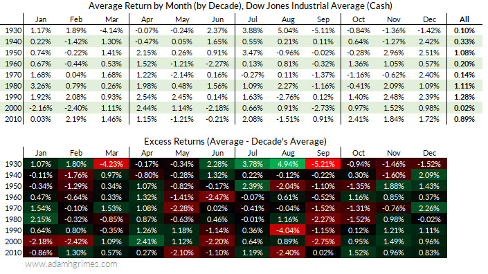
While I think simple binary (e.g., up or down) categorizations are very useful, there's another way we should look at the data. Size matters. We could, for instance, have a lot of small gains in one month that are consistently wiped out by big losses. The table below looks at the average monthly return for the same data:

This table more or less reinforces the perspective we got from our very rough "christmas tree" table in the previous post. Spend some time looking at this table, but here are a few points:
- December does seem to do very well. Aside from the 1930's, Decembers have outperformed the average month. This is the most consistent outperformance we see in the table.
- In recent data, November also appears to be stable and strong. In fact, November continues to look better.
- Again in recent data, June and September are weak.
What questions should we ask now? Think about this for a minute or two.
The question that really matters, of course, is what will happen in the future? We'd like to know, ideally, if this December will be up, and maybe even if all Decembers will be up! Maybe we'd settle for knowing how likely December is to be up, or whether it's more likely than any other month. Those are the kinds of questions that matter to traders.
Unfortunately (and, hopefully, obviously) those questions are unanswerable. We can never know the future. The government-mandated disclaimer that "past performance is not indicative of future results" is not just bureaucratic tiny print: it's a fundamental truth of financial markets.
The practical question we need to be asking is "do I think the future will look like the past?" Or maybe "does the past tell us anything about the market that is likely to continue into the future?" We can get some answers to those questions, and I would suggest the right answer is something like "yes. Probably. Maybe very likely, but we need to be careful and respect the limits of what we can predict."
I'll be back tomorrow with another post. We'll slice the data another way, and talk about what can go wrong when we start asking too many questions. Oh, and we still haven't talked about what the Santa Claus rally really is. (Hint: it's not just in December.) Or statistical significance. Or how much of this could be seeing patterns where none exist. Stay tuned...


