This is what manipulation looks like


I'm always looking at new ways to look at market data, and specifically new ways to present the data visually. Much of this finds its way into my work at MarketLife and Talon Advisors.
A year or so ago, we started presenting correlation tables in the reports. Correlations are not what people assume: for one thing, they don't always lead to intuitive outcomes. (I can, for instance, show you artificially constructed data series that are perfectly (+1.0) correlated, yet the move in exactly opposite directions!
Correlations also change much more often than we might expect, and technical analysts often run correlations on price instead of returns. (This is a basic, stats 101-level error that is kept alive in most trading books an nearly every major charting package.)
So we started presentable both longer and short-term correlation tables, as well as highlighting the changes in short-term (20 day) correlations from week to week. This was interesting, but I also started looking at correlation of volatility between markets.
Now, correlation between price movements (formally, between returns) is not super-intuitive, so correlations between volatility (correlations between the second moment of the distributions) are wildly counter-intuitive. For months, I kept running these wondering just how useful they were.
Then, we struck gold.
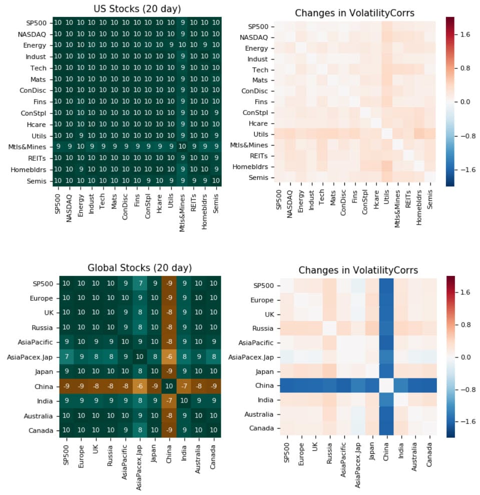
The chart above shows exactly what we would expect: volatility tightens up all around as markets come under stress. All markets start "moving together", except... China.
We know that the Chinese government has gone to great lengths to hold their markets up. (And I'm not making a judgment on the rightness or wrongness of those steps.) They have instituted selling bans and taken other steps. We can see on a chart that these steps have been effective, but here's a dramatic, quantitative visualization.
China stands out from other global markets in vivid contrast on the second table above. This is a confirmation, and perhaps points the way to using this tool to find other short-term inflections where markets disengage from other, tightly related markets in the same group.
This is an interesting example showing how a quantitative tool can have immediate and powerful perspective on complex global markets.


