I am still trying to figure out how to incorporate Twitter and other social media into my work. One thing that has become very clear is that tweeting each trade or position just doesn’t make sense. For me, I don’t necessarily want the world to be able to figure out where my stops might be, and there’s no point creating potential liquidity problems on entries and exits. For the reader, I also don’t really see the point. You cannot hope to be successful following some else’s trades. (Furthermore, I suspect the vast majority of trades tweeted are mostly for ego purposes.) I share my market opinions every day in my Waverly Advisors work, and I work very, very hard to eliminate as much bias and ego from my analysis and trading–being involved in the Twitter stream actually works against that goal. In addition, I see this blog evolving to focus more on trading concepts rather than specific, current trading setups. However, I know it also will be useful to occasionally look at some current market situations; some lessons are best learned in real-time as patterns evolve. With that in mind, let me share some thoughts on the current situation in US stock indexes, using the S&P 500 as a proxy for the broad market.
First, a little history is in order. I instituted a bullish bias on US Equities in my Waverly research near the end of the third quarter 2010. A bias like this is primarily a backdrop and context–perhaps most useful from an allocation standpoint, but we are comfortable trading both with and against the bias as dictated by short-term patterns. We maintained that bias, with various callouts for spots to increase and reduce exposure along the way, until 8/4/11 when we made the following bearish call:
The video shows a little bit of my analytical approach to markets, and how simple patterns can sometimes give an edge to market direction much further out. (Also, not emphasized in the video is that fact that the pattern has implications for volatility in addition to direction.)
Next, let’s consider the money flows in and out sector indexes. A good way to visualize this is to look at the spread of cash sector indexes against the cash S&P. You can use ETF’s (XLE/SPY, XLB/SPY, etc), but there are some nasty issues with dividend timing. it is best to avoid doing any analytical work on ETF products; stick to cash or futures and make sure to always be comparing apples to apples. The following chart shows nine major sectors against the S&P. When the lines go up, the sector is outperforming the market on a relative basis. It is completely possible for the index to go down, but to outperform the S&P, so the line can go up. Lastly, note that these are weekly charts. Each dot represents one week’s trading.
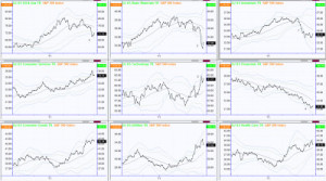
From this, I draw a few interesting points. (Refer to numbered areas on the chart):
- The 2009-2011 rally was led by the triumvirate of Industrials, Energy and Basic Materials. Strength rotated between those three (an interested study for another day perhaps), but they were the clear leaders. We can get a lot of information about the integrity of the trend by monitoring the leaders: when the Generals fall, the charge is in jeopardy. Industrials broke first, and have broken sharply enough that we do not believe the sector is a candidate for leadership on the next rally.
- Incredible technical damage has also been done to Basic Materials over the past few weeks. This is not all Gold and Mining as would be expected, but broad weakness through the sector.
- Energy has held up comparatively well. Though we do not look for a rally anytime soon, it pays to consider where we might allocate when that rally does eventually emerge. (That is the point of much of this analysis.) Energy is still a potential candidate for leadership. Do not take this talk of leadership as a reinforcement of the retail bullish bias. The clean uptrend is broken and it is not appropriate to focus on buying dips yet.
- It is amazing how many times you hear this line parroted: “The market cannot rally without the participation of Financials.” False. Absolutely, completely false. The 2009-2011 rally (over 100%) featured persistent underperformance from Financials. However, we believe that continued weakness in Financials represents a risk factor for the market, considering that the technical picture has shifted significantly. We have a short-term call out warning of a possible bounce in the sector, but that is only a warning to heavy shorts.
- Technology is definitely a candidate for leadership on the next rally. Good strength in some individual names and industry indexes there.
- (not labeled on chart) The bottom line on the chart are defensive sectors. They are behaving as expected: outperforming on market declines (see stocks such as SO, DUK, EP, ED over the past 2 months), and giving up that strength as the market rallies. This is a confirming indicator that the psychology has shifted into bearish mode. That might not seem to be useful information, but it is additional context that can make a difference.
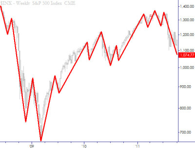
Next, consider the very high-level technical picture. This is a weekly chart of the S&P Cash index, with lines drawn according to a proprietary rule set I call Algo Swings. The details of the methodology are not important; it simply delineates the major swings in the market. (Note also that this chart is log-scaled. Anytime you are looking at a chart that includes a large price change (say > 50%), it should be log-scaled.) The most important thing to notice here is that recent downswing is large enough to break the established trend pattern. It is longer than any downswing in the trend in terms of both price and time. Sometimes, simple analysis is enough.
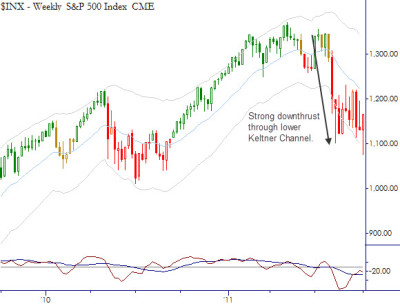
The next level is to look at an actual chart of the weekly timeframe. What stands out here, to my eye, is the large downthrust and subsequent consolidation. This is a pattern that should generate another downswing. This is a big part of the reason why I consider the over-arching technical backdrop to be quite bearish.
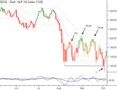
Lastly, a look at the daily chart shows some interesting patterns. Four trades are marked, with decisions I made in real-time. (Note that these decisions were filtered into individual Equities, except for the last, which was a long in the S&P futures. Regardless, the index structure drove much of the decision process in the individual issues.) The first, a possible short at the first downturn after the selloff I skipped. Why? Because volatility was so elevated and the bounce was not long enough or far enough to provide a good consolidation for further downside. My sense was that any move down at that point would be likely to fail. (The discussion of how to manage trading positions in high volatility conditions is a subject for another blog. The short answer is trade less and trade smaller. Large price swings and low liquidity (= large spreads) create a treacherous environment. Some traders become more aggressive in these environments, but it is almost always the wrong choice.)
Two shorts are marked next on the chart. In both of these, note that the market had three to four days of downside follow through, and then it was bought. At both of these inflections, I entered short positions that, frankly, did not pay off very well (with the exception of a short in ANR that worked very well.) This is a good reminder that all we can do is to identify the inflections, put on the positions, and manage the risk. Don’t be a hero and don’t be stubborn because even the best setups fail at times. The Long trade at the end of the chart, I already discussed in this blog written early today.
At this point, this market has entered a complex and complicated state. Many times (80%+) there is simply no strong technical edge in any given market, and it is equally possible to make a case for up, down, or sideways action. (“I don’t know” is a valuable phrase for short and intermediate-term traders to learn.) We are still long a couple of individual names, and the long S&P trade is within a few handles of its first (1X initial risk) profit target, but it is difficult to justify new positions at this point–there is still a bearish overhang and context in this market; any long trade is only a countertrend trade, not an allocation decision. If more strength comes in, the bearish edge can be further eroded, but, if the bounce fails around current levels, many individual names and sectors will be painting attractive bear flags near recent lows, which could presage a turn into another significant downleg.
In conclusion, some points to think about:
- Simple technical patterns can provide a bigger-picture edge for major market direction.
- Relative strength and sector flows provide additional context for equity traders.
- Step back in high volatility conditions. Reduce position size, risk, and trade less.
- Simple technical patterns are only useful in context. The best approaches synthesize a number of factors and influences. (This post has certainly not been exhaustive. Though I hit on the major factors, there have been many other influences to consider at various points.)
- Even correctly identifying inflections does not guarantee profits. At least two of the four trades above (the jury is still out on the long as I write this) were nearly ideal entries, but there was no payoff.
- Many times, it is not possible to derive a strong technical edge in any market.
- Beware of the retail bias to buy every dip. Temper that with an awareness of the bigger technical picture.
I noticed that you often used the Keltner Channal which is based on the ATR hence volatility. It would be interesting if you could explain in the future how you used the indicator, volatility is the core of the market and understanding it better would benefit any trader-investor.
I also liked your point on ETF sectors and how dividends can cloud the picture sometimes, thank you for providing us with the substitute in US DJ indexes.
Hi Ahmed,
I will talk a lot more about Keltner Channels and volatility in general. i think it is a very important topic and something that many traders neglect. (My book also includes information comparing Keltners to Bollingers. To me, the clear choice is Keltners.)
Glad the post was helpful.
Pingback: Current Technical Situation: S&P 500 | Adam Grimes