Did you miss a trade?

What happens if you miss a trade? Newer traders will often make a frustrated FOMO trade, and add a loss to what should have been a non-event. More experienced traders gain the self control to move on—this happens and it’s just part of the game. But sometimes we can do more. Sometimes, a missed trade can give us insight into the market action that follows and sets up new trades.
Did you REALLY miss a trade?
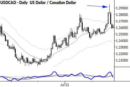
Not to dwell on this point, but many missed trades weren’t actually missed. Take a look at the chart of the USDCAD above, and see that I’ve highlighted a big reversal bar. In retrospect, that looks like a nice place to short, but it wasn’t set up very cleanly at the time.
In other words, if you think you missed a pattern, back the chart up to the day before the event and see if you reasonably could have taken the trade or not. In this case, I’d argue this wasn’t even a missed trade, but it sure looks like a juicy opportunity in retrospect!
Tilting points
This pattern goes by many names, but focus on what it does and what it shows us about the market. A few important points from this single bar:
- The size (range) of the day is at least average, and maybe on the large size. This shows good activity for the session—what happened here was probably not a “mistake”.
- The market probed to new highs (relative to recent action). This shows strength.
- But failed to hold on to those gains. (This shows reversal and weakness).
- The open and close of the bar were the same, clustered at the bottom of the bar.
We might, correctly, usually say that when the open and close are roughly the same, the market was full of indecision. In this case, with both of those at the bottom of a large(ish) bar, it points to exhaustion and potential climax above those highs.
This is what we mean by a “tilting point”. When a market probes those new highs and fails, there’s now a setup for a multiple bar move in the other direction, continuing the action of the sellers in that session.
This is also what we mean by context. Those little tables of candlestick patterns people love to publish are worse than worthless—they are dangerous because they are misleading. Even casual testing would show you that simple candlestick patterns have no statistical edge. (If you disagree with that, reach out with some of your own statistical work.) But, put in context, a pattern like this comes alive with meaning and potential.
So what to do?
In this case, that exhaustion bar wasn’t very well set up for a short on the close. Executing a trade like that is not within my trade plan, but there are still several things you can do with this:
- If you happen to be long (first, congrats!) you probably should have taken profits somewhere in that bar. If you didn’t do so, at least you can avoid giving back more the next day. Exit your trade on close.
- If you got suckered into that false move (it happens to everyone), at least don’t compound the problem by holding for the next bar. Exit your trade on close.
- If you want to short on the daily chart, you could look at shorting under that exhaustion bar’s low. This might be a difficult trade with the close right on that low (meaning that noise can suck you into a false short entry), but it’s worth watching.
- If downside momentum develops, use it to set up trades on the lower timeframe.
One pattern, many possibilities. Depending on how you trade and who you are as a trader, you can find many ways to use the information in a chart like this. Reading charts goes so far beyond recognizing simple patterns and “setups”.


