Today’s chart of the day will be a little different. Take a look at this table which shows 2 week, 1, 3, 6, and 12 month returns for every trading day in the S&P 500 from 2/3/1960 – present (13,241 trading days.)
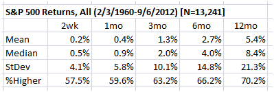
Notice first of all that the long-term bias is clearly up, as all timeframes have a positive mean and median. Note that means are smaller than medians (reflective of large downside outliers that shift means but not medians), and that standard deviations are very large relative to means. Also, would you have guessed that randomly buying stocks, you would have ended up higher a year later 70.2% of the time, just by random chance? It’s important to realize this when you are evaluating statistics and system results.
Last Thursday’s large upward close in the major Equity indexes were the largest-ever, on a volatility adjusted basis. (Volatility adjusted meaning, in this case, that each day’s return is expressed as a standard deviation of the previous twenty day’s returns. This is my volatility spike indicator, discussed in The Art & Science of Technical Analysis in considerable detail.) This is extraordinary, and prompted me to take a look at the historical record following other large up days. The first thing we notice is that stock returns have asymmetrical risks—a lot more bad surprises happen to the downside than good surprises to the upside. There are nearly twice as many large downward spikes than upward, so, even in a dataset of over 13,000 trading days, our sample size is very small. Regardless, take a look at the statistics for days that closed greater than+ 4.5 standard deviations on the S&P 500 cash.

Though it’s beyond dangerous to draw conclusions on a such a small sample size, note that these returns are overwhelmingly positive. Furthermore, volatility (risk?) is greatly reduced, which you can see by comparing the standard deviation of returns to the means. Also note that means are larger than medians, suggesting that outliers are to the upside. We simply don’t have enough of these events to draw any good conclusions, so let’s widen the parameters a bit and look at +3.5 standard deviation closes.
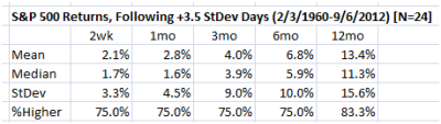
Here again we see the same tendency, and extremely positive results. The sample size is still much smaller than we’d like, but it at least gives us some idea of which way the wind is likely to be blowing. Is there a logical explanation for this? We certainly should be wary of accepting statistics blindly, in the absence of any logical reason why things should be as they are, but perhaps there is a simple explanation here? Perhaps the buying pressure to produce these large upward spikes only exists in a positive environment. Perhaps these large moves are reflective of the voting power of large, smart money interests, and they tend to occur at smart points. Perhaps it is simply a dangerous statistical fluke, due to a very small sample size.
Be careful, as there is plenty of short-term to play in both directions. It’s easy to have a bias, even a correct bias, on a higher timeframe and to get killed on your trading timeframe because that bias makes you stubborn (a good topic for a future post.) For now, just realize that all the pontification and speculation about why stocks should not be going up is pointless—stocks are going up. For now, the market has voted.
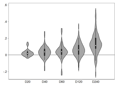
And last, here’s a violin plot of the returns for the +3.5 standard deviation days. For most of you, this won’t be that interesting, but it’s kind of cool chart porn at the very least. 😉