A short trade in silver: dealing with oversold levels in trends
A few lessons from a simple short trade in silver.
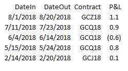
First, a little bit of history. I’ve been trading gold fairly actively this year, and have published five trades in my published research. These trades were in gold, but, in every case, I considered whether silver was a more appropriate vehicle. Usually, gold wins:

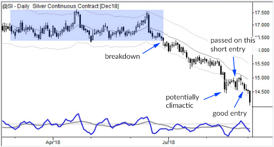
So it’s been clear that gold (and silver) broke from ranges (see chart below) in early summer, and then extended into a downtrend. There were a few tradable structures in there, just trading pullbacks in the trend.

Now, my read of the action in August was that this was potentially climactic. This is one way trends end: they accelerate and end in a little climax (either buying or selling) which is visible as larger range bars, typically outside the channels, and often showing long shadows in the direction of the previous trend. (This is a simple, high-level way to understand many of the candlestick patterns.)
So, to be perfectly honest, I expected my next trade in precious metals might be a long trade because I thought there was some evidence that, maybe, the downtrend was ending.
Here’s an important lesson: markets correct through both price and time. They reach overextended (overbought or oversold points) and often snap back… if they don’t snap back, then there’s a good chance the trend will continue. But first, the market usually has to absorb the overextension, and that's why I passed on the short entry marked on the chart above.
A common outcome is a complex consolidation, or a flag that attempts to renew the trend, and fails. When you see that first failure, pay attention. The trend may now reverse sharply, driven by trapped trend trades. If that doesn’t happen—if the market stabilizes—then you probably have a tradable structure for with-trend trading.
I think that’s a very important concept: when you have a potential overextension, monitor the market for a longer pullback, and then be prepared to take with-trend trades if the pullback still looks “good”. In this case, the good entry is labeled on the chart, and the trade hit its 1R profit target early in today’s trading.
Be suspicious of anyone showing you chart analysis or examples in books. It’s terribly easy to find good examples, but harder to find them in real time. In this case, I’m not reinventing history. All of the trades in the table above, and this specific trade, were covered, in real time, in my research I publish with Talon. (Obviously, if you’d like to see more trades like this, check out my work there!)
This is an example of how we can read market dynamics in real time, and how simple price patterns, put in the right context, can give us powerful insights into trend dynamics. It’s also an illustration of how those simple patterns can point to profitable trading opportunities, even in difficult markets to trade like precious metals.


