I thought it might be useful to step back and take a look at gold from a much longer-term perspective. First, the monthly chart (difference back-adjusted continuous futures):

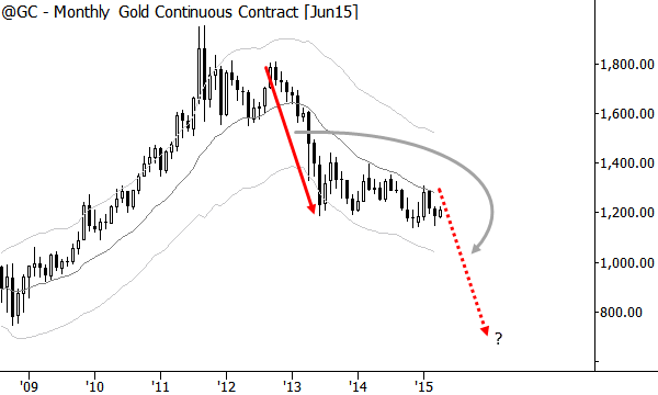
The first thing we see on the long-term chart is a big pattern of up then down. Keep in mind, this is a very long-term perspective, and we are brushing trends that extended for 2-3 years into a simple category of “up or down”, but that is the purpose of long-term analysis. We can also see that there were two periods (outlined in grey) when the market was relatively flat–in some type of trading range or consolidation. The most recent market action is most likely consolidation, suggesting that gold has probably been relatively directionless in the recent past. Now, let’s zoom in on the weekly perspective:

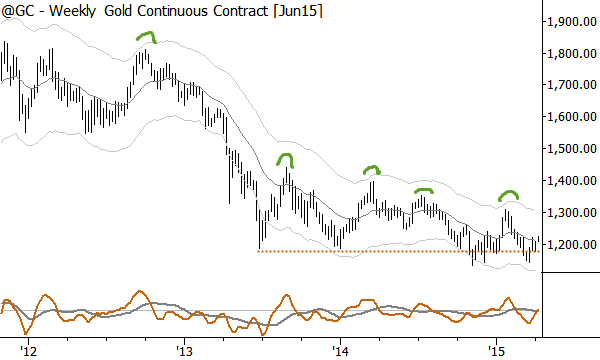
The weekly chart shows that the 2011-2013 decline seemed to find some support that has lasted from 2013-2015. This support level is not a clear level, but that’s how markets work–support, when it exists, is usually a large “messy” zone rather than a clear, sharp line. What stands out on this chart is the pattern of lower highs into that support level; this is usually a strongly bearish pattern, perhaps because it shows that buyers are a little bit less interested every time gold declines. If this support breaks, a quick meltdown is possible. We can look at the monthly chart to get a rough idea of where that trade might go:

People love precise projections, but, again, the market doesn’t work like that–there’s too much noise and uncertainty and the market does not work according to any mystical ratios. (If we’re ready to face reality, we must turn away from the false confidence of the Fibonacci crowd and magic numbers like a 168.8034% extension.) We can, however, use the trading characteristics and volatility of a market to get some rough idea of what might be possible.
In this case, a simple symmetrical project suggests that a selloff in gold could have potential into or beyond the low 800’s: if the next trend to develop looks something like the last trend, those numbers are well within striking distance, and let’s call it roughly a 33% selloff. This is the big picture we are working with for gold, over the next several years.
Perhaps more than any other market, people have emotional reactions and attachments to gold. For so many people, it becomes a focal point for any concern they have about politics, social conditions, or vague fears about the future. While some of these fears may be well-founded, they are a poor thesis for trading and investment decisions. Too many people are unable to short gold, and want to do nothing but buy gold (and gold stocks) at all times. Fight those natural tendencies, and try to see the market for what it is. The message of price and market structure is clear: There will be a time to buy gold, but there will probably be a time to short gold, first. There will be a price to buy gold, but it will probably be far lower than current prices.
To everything, there is a season. Our jobs, as traders and investors, is to find that season.