Working on a new way to view charts
I change slowly. The last major change I made to my trading was in 2005, and the smaller changes I've made since then are tiny, incremental changes. Often, they're just time-saving tools that have grown out of my coding work.
I also am very consistent: I use basically the same indicators (Keltner Channels and a modified MACD (the 3/10 oscillator)) on every chart, regardless of timeframe or asset class. I don't think there's a lot to be gained from trying to tweak indicator settings, since what we're looking for are just broad concepts and structure on the chart.
So, it's very rare that I find a new indicator idea that excites me... but I think I have. A few nights ago I was playing around with some ideas, had a little flash of inspiration (one of those questions that begins "what would it look like if we measured this in this way...?") and have created a band/channel structure that I think is entirely new. I'm in the process of crunching numbers around it and looking at it subjectively on many charts, but I have to say I think I like this.
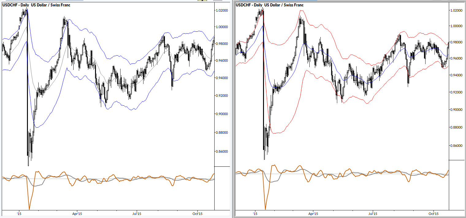
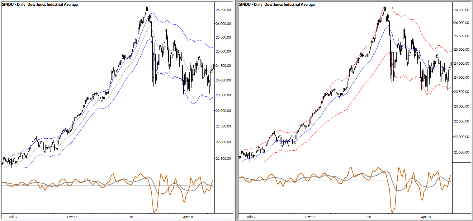
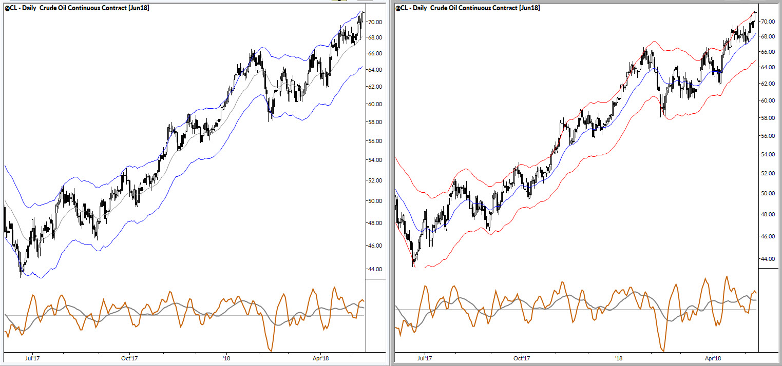
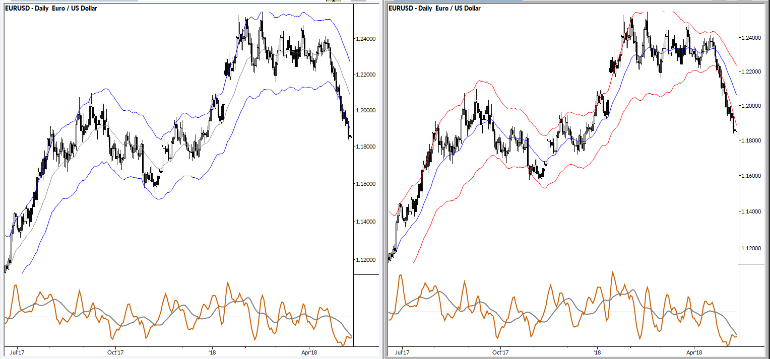
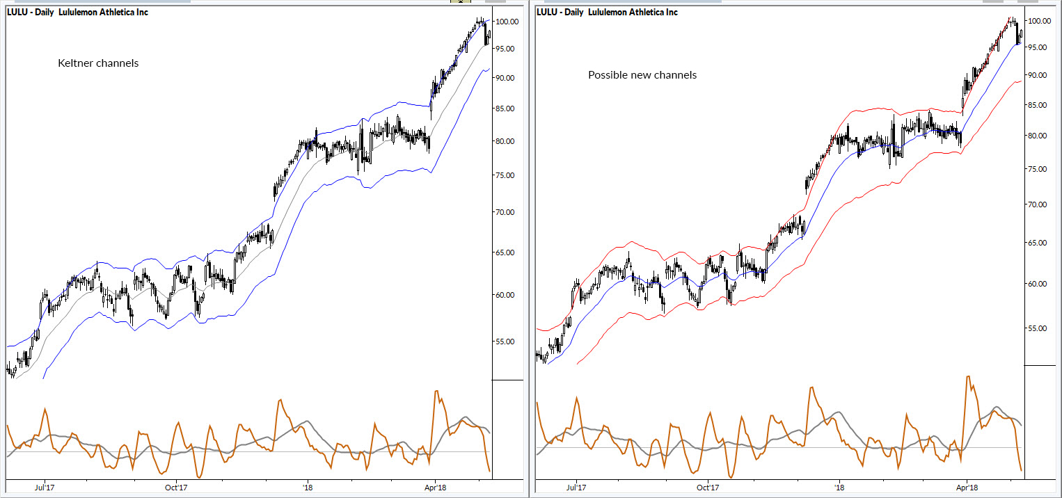
They are designed to do a few things better than Keltners or Bollingers:
- respond in a specific way to both increasing and decreasing volatility
- respond to changes in the momentum of a trend. (Both Keltners and Bollingers fail on this front.)
- to measure volatility in a way that is more logical and consistent with the purpose of the bands. (For instance, the logical inconsistency of Bollingers' standard deviation of price has always bothered me!)
I'm not ready to talk too much about these or the concepts driving them yet, but I thought I'd share some images and examples. If this pans out, you'll be hearing more about it later!
Keltners are on the left. New bands are on the right. If your first thought it "they are the same", look closer. If you think they are very similar, you're right and that's the intent.
