Tracking intraday risk and opportunity

I spend a lot of time writing about volatility and even more time thinking about volatility, correlations, and the implications for risk. I want to share a quick look at one of the screens I monitor intraday. Charts are very helpful, for many reasons, but where they falter is in showing what is happening right now. (And I say that, having had, at one time, 8 monitors full of charts on my desk (and another screen to execute). I just don't think a face-full of charts is the fastest way to understand what is happening in the market right now.
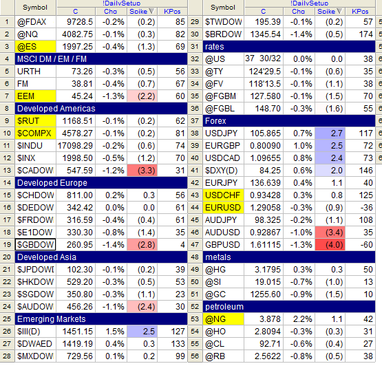
For that, a quote screen is useful, but even more useful than that is a volatility-adjusted measure. This is where, once again, I find a tool like my SigmaSpikes really comes into its own; the chart above shows several markets, separated into various geographies and categories, with a color-coded field to flag the large standard deviation moves for the day. At a glance, you can see where you need to be devoting your attention and focus for the day, and, with a little more work, you can start to build a story over the course of many days.
This is, admittedly, a very short-term perspective. Many times, much more work is needed, and a system like this just calls attention to where you need to start. Still, it's hard to beat a system like this to give you a good five second read on global markets, any time of the day or night.


