Reading sector relative strength
[dc]R[/dc]elative strength is an important trading concept, and there are a lot of ways to define, monitor, and trade these relationships. Looking at the sector relative strength within the US stock market gives a deeper understanding of money flows and psychological support for a bigger rally. One of the keys to stock market rallies is that leadership tends to be persistent, particularly on rally legs. When markets consolidate, as this market arguably has been doing since the beginning of this calendar year, sector rotation is to be expected--it's normal to see leaders emerge out of the foam and then crash back in failed breakouts. However, when we do catch these leaders, sometimes we can get very nice, long traders: in my published research, we have been overweight Healthcare since 7/27/2012 and underweight Utilities since 1/27/12--substantial wins for what are now long-term trades. Of course, if you are going to do this you have to be willing to let some positions go at a small loss or breakeven, as we may have to do with an overweight on Energy that has lagged a bit since we put it on in May of this year.
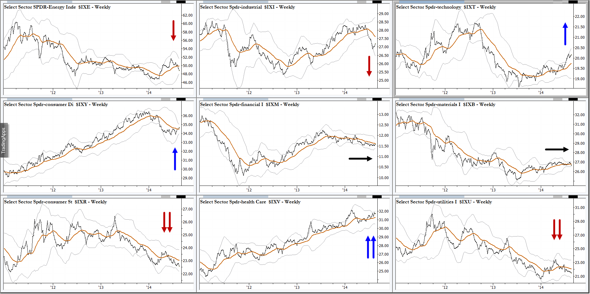
I find it useful to look at spreads of indexes against the broad market; this is part of my analytical work done several times each week. Volatility-derived bands (similar to Bollinger bands) around the spreads give some idea of the volatility of the spread, but, remember this is not tied directly to underlying market volatility--be clear that it is the volatility of the spread relationship. I am presenting these nine charts without a lot of commentary, but have summarized my reads with the very scientific "one or two arrows" system. (Two arrows = stronger conviction for a move in that direction.) Also, just like anything else in the market, there is not always a directional edge. Sometimes the best we can say is "dunno", and I have indicated these sectors with a sideways arrow. (It is also useful to sometimes drill deeper, down into the industry or sub-industry level.)
Anyway, here is a look at the current relative position of the major sectors within the US market. It is interesting to note that a possible inflection in Discretionary, a sector which often drives strong rallies, may be lining up with very bullish condition in broad indexes. This is an example of how quantitative analysis can begin to inform a more subjective read on market direction. (Click on the graphic to enlarge.)


