Visualizing Sector Relative Strength
Understanding sector strength and weakness is an important part of the investment process. Here is one way to look at short and long term performance relative to current volatility within each sector.
[dc]O[/dc]ver the years, one of the things I have spent some time on is figuring out good ways to visualize complex market data. Though some investors tend to downplay the importance of charts, I think this a mistake. A chart displays quantitative data in picture form. This is valuable because it may encourage more intuitive processing, and can help us access other ways of thinking about the data that might be elusive if we were to look at the same information, for instance, in a tabular format. There is a reason that experienced chartreaders talk about "feel" or "character" of a chart; that is because we are able to sometimes get information from the chart that goes beyond rational analysis. (Of course, that information can sometimes be misleading.)
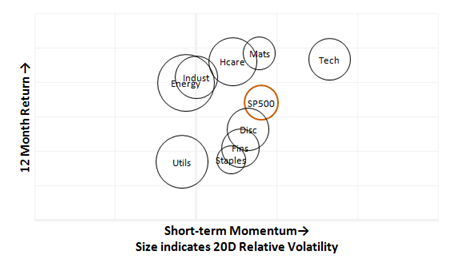
Because I have found charts to be so useful, I am always looking for new ways to present complex data in a simple format, and many of these visualizations find their way into my research reports to help our clients understand shifting market data. However, it is always important to make sure a new chart presentation is useful and adds something to the analysis—there is little value in a cool chart for a cool chart's sake. The chart above is one of my newest innovations. It ranks sectors vertically by 12 month return, which is an arbitrary measure of longer term relative strength. Horizontal position is determined by a short term momentum measure, which is basically a very short term relative strength ranking. The size of the circle is determined by relative volatility for each sector.
In this case, we can see a few interesting points. Near the top of the chart are the leaders: Tech, Materials, and Healthcare. We also see Energy and Industrials vying for position. Laggards are near the bottom: Utilities and Staples, with Financials and Discretionary edging into laggard territory as well. In the short term, Tech is leading (earnings), while Utilities, Industrials, and Energy lag. Volatility has come into Utilities (easy to overlook that), Energy, and Healthcare. This is information that can be useful to essentially any market participant from long term investors looking to tweak allocations to short term traders looking for the best sectors as part of a top-down process, to daytraders who want to know where the volatility is. Regardless of your style or approach, good data visualizations can be a tremendous help in the quest for investment profits.