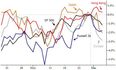
Two ideas to think about today: First, there are many ways to track relative strength. One of the simplest is just to look at returns (returns are simply a way of saying “percent changes”) over time period (a month, 6 months, a year, etc), but this method suffers from the fact that the “left side” of the window also has an effect on the reading. If a large event happens to pass out of the evaluation window, your return measure which jump, which probably is not what you want. A good solution is to attach the relative strength measures to important pivots in the market: swing highs and lows that mark critical market structure. That is what the chart above has done: major global stock indexes (all in USD please) indexed to zero at the S&P’s pivot high on 11/29/13, so we can see relative performance during the recent pullback. Concept two: the strongest market or group of markets on a pullback will often lead the next rally. Look at Hong Kong. Enough said?
One conclusion from the chart is that Hong Kong had the strongest performance since 11/29 and thus could be the potential leader in the next potential rally. What would say on the observation that Hong Kong was the second worst performing in the 5-6 weeks before 11/29 and leadership is rotating. Furthermore, the main indexes may have similar volatility, but this may not be the case when you do the same exercise for e.g. the sector ETFs. Would you apply some volatility adjustment, or do you keep things simple?