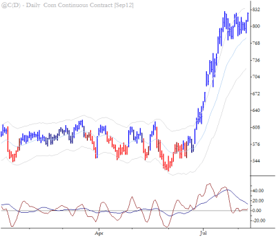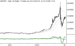
[dc]R[/dc]eader Jayram asks, “Can you tell what is the significance of the blue & red bar coloring in your charts on the blog?”
Sure, Jayram. I use various color rules on my charts, but I do not use them in any systematic fashion (for the simple reason that I have not found any systematic trend indicators that give an edge to my discretionary trading.) This particular rule set does actually have a small quantitative edge, but it is mostly there to provide another layer of structure on the chart. Chart setup is something I discuss in detail in The Art & Science of Technical Analysis, and one of the overriding principles is consistency—I think it is important to use the same indicators on all charts and to change them as rarely as possible. (An important exception to this rule might be if you were using something like Alexander Elder’s Triple Screen system, as described in his excellent book Trading for a Living
, which requires different indicators on different timeframes.) Having said that, I do change the colors displayed (e.g., red/blue, orange/green, purple/blue, etc.) from time to time to keep the eye fresh.
There are many ways to set up these color rules. A simple one might be blue above a moving average and red below. A more complicated rule set could be a gradient depending on where the close or midpoint of a bar is in a set of channels or bands. The particular rule set I use is adapted from Linda Raschke’s work, and has its roots in Welles Wilder’s
Parabolic system. Specifically, it looks back over 40 bars and marks a “trend change” (flipping colors) when price moves 2.6 ATR’s off the highest high or lowest low of that lookback period. Don’t get too caught up on specific rules, but consider if adapting the concept of some kind of trend indicator wrapped into color rules might help you see charts more clearly. If so, use it. If not, go for clarity and keep things as simple as possible.
