Chart of the Day: Multiple Inside Days in FRX
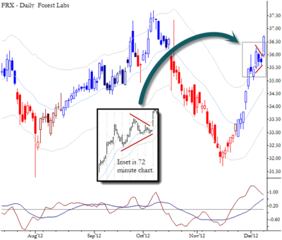
Two inside days can set up a good breakout trade.

I have written before on the importance of being able to identify volatility compression. This chart of FRX shows an example where a chart pattern could have alerted you to volatility compression. Note the two inside bars on the daily chart, which "hides" a triangle on the intraday chart. When you see a pattern like this, it warns you that any breakout is likely to see continuation. How you use this information depends on the situation: it can be motivation for an outright trade, can affect risk management decisions (particularly on higher timeframe), can set the stage for options trades that are long a lot of volatility (though timing can be difficult). At the very least, do not be caught fading a move out of a pattern like this.
Note that this pattern is presented as an example of an historical pattern that may already have played out, not a pattern or setup that is "live" in the market today.
// < ![CDATA[ <span style="overflow:hidden;line-height:0px" data-mce-style="overflow:hidden;line-height:0px" id="mce_0_start" data-mce-type="bookmark"> // ]]>


