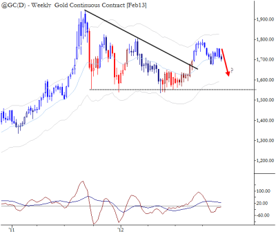
[dc]T[/dc]echnically speaking, the chart of Gold is complicated and unclear. To recap: the second half of 2011 saw a sharp collapse in prices. This selloff found support around 1600 (1,550 on this back-adjusted chart), a level which was tested at least 4 times on the weekly chart. Coming into the summer of 2012, we were on guard for a potential breakdown below that support, but this was not be—a strong rally broke the trendline in August and the stage was set for a retest of the 2011 highs. (We traded Silver to the upside on the breakout, rather than Gold.) Prices crested in October, rolled over into a pullback that bottomed in November, and here’s where the story gets interesting: prices turned higher in an obvious technical trade, and then faltered. There has been little to no upside momentum, and there is now good justification for short positions.
Obvious technical trades bring some dangers. Many people put stops in the same place; these stops being hit can lead to sudden, outsized moves. The best way to take advantage of this is to recognize when the pattern may be failing before everyone else does, and to take the appropriate position. Of course, there is always the tradeoff that the pattern may not fail (i.e., in this case, that prices may reverse and head higher), but that is the nature of trading—every trade is nothing more than a slight tilt in probabilities. When we’re wrong, we book the losses and wait for another trade.
Hi Adam,
How do you label the current price action and past market structure in the weekly timeframe? Do you see this as a pullback ( or maybe a potential complex pullback if we take November lows) from the up leg starting in August? Do you see it as a test failure from late February? Or are we just in the middle of a big range with highs on September 2011 and lows on December 2011 and so making the edge ( on the weekly ) very small?
Thanks