If you could hear anything beyond the screaming this morning over Greece, you probably also heard the news that China is now officially–yes, that’s right officially–in a bear market as the major index has slipped 20% from its highs. This makes for a good headline (and I’m disappointed no one tried to float a “Is This the Year of the Bear in China?” headline), but it also raises a few good questions, the most important of which is: now what?
Labeling corrections and bear markets
There’s a common plan for labeling stock market moves that goes something like this:
- a 5% decline from the highs is a pullback
- a 10% decline from highs is a correction
- a 20% decline from highs is a bear market
- (a 50% decline is Armageddon?)
Here’s something to keep in mind: those are just made up numbers. Labels might be useful because they give us a language and let us talk about market movements from a common ground, but they are dangerous because they create assumptions about what the market is likely to do in the future.
Of course, the news that China slipped into a bear market is supposed to be ominous. It’s supposed to scare you and make you wonder if the economy, probably not only of China, but maybe of Asia and then the rest of the world, is ready to slip into a hopeless chaos of depression and stagnation. It’s supposed to get your attention, and we live in a soundbite world that depends on those “quick hits”.
Of course, we can label anything with any name we like: we could call a 15% pullback a bluebonnet bump, and that might be better because it would, at least, free us from the emotional connotations of some of these words.
Other ways to measure
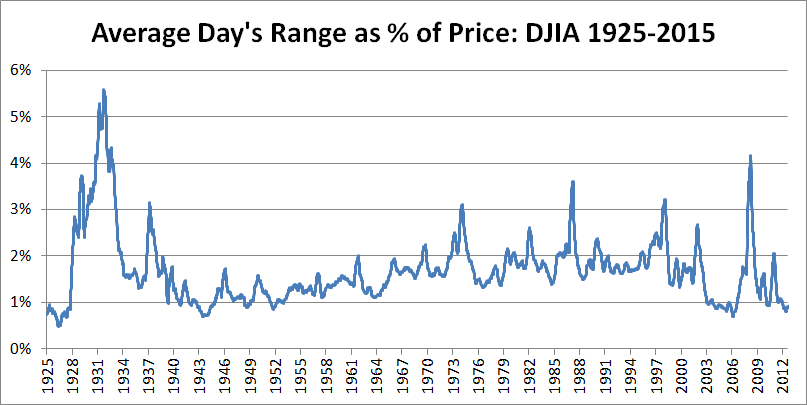
Markets fluctuate; they bounce around a lot. Furthermore, how much they bounce around changes frequently. (If you think of the analogy of a bouncing ball, we’re talking about how fast and how high the ball bounces.) Take a look at the chart below, which shows what an average day’s range in the stock market would have been, as a percentage of the price of the index, for the last 90 years:
So what are you supposed to take from that chart? Simply this: the volatility of the market changes a lot. Over the 90 years on that chart, it has averaged right around 1.6%, but has ranged from a high of an average day moving 5.6%, to a low of 0.5%. Think about that for a moment–those are very different worlds. Stocks changing 0.5% is like watching paint dry, while having 5.0% days (on average!) would be a roller coaster.
Think again about that “bear market is 20%” definition. Does it make sense to apply that same label to an environment where 20% is about four times the average days range and also to a market environment where it is 40 times an average day? Decide for yourself, but, for me, the answer is no.
There are other ways to measure. There are a lot of possibilities with moving averages: we can look at crossings of moving averages (the famed Death Cross and Golden Cross, which, from a predictive standpoint, are pretty much garbage), slope of moving averages, or simply price crossing a moving average. We could use some variation of the 20% method, but correct for volatility. (That one might work, but it will never gain traction because you can’t explain it in a soundbite.) There are also structural possibilities, looking at swing points to be violated with a certain volatility hurdle applied or simply a breakout of an X day channel. We could also combine some of these ideas, but, in this kind of work, simple is often better.
What these labels mean
However you choose to label or not label market moves, here’s the most important thing you need to know: no measure of trend has any predictive value. (At least none that I have seen, and I’ve devoted a lot of time and energy to finding one that does.) “What of the trend followers? What about the legions of CTAs that do pull returns out of the market using trend indicators?”, you might ask. Good question (and thank you for asking it.) Yes, there are measures of trend, that, when applied within very rigid constraints of exit methodologies, stop losses, profit targets, and risk management can produce significant returns over a long enough time horizon. But, they will do so with significant drawdowns and low win ratios (a lot of trend following systems have win ratios around 30%)–this is not what we probably think we are getting from a trend indicator. A trend indicator that is right 30% of the time sort of bends the mind, doesn’t it?
Rather than thinking about labels like this, focus on the task of reading market context and market structure. Work to develop the skills of competent trading and investing. (Check out this podcast for ideas on that, and this one for ideas about how to actually get in and out of trades.) Read the headlines, but try to strip them of their manipulative, emotional content. Focus on eliminating all hysteria and emotional extremes from your own actions, while you work to identify those extremes in the crowd. This is how you make money in the market–it’s not easy, but it can be done… and you can do it.

Pingback: 06/30/15 - Tuesday Interest-ing Reads -Compound Interest Rocks