Are the secrets of price action hidden in randomness?
This might be a more challenging blog post than most, but if you’re interested in really understanding price action I think it’s very important.
Over the past several weeks I’ve been doing some deep dive coding and quant work. (Stuff like looking at correlation and cointegration in the higher moments of distributions… and using tools like Granger causality to see if there’s predictive potential there. For a concrete example, what if one market starts showing more “extreme” values (kurtosis increasing)… might there be points where this type of action points to a change in the volatility of another market?)
It's fascinating stuff, but it also sent me back to a different place too. Many quants disdain charts, saying that all efforts at chartreading are doomed to failure. (To be fair, most quants are highly educated in mathematics, but very few of them have spent any time at all learning to read a chart correctly. When they do investigate the discipline, they usually run down the route of traditional technical analysis and (correctly, I believe) find that most approaches there are too subjective and lack any quantifiable edge.)
However, I was driven in a different direction over the past few weeks: to investigate implicit learning that hovers at the edge of what is knowable and quantifiable—to think about those, potentially very valid, aspects of discretionary trading that we can’t really express in numbers and code… and then, to think about how I might share those thoughts with you, my reader.
Random charts
Here’s one way to think about it. We are all familiar with the heavy-handed books that show random price charts and say something like, “look! You can see the same chart patterns on random charts as in the real market. Therefore, patterns are random and useless. Therefore, you should just put money in the index product I’m marketing…” (Most people don’t realize how effectively Wall Street has hijacked mathematics for marketing purposes!)
Now, there’s absolutely a huge grain of truth in that argument. We cannot make money with something that is random. To say the same thing another way, we must have something that is non-random to create a trading edge. So, comparing things to randomness is actually a very valid concept—if we can’t say something is “not random” then we probably shouldn’t build a trading system around it. This concept is the core of significance testing, but let’s not go there.
So while many books present a facile dismissal of chartreading by comparing price charts to random data, there’s much more to the story.
We can tell the difference
There’s a pretty significant problem with the argument I just presented: humans can tell the difference between random data and actual market data. Andrew Lo ran an online experiment called Arora that showed humans could very quickly learn to tell the difference between real market data and randomly generated fluctuations. Antoine Bruguier took the experiment a step further and found that even completely untrained traders could actually tell the difference when they were operating in a market that was being manipulated by informed traders or not. (The actual language from the abstract begins “experimental evidence has consistently confirmed the ability of… even novices to infer information from the trading process.")
The two examples above presented data in ‘real time’, as it developed, to traders, but, over the years, I’ve run variations of this experiment with static, printed charts. I found the same thing: humans do a pretty good job of telling the difference between real and random charts. Not 100%, and some random charts “look pretty real”, while some real charts “look pretty random”, but, overall, there’s a very good chance you’d score higher than 50% if we played the ‘real or random’ game.
Despite the examples in many books, the people who say you can’t tell the difference between real and random charts are wrong.
How we can tell the difference
Here’s the question that grabbed my attention over the past few weeks: how can we tell the difference between randomly-generated and real price charts? That question—the how—is a question of profound importance.
Why? Because it points us toward a homespun type of significance test. If we can isolate the elements of a chart that help us, with some degree of reliability, to pull out the real from the random price charts, we might have isolated valid aspects of price action. If we can isolate valid, non-random aspects of price action, we might be able to find profitable trading opportunities.
So I spent a lot of time staring into the abyss of randomness (and yes, in deference to Nietzsche I suppose we should acknowledge that said abyss probably stares back at us), and here are some things I believe are true. These are aspects of real price charts that probably offer trading edges:
- Volatility tends to be more or less consistent. It’s really weird to see giant bars coexisting alongside (i.e., close in time) to tiny bars. Typically, markets move at more-or-less one level of volatility, until a volatility spike hits the market. When that happens, bars usually stay big for a while.
- Specific candlestick patterns showing thrust (full body, no shadow) or exhaustion (long shadows with wide range) usually happen near one end of a price move.
- Thrust bars (full body) typically have some followthrough.
- Big gaps usually lead to some motion, either in followthrough or snapback.
- There are specific patterns that tend to occur at turning points of larger swings, and not in the middle.
Armed with those ideas, take a look at the chart below, which is randomly-generated (by shuffling price data from an active market):
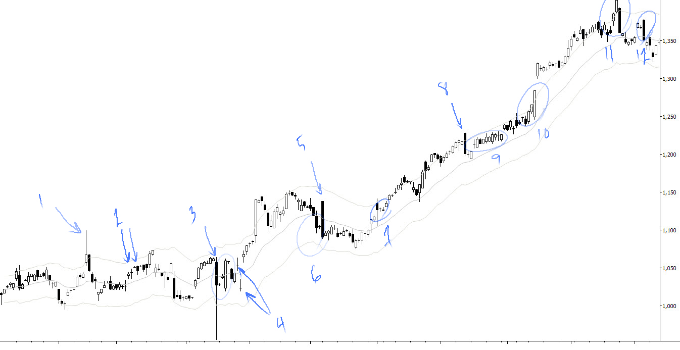
I highlighted some points on the chart that I thought showed departures from real market data, and that would have caused me to ask if this was a real chart. Here are my quick notes:
- Strange to see this large bar here. Would expect after larger upswing.
- Weird tiny dojis alternating with more normal bars. Also weird to see advance happen on black bodies.
- Very strange large bar out of nowhere. Also odd to see tiny bodies just following the big bar, and for all price action to have remained in the bar for 8-9 bars after.
- Weird gaps and tiny bodies.
- I don’t know why this comes after 6. It was late at night, I guess. Strange to see no followthrough after the failure of such an optimistic gap opening.
- Another weird tiny bar following big bar.
- More tiny bar weirdness
- Unheard of? No, but it is a slightly odd location for this big bar… and no real followthrough.
- Strange overlapping formation
- I circled this at the time, maybe not so strange in retrospect. This could be real.
- My thoughts won’t really fit in a bullet point…
- This is weird alternation of small and big bars.
You should also look at what things are on this chart that do “look pretty real”. We could make a long list, but I see alternation of trading range and trend. (I do not see volatility correlating with moves out of ranges, however.) I see pullback in trends. I see support and resistance being respected and tested. (I do not see evidence of pressure around S/R, however.) I see some gaps that appear to come in the “right” places in trends—exhaustion, continuation, etc.
Now, you may disagree with some of those points, and that’s ok. This is a highly subjective exercise, but I’m just trying to illustrate some of the important points.
Nearly all of the authors who would like us to believe you can’t tell the difference between real and random charts use line charts in their illustrations! Of course, a line chart presents us with only the barest aspects of market movement. If allowed to stack the deck like this, yes, I would admit we probably could not tell the difference. But give us more information—give us open, high, low, and close data—or give us tick charts that are generated in real time (so we have some understanding of pace), and then things become a bit more interesting.
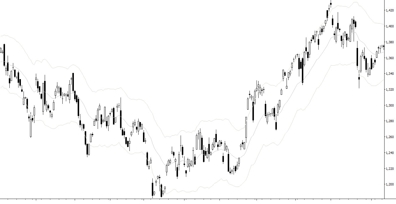
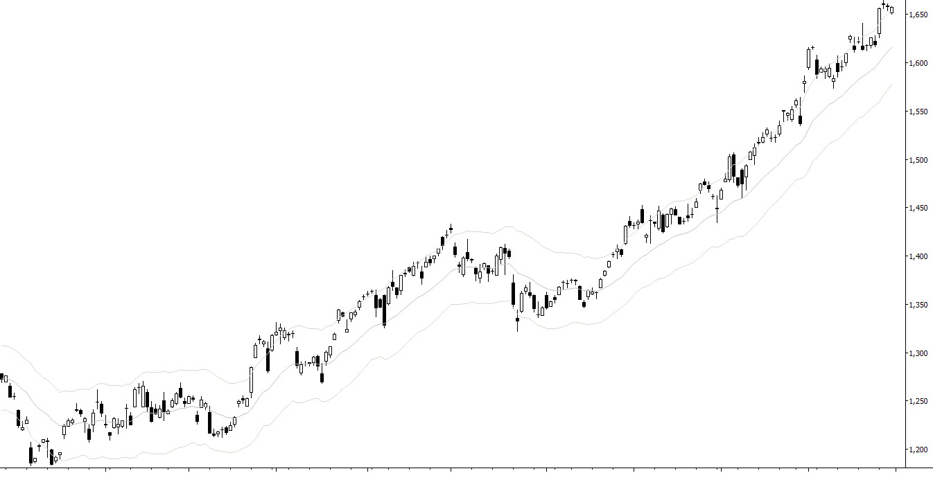
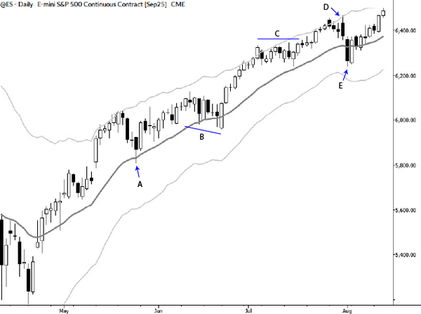
I’ve just written 1400ish words on this subject, and, to be honest, I don’t think I’ve communicated the point as clearly as I wish. Take a look at the charts below, and play the same game on them. I’ll revisit this topic soon, because I think the entire essence of what is knowable about charts and price action might be hidden here!
