This is another post in the small series on tracking, understanding, and trading relative performance. In previous posts, we looked at two ways to track relative performance as a percent change from some previous point in time, considering that previous point either as a structurally significant swing point or an arbitrary lookback point. We displayed the relationship both as a number that could be ranked, and as a chart which could also give some qualitative assessment of the relationship between two markets. Today, let’s look at the tool that is probably the most widely used: the spread chart.
A “spread” is a price relationship between two markets. There are two ways to calculate the spread:
Difference spread = Price of asset A – Price of asset B
Ratio spread = Price of asset A / Price of asset B
Right out of the gate, we have some issues to consider. Which spread will we use, and why? For futures traders, the choice of which spread will depend on which back adjustment method is used. If you are ratio-back-adjusting, then you must use a ratio spread. If you are using the standard “Panama canal” or differenced method of back-adjusting, then you must use the difference spread. Be careful; your software will probably easily allow you to make a mistake here, and it is not uncommon to see ratio charts in published research (i.e., that people are charging money for!) with errors made here. In particular, the ratio chart becomes a significant problem as one of the price series approaches or crosses zero, and this is not at all uncommon with back-adjusted futures. You have to understand your data and remember there is more to this stuff than lines on the screen.
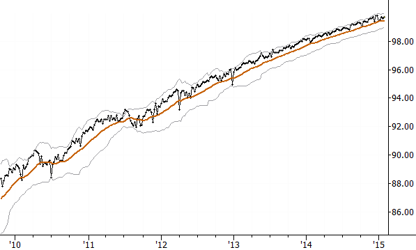
There is also the “apples to apples” issue to consider. Once we have a tool like this that allows us to look at one asset against another, the possibilities become nearly endless. We can put anything on a chart and look at the relationship, but does it make sense to do so? At the risk of oversimplifying, consider that prices fall into three broad categories: things that might pay a dividend or distribution, things that include carrying costs (i.e., futures), and things that more closely reflect spot prices. If we start mixing “things” from different categories, we’re likely to be misled. Consider the following chart:

This chart seems to show a nice, steady trending relationship, but it’s an illusion: this is chart of the S&P 500 futures (continuous contract) against the S&P 500 cash index, and simply shows the natural price “decay” of each futures contract to spot price at expiration. You don’t have to be able to calculate the futures price from spot (but why should you not be able to do so?), but you do have to understand the issue. Futures prices compared to spot prices can be highly misleading. Look at the next chart:

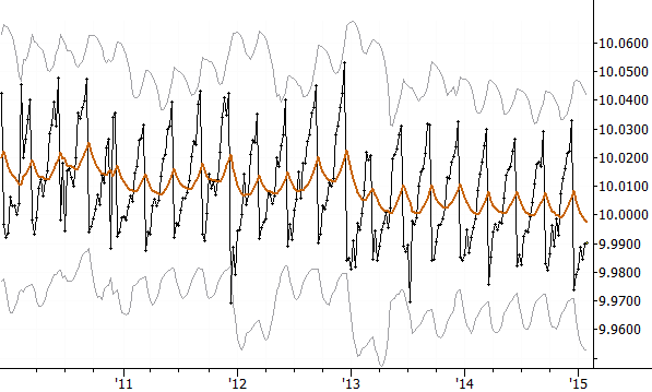
This chart also shows what appears to be an interesting distortion, but this is nothing more than the accumulation and regular payment of SPY dividends. If you aren’t aware of this issue, then you might think there’s a trading opportunity here, but this issue would also appear if you were comparing any stock price (that pays a dividend) to the S&P 500 cash index. So, for instance, rather than comparing PFE to SPX, we should compare PFE to SPY, etc.
Another issue to consider is exchange rates. Currency issues can also play a part if we are looking at assets denominated in other currencies, but consider how you would actually implement the trade. Will you hedge the currency exposure, or is that exposure part of the trade? Two different trades will require two different expressions, so, again, consider what you are trying to accomplish. If you were trying to trade US stocks against Europe, how will you implement that? Will you hold a basket of Euro stocks and a basket of US stocks? How will you finance it? Will you hold a Euro stock basket against SPY, or take a simpler route (from execution standpoint) of holding VGK against SPY? None of these options is “right” per se, but you have to look at the relationship in the way that matches your trade.
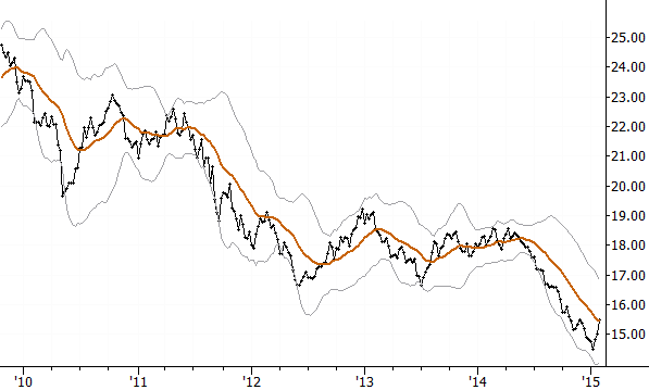
Speaking of Europe vs US, here is a chart of the spread relationship between Europe and US cash indexes (in USD):

Before continuing, let me point out a few features of this chart, which is how I find it useful to display a spread relationship. The spread itself (ratio, in this case) is the heavy black line. The orange line is a 20 period moving average and the bands are simply placed at multiples of 2.5 standard deviations around that average. Together, the average and bands give some indication of character of the spread (trending or mean-reverting) and whether it is extended or near its historical, average level. Looking at spread charts like this can avoid a lot of nonsense. One of the assumptions that people make is that a spread shows what ratio things “should be” trading at, but many spread relationships are trending relationships. We’ll dig into that idea, and how to actually trade these relationships, in the next and last installment in this series.
Hi Adam
Have you done much work with co integration and looking at mean reversion pairs trading? I’ve been doing some reading in this area and was wondering what your thoughts are on these types of strategies.
Also a post or two discussing how you structure and manage a pairs trade, perhaps with a few examples, would be very interesting and helpful.
Blogging a bit more about pairs or spread trading is on my to-do list, but it’s also a subject that gets people into trouble… the edges are thin and you generally have to trade larger… so mistakes can be costly. I also think it’s a much-watched area with all the quants so it’s gotten harder and harder to find trades. If I was starting out today, I don’t think I’d focus here, but it’s certainly a great topic for discussion//
Thanks. My initial thoughts impressions were similar to yours but I found the concept interesting.
When sizing positions in a spread trade do you take correlation into account? I’ve seen some people talk about sizing according to beta or ATR etc. Do you use any of these or just treat each position as a separate entry and risk the same dollar amount for each position?
Also, when analysing a ratio spread do look for pullbacks/overtensions like you would on a normal chart or are you focusing more on the slope of the line? Have you done any quantitative testing on spreads?
Sorry to bombard you with questions but this area is fascinating to me.
Good questions… basically I would take the volatility of the spread itself into account. There are other ways to do it, and all ways have some risks.
This isn’t something I have done enough quantitative work on, to be honest. I don’t want to just spew opinions and guesses–your opinions are as good as mine, at this point.
It’s an area in which I will do some more work in the future, but I’ve always traded either in trend or mean reversion mode and used volatility of the spread to set position sizes.
So do you mean use the annualised standard deviation of the returns of the spread to give you the spreads volatility?
How would I use this to help me figure out how many shares of stock A to buy and stock B to short?