Yesterday, I discussed some reasons why traders might want to consider looking at, or trading, the relative performance between markets. Today, let’s look at a simple way to display that relative performance, and consider some things that can go wrong.
Tracking relative performance simply means we want to know how one market has performed against another, or against a set of other markets. Right away, we see one potential issue: we have to standardize somehow. Consider a situation where you are comparing a $10 asset again a $500 asset, and they both increase $10 over the time period measured. (This is an important point, so bear with me for a few more sentences if the answer is immediately obvious to you.) On a per-unit basis, they both had the same performance (+$10), but this is largely irrelevant because what we care about is the impact they would have had on a portfolio if the portfolio held the same dollar amount of each asset. Since the $500 asset is 50 times more expensive than the $10 asset, we would need to hold 50 shares of the cheaper asset for each share of the $500 asset, so the $10 price increase would be multiplied 50 times.
This is convoluted thinking, and, of course, there’s a simpler way: we standardize everything to returns, which is simply another way to say that we look at percent changes. Speaking in terms of returns is second nature to most traders and analysts, but I have seen several places online where the term “returns” mystifies board participants and led to considerable discussion. (These were usually FX boards, by the way.) The math is:
return = ending price / starting price – 1
When we do that, we see that the first asset increased 100% (20 / 10 – 1), while the second only grew by 2% (510 / 500 – 1). Those percent returns are the numbers we care about, and, in most analytical work, the first task is to convert prices to returns, though there are some exceptions.

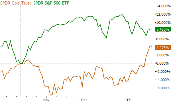
The chart above shows one way to display this relationship visually: GLD and SPY are converted to returns, using the October pivot in SPY as the “zero point”. From this chart we can easily see a period where GLD lagged SPY, and then what appears to be a period of outperformance. The choice of where to start the returns at zero is important, and there is no good answer. One possibility (and we publish a chart like this nearly every day in my research for Waverly Advisors) is to use previous structurally important pivots as anchors for these charts, but this introduces a subjective element into the analysis. (It also takes some skill and experience to choose the most relevant points.) If we chose a different date to anchor, we could have shown dramatically different relative performance patterns, so give this some thought.

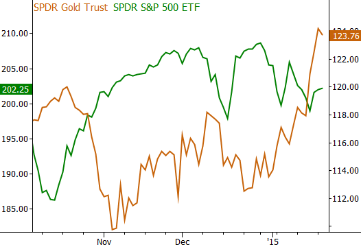
Take a look at the char above, which shows one common abuse of this idea. There is a critical difference here: the two markets are illustrated as prices not returns (remember, the first task is usually to convert to returns), and are put on the chart with two different price axes. Doing this, you can make a chart show whatever you want, as the scaling and placement on the chart is meaningless. In my opinion, you should completely disregard any chart you see like this as it is likely to be misleading at best. If it makes a valid point, it is only due to chance. At the very least, this error shows that the producer of the chart does not understand some fundamental issues with the visual display of price data. Never put two price series on the same chart, with two different price axes.
A few other things to consider today: remember that the choice of where to “start” the chart (i.e., index from zero) is very important. It’s not too difficult to pick starting points that will give diametrically opposed results. If you’re doing the work yourself, be aware of this problem, but if you’re looking at someone else’s analysis, remember that you have no way to know how much time they put into finding the points that make their case stronger. Indexing to a pivot is one solution, but it is still at least slightly subjective. Also think about what you are comparing; it is possible to put anything you want on the same chart, but does it have any actual meaning? If you are comparing the price of oil to toothpaste consumption in Argentina–yes, you can make a chart–but what does it mean?
We’ll revisit this question and more tomorrow, when I look at some other ways to consider relative performance between different asset classes.


Are percentages enough or do we need to normalize percentages against some volatility measure too? An asset with 1% volatility rising 5% is different than an asset with 5% volatility rising 5% .. isn’t it?
I’ve played with that concept… on some level what you end with is more or less comparing something like Sharpe ratios for different assets. It’s an intriguing idea, but I wasn’t able to find any real value in it… maybe there’s something to be done there, but I just didn’t find it and it’s not a part of my tool set at this point.
Good idea, though!
Great learning. Thanks a lot. What if you divide one assets price by another? That would eliminate the subjective use of a starting point. What do you think?
Thanks,
Yes that is another way.