[dc]C[/dc]harts can be a powerful tool for market analysis and trading. At a glance, they can provide a quick overview of important price movements, can highlight supply/demand imbalances, and can suggest where repeatable tendencies in the market might be. Furthermore, because they are a visual tool, they can speak directly to a trader’s “right brained” intuitive side, perhaps engaging deep levels of intuitive/inductive analysis that might otherwise lie unused. However, there are significant problems. Charts can also be misleading and can be easily manipulated to show anything you want them to see. Perhaps traders are not reminded of this often enough, and traditional technical analysis does not encourage an objective approach to data analysis. Abuses are all too common.
One of the worst abuses (and I don’t say that lightly) of technical analysis is to put two data series on a single chart, usually simply by putting them on two different axes. This is a technique that is almost guaranteed to be misleading because, on any chart, any data series will have 2-3 turning points. If you have more than one data set on a chart, chances are that at least one of those turning points will “look” significant, simply by random chance. The problem, and one that more technical analysts need to consider, in my opinion, is that looking at lines on a chart is not actual data analysis. There are well-established tools and techniques for analyzing the relationship between two data series, so why don’t we use them instead of making new ones up?
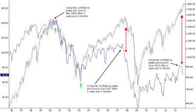
This was prompted by a particularly egregious example I stumbled across today, where someone had superimposed a Consumer Confidence index on a chart of the S&P 500, pointed out what I assume was supposed to be a divergence, and drew the conclusion that stocks are in trouble. (I have recreated the chart as faithfully as possible, rather than posting the originals because the point is not to call anyone out specifically—the point is to encourage us to think objectively about the tools and techniques we use to analyze the relationship between two data series.) I commented that the S&P and Consumer Confidence were coincident and that Consumer Confidence certainly didn’t lead the market. Someone replied that yes they usually thought so, but looking at this chart, they thought differently. And that is precisely the problem.
The chart above, showing the monthly S&P 500 (SP500) index in gray candlesticks on the log-scaled right axis and the Conference Board Consumer Confidence Index (CBCCI) as a blue line on the linearly-scaled left axis, is a recreation of the original, with one small addition. (Just to be clear: the text and markings are not mine; they are from the original.) The idea here is that CBCCI declines after 4 years and 4 months and leads the market to the downside, and this chart does appear to show that happening. However, the first thing you should notice is that these data series have been carefully aligned to make the chart tell that story. I added the bright green arrows to show that the CBCCI chart has been rescaled so that it fits nicely on top of the S&P 500 index between those arrows. From a data analysis standpoint, there is no validity to this technique—it simply makes a nice chart and makes the proposed relationship look stronger. (Click on any of the charts in this post to see them full sized.)
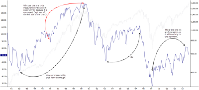
Let’s consider is the cycle argument. The chart shows three market examples of a 4 year and 4 month cycle, and at first glance, my first thought was, “hmmm… that actually does look interesting.” But, look a little deeper. The last example certainly doesn’t count. This is the one we are forecasting, saying that the June peak will turn out to be the peak in CBCCI, so it cannot be used to add weight to the argument. The second example is exactly 4 years and 4 months, but the cycle was derived from counting the length of time between this peak and the trough. This is the reference example, and it does not add weight to the argument, so we must look at the first one on the chart. Are you curious about what lies off of the left edge of the chart, where this cycle inflection is supposed to have come from? I was. Let’s look at another chart:
Looking at more data to get a better perspective, we find a serious problem. The argument hinges on the cyclicality of CBCCI, but the cycle highlighted in red cannot possibly be considered valid. A correct measurement is from the 1992 trough, not the convenient 1996 low, which is nothing more than a random jiggle on the chart. To my thinking, this completely invalidates the cyclical argument. Now all we can say is that the 2003-2007 swing in the CBCCI was 4 years and 4 months, so maybe June 2013 was also a peak. This is not a compelling argument at all. Speaking of a better perspective, what happens if we look at even more data?
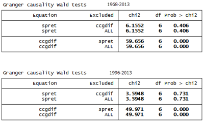
This chart shows the history of the CBCCI and the SP500 from 1968 to present, and it seems to tell a very different story. To my eye, I see a trending data series and one that appears to be mean-reverting. Is there a relationship between the two? It’s hard to tell, but it does look like CBCCI shows sharp declines when the SP500 has a setback, and this appears to be consistent. Is there any cyclical or leading relationship? Not that my eye can see, but, once again, looking at a chart is not actual analysis. We do have tools for understanding what the true relationship, if any exists, is between two data series. [Feel free to skip this part: I made sure the series were aligned correctly to the same dates, differenced the CBCCI, and took log returns of the SP500. I then did a VAR on 6, 12, and 24 lags and followed up with a Granger causality test.] There is a statistical test called a Granger causality test that looks for predictive (forecasting) value between time series. We all know that traditional correlation and regression only show relationships and do not imply causality (“correlation does not imply causation”), but a Granger test specifically tests for something called “predictive causality”: can we use one data series to predict changes in another? This is exactly the question we are asking. Here are the results of running that test, first on the whole data series from 1968 and then from only from 1996 (the date range of the original chart), just in case something has changed in time.

Without going into details of the test results, allow me to summarize: There is a causative connection here! One of these data series shows clear statistical power to predict the other one. The problem is, the chart had it “backwards”—the S&P 500 could be used to predict changes in the Consumer Confidence number, but not the other way around. The original analysis and conclusions on the chart were beyond misleading; they were flat-out wrong, based on the historical relationships in nearly 50 years of data. (And, it is not that surprising to find that consumers’ confidence changes in response to moves in the stock market, is it?)
My point here is not to call anyone out for any particular example. Every single day thousands of charts like this are generated and many of them are circulated—through emails, research reports, social media, and even major media outlets. The discipline of Technical Analysis has few standards for best practice. Much of what goes under the umbrella of technical analysis has not been tested and resists testing, and many of the techniques may not have any predictive power at all. Furthermore, the attitude that “you just have to find techniques that you like and that work for you” makes it too easy to defend any practice on the grounds that everything is relative and subjective anyway.
Everything is not relative and subjective. Why risk your own money on something imprecise? Why waste time and cloud your thinking with tools and techniques that are poorly understood? How can we carry out our fiduciary responsibility to clients and investors if we do not address abuses and errors in thinking? We must carefully think about every tool and every assumption we use, and we, all technical traders and analysts, must always hold ourselves to the highest standards.
(This is one of the ideas that we will address in my 100% free trading course. Please check it out if you haven’t done so already.)


Awesome analysis. Really enjoy reading your posts and learning from your thought process.
Thank you!
On a Lighter Note – Someone interesting said is; If you torcher data enough, It will confess to anything …
So true.
Pingback: Wednesday links: breakthrough creations | Abnormal Returns
Does this apply also to things like charts that have the s&p and below it a chart of the adv dec line or the stocks over the 50 or 200 day mov avg?
Actually, a very different set of problems apply. I’ve discussed MAs in some detail in the course and also on the tumblr. I think the Adv/Dec line doesn’t work like people would like you to believe either but I havent done the testing work on it to really say. I’ll look into that.
The MA question is a good one. Check out week 3 video 1 of the course for probably more info than you wanted on MAs. 🙂
This is so great – I get a ton of these charts emailed to me everyday and its painful. You could plot Blue Jay Migration Habits against the S&P and if you worked hard enough make it look like a correlation somewhere existed. Really nice work.
Yes. I thought about doing a post with ridiculous “correlations” like that. Sadly, this seems to be how so many “technical analysts” think about the market, probably because they just look at charts and begin with the assumption that any pattern they see is valid. I think a profound shift comes when you begin with the assumption that any pattern you see is probably not valid, but that’s much harder work.
“…(M)any “technical analysts” …just look at charts and begin with the assumption that any pattern they see is valid. I think a profound shift comes when you begin with the assumption that any pattern you see is probably not valid…”
Love it. That sounds a lot like Karl Popper’s thoughts on scientific theory. Popper wrote that a theory should be considered scientific if, and only if, it is falsifiable. You took that perspective into the area of technical analysis when you assume a pattern to be invalid until proved otherwise. If one started with the reverse, the assumption that all patterns were valid until proven otherwise, we’d be approaching our discipline from the perspective of religious faith rather than science.
I just read your post on biases. You seem to be employing that same reasoning in requiring any bias to be refutable. Would you agree, with so much baloney and mysticism surrounding markets, that you have to be equal parts philosopher, cynic, and scientist to survive?
Congratulations Adam, this is a splendid web site.
Thank you so much for your kind words on my blog. Yes, I think you’re right… a good deal of cynicism and doubt are very important, but it’s also important not to let it cloud your mind or ruin your attitude. If you’re so cynical you are always expecting the worst, it’s not hard to guess what will happen. There’s far too much “faith” in traditional TA (and many of the “educational” programs in existence) for my taste. I’m a nihilist. 😉
Awesome post – every time I hear a financial advisor saying something like, “well, the charting shows us,” I just want to run screaming from the room.
This is always infuriating. The latest culprit has been the ‘1929 vs. 2013’ analog chart that purports to show us on the verge of crashing….except the two scales on the axes are WILDLY different in magnitude, with the move in 1929 being almost 4x as strong on a percentage basis.
Here is just one example of where this idiocy has popped up.
http://blogs.barrons.com/stockstowatchtoday/2013/11/29/are-we-headed-for-a-1929-crash/
fantastic example. thank you. ironically, i was originally going to write a blog on this “analog chart” concept, but the CCI thing popped up the day I started writing. I took the opportunistic shot at this CCI/SP “relationship” but I’ll get to the analog concept very soon and you just provided a great example!
thank you
Pingback: Longs and shorts: evaluating financial advisors, bitcoins and ETFs | Market Intelligence Center