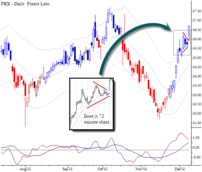
I have written before on the importance of being able to identify volatility compression. This chart of FRX shows an example where a chart pattern could have alerted you to volatility compression. Note the two inside bars on the daily chart, which “hides” a triangle on the intraday chart. When you see a pattern like this, it warns you that any breakout is likely to see continuation. How you use this information depends on the situation: it can be motivation for an outright trade, can affect risk management decisions (particularly on higher timeframe), can set the stage for options trades that are long a lot of volatility (though timing can be difficult). At the very least, do not be caught fading a move out of a pattern like this.
Note that this pattern is presented as an example of an historical pattern that may already have played out, not a pattern or setup that is “live” in the market today.

I had a question about selecting lower time frame to effect multiple time-frame trades just like the one you showed above.
If the daily chart is my primary TF, what should be the ideal lower time frame to identify entries? i mean, a 5-15 min chart contains just too much noise, while a 4 hour one contains too little. An hourly chart looks about ok, but i see that you are showing a 72Min chart above. Any particular reasons for the same?