Welcome to Markets Unlocked 9/24/22: A look at our MSI, a fear gauge that works
As we cross the line into fall, we are going to start publishing a short end-of-week update. We'll share some of our thoughts on the current market environment--what you need to watch out for, where opportunity might lie, and how to trade it. You'll see some of our key analytics, many of which, until now, have been reserved for our institutional advisory clients; each week we'll choose a few relevant graphics or datapoints to share in these posts.
I'll probably also share some personal thoughts and insights--things I'm reading or looking at--and maybe some recent trades we are either currently managing or have recently completed. Over time, this set of posts should grow to be another valuable educational resource. Let's get started.
Current Market Conditions
Markets are under stress, and we continue to think the intermediate term direction for stocks favors the downside. This is important and remarkable, because the "baseline drift" of stocks is clearly to the upside over multiple years. If you're going to focus on the downside, you must do so at the correct spots.
We are suggesting a number of strategies--from outright index shorts, to shorts in individual names, to appropriate options strategies--for our MarketLife members. If you want to see what we're doing, we invite you to check us out with a $7 trial for the first month. Sign up here.
Tom and I have been focusing more heavily on futures after the end of the summer. We've executed trades in the Nasdaq, Gold, Euro, Natural Gas, and a handful of other markets. This is a market rich with opportunity for the active trader. Yes, there's risk, but risk and reward are ever-present companions.
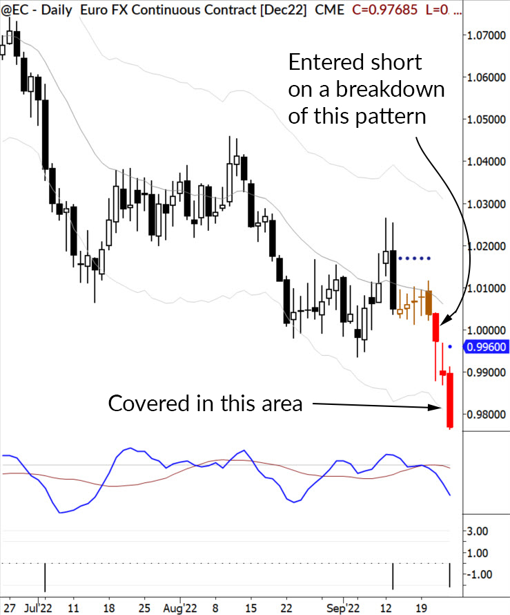
Targeted patterns let us move in and out of markets at the right time, minimizing time in the market (exposure), with the idea of only being in the market for clean moves. Here's a look at one of our recent trades, based on a breakdown of a simple flag.
The MSI
Several years ago, I took a good hard look at all the "fear gauge" indicators out there, and came to the conclusion that they were all garbage. They are improperly constructed and based on factors that don't work in the first place. These tools are designed to generate clicks and to give commentators something to talk about, so they usually include a laundry list of inputs, many of which conflict with each other or overlap in ways that confound the output.
I knew we could do better, and we did. We created our Market Stress Index in 2018, and have been using it ever since. The MSI is a sentiment gauge designed to pick off overextended spots. The "in between" areas are not that important; in other words, there's little meaning in the middle of the range, but we do pay attention at both extremes.
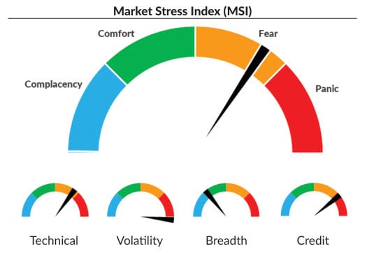
We present it in a simple "speedometer" format, and also show the subcomponents.

While the calculations are proprietary, we can tell you this, and share a few guidelines to use the tool. It is composed of only four components, but some of these have a but of nuance to them. Here are the components, the intuition behind them, and a few insights into how we calculate the measure
- Technical: Technical factors matter, but you have to look at the right technicals! This measure considers trend of major indexes, where we are in the recent price history range, and looks at measures of stability, comparing recent data with longer history.
- Volatility: Stocks move through different volatility regimes. "Bad things" are usually set up by tremors before the earthquake, and this tool excels at finding them.
- Breadth: We look at a measure of advancing declining stocks and underlying volume, and then apply a calculation to put this raw (and noisy) measure in correct historical perspective.
- Credit: There is great intelligence and even prescience in credit spreads. We monitor a few key datapoints here, and echo the stress these markets forecast into this measure.
All of these combined give us the MSI-Composite, which is the measure we look at weekly. Like all sentiment gauges, this tool is most powerful at extremes. And the real power comes from picking off overextended ("oversold") points to the downside. While we don't trade based exclusively on this tool, we could! How would it have done historically?
Here's a look at some history, going back to 2015. The blue arrows marked points where our "fear gauge" slipped into Panic territory--these are always good points to lighten up on shorts and to watch for (at least) short-term long entries.
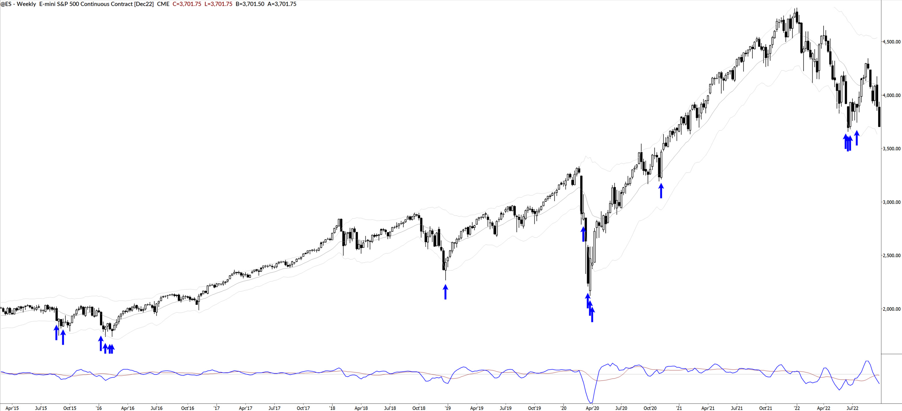
You might be asking, "does the world need another fear gauge? What's the biggest difference between yours and the one Jim Cramer talks about?" The biggest difference is simple: ours works. We have a tool that is backed by solid quant work, has a demonstrated edge, and that we expect to continue working into the future.
We will share our MSI with you ever week in these ongoing Markets Unlocked posts, and you'll see how we use it to make decisions at key turning points in major indexes.
