For anyone actively trading, looking at the markets you follow is a critical part of the investment process. Whether you do this once a week, once a day, or many times a day depends on how you trade and who you are, but it is essential that you are somehow involved observing the flow of market data. There are obvious reasons: knowing what is happening with your positions, when you might have new entries, or when you might need to get out of existing positions, but, even more than that, the more we look at the market from different perspectives, the more of our cognitive abilities can be brought to bear on the problem. This is one reason why I also engage in ongoing research.
Research often means looking at the same things from slightly different perspectives. If we are simply looking at price data, there are only so many things that make sense because markets do the same simple things over and over: they make sharp moves from one level to another, sometimes provide entries after those sharp moves, and sometimes reach exhaustion points and reverse. Oh, and they also do this in a wrapper than is nearly entirely noise most of the time; separating the gold from the dross is not easy to do! If we add relationships between markets and non-price data (e.g., fundamentals or economic releases), then the analytical problem becomes more interesting, but there’s much to be learned from simple price data.
Personally, I review a lot of charts every day. Depending on market activity, more or less, but currently around 900, on at least two timeframes, and I do this review 4-5 times every day. I also look at writing “scans” or short technical filters that highlight some of the important things I’m looking for. Most of these ideas don’t pan out, but some turn out to be very effective, (and I publish the best of them in my daily research reports I write for Waverly Advisors.)
For me, the value comes in thinking about what should go into these scans, creating precise criteria, and then seeing what happens when they hit the market data. Sometimes, there are happy surprises, and I want to share a list from a new scan I’ve been playing with. This is a scan designed to find pullback trading candidates on daily charts in US-listed stocks. (List below, and you can download the spreadsheet as well.)
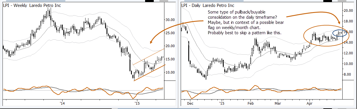
How to use this? Well, think of it as a first step. Not every name on those lists will actually have a tradable pattern, but some will. The core idea is that these are names that have made sharp moves up, and then have pulled back, with a few other criteria based on extension/overextension on two timeframes. I would go through that list, looking at daily and weekly charts, and find patterns that catch my eye. One of the things I would “filter” for manually is that I do not want to be buying pullbacks that sit near the top of weekly structures that could be pullbacks in an established weekly downtrend. (See LPI, PTEN, MBI, etc.) These are trades that are likely to, at least, suffer from some multiple timeframe confusion and crosscurrents, so they are easy to avoid.
Anyway, I wanted to share these lists of buy and sell pullback candidates with you here. There are some good setups and patterns here, but I would use these lists as a highly targeted, pre-selected list of names for your own further work.
[gview file=”https://adamhgrimes.com/wp-content/uploads/2015/05/PullbackSetups.xlsx”]
Pingback: Filter out the noise and find your focus: pullback trading candidatesWidows and Orphans Portfolio | Widows and Orphans Portfolio
(re-posting, I mistakenly pressed Ctrl+Enter in my previous comment)
Thanks Adam, interesting new ideas for me to digest.
I’d have a few questions about the spreadsheet (I posted something similar in the past, at https://adamhgrimes.com/quantitative-screens-relative-strength-scans/):
– KPos means the overall measure of the RS Strength?
– RS(SP500) – what would be the meaning of this (not the exact formula behind this)?
– OB/OS flags – there is a formula behind of this? or is that element of art/discretion? (e.g. you fill in this column manually after a visual analysis of the chart, or the column is automatically calculated based on some math)