The power of the channel
Trendlines are useful. For the uninitiated, it may seem odd to draw lines on charts and to expect them to work, but what we are actually doing here is to create a shortcut (a heuristic, if you prefer.) A properly drawn trendline will reflect both the trend and the volatility of the market, and can give an early warning of when these elements may be changing.
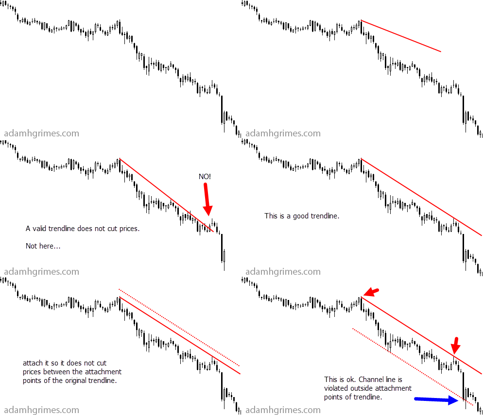
We'll dig into trendlines in a bit more depth later (and I have covered their use in my book, too), but let's consider the trendline's friend and companion, the trend channel today. Creating a trend channel is easy:
- Draw a correct trendline.
- Create a parallel version of that trendline.
- Drag the new line (the channel line) to the where it does not cut prices between the attachment points of the original trendline.
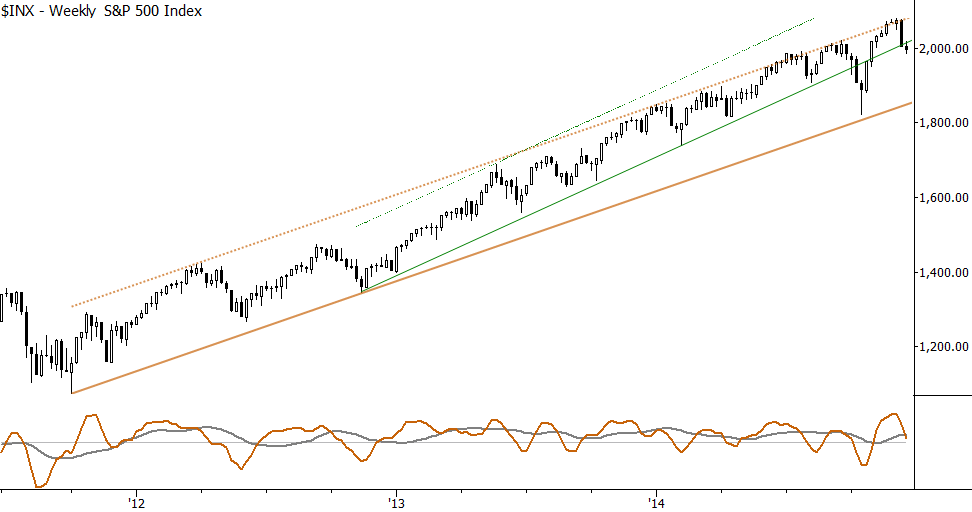
It may cut prices before or after, but you just want to make sure that it's "clean" in between those attachment points (as the original trendline itself should also be clean--this is one of the most common trendline mistakes.) In the chart below, the dotted lines are the trend channel lines for the S&P 500. Notice what happens when price touches them:

These lines have been remarkably powerful in predicting points where the trend might be exhausted to the upside. I think of this as another type of "overbought" indicator, and one that works very well. You should be suspicious of any lines drawn on charts after the fact; it's always easy to make them look great. In this case, these lines were drawn in late 2012 (the green set in 2013), and I have been using and writing about them in my Waverly Advisors research since then--there's a few years of real-time history with our clients seeing these lines and their implications nearly every week. Though this is an isolated example, it's a good example of how these lines can give some good insight into where the turning points might be in a longer term trend.
Here's a small animation that walks you through the process of creating these channel lines. Try these on your chosen markets and timeframes--this is one tool that is as useful to the daytrading as it is to the long-term investor.


