Here's a kind of chart you should be using more
As I mentioned in my social media posts, I’m travelling this week and next so I will be a bit slower to get posts out. (I think an interesting topic is “vacation” for a trader. I’m writing this from my private terrace in Rome, but I’ve also done many hours of market work each day this week… and am very in touch with trends and changes in many asset classes. (Also a bit interesting to be in Italy as trouble here takes a bit of the front stage in the economic narrative.) This is as close to “on vacation” as I’ve gotten in a couple decades—if you’re a trader, you’re never really far away from the market. But, as I said, a topic for another day…)
Today, I want to share a data visualization that I think should be used more often in technical analysis. A scatterplot is a standard statistical graph that can show relationships between different variables. In the case of finance and market data, scatterplots can show us how two things move together, and we can start to think about the ways in which they might influence each other.
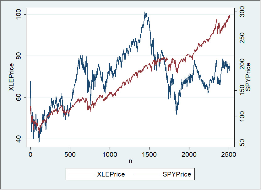
Surprisingly, this tool is little-used in technical analysis. (If you come from a math background, you’ll probably be very familiar with what I’m writing here.) Let’s consider the XLE and SPY together—what we want to know is how much the XLE is “moved by” SPY (and we can also ask how much of XLE’s movement might be due to oil.) Typically, if a technical analyst wants to know how two markets move together, he might put them on the same chart, like this:

To be perfectly honest, I’m a bit suspicious of this technique. First of all, there’s a good chance that any price series will show a few inflections (bends or swings) on a chart. If we have more than one market on a chart, there’s a very good chance that at least one of the inflections lines up pretty closely with an inflection on the other series. If so, it will appear to be very significant.
Why highlight “appear to be”? Because we also need a healthy respect for the power of cognitive bias. We’re really good at finding patterns, and our brains will happily create patterns if none exist.
Victor Niederhoffer flatly recommends never doing this—never graphing two things on the same chart to see how they move together. Still, many traders do this because it’s an easy (or is it facile?) way to look at data. Most people posting charts like this have no idea of the issues with what they are doing, but even those who do often wave it away, saying they “just want to get an idea”. But what if we get the wrong idea?
[box type="info"] Most traders are familiar with the “random chart” exercise in which we create a chart with random data and then analyze it as if it were real market data. There are several things we can get from such an exercise, but perhaps the most important are seeing the ways in which real data might be different than random data… and ways in which they might be similar! An interesting extension to this experiment is to create charts with two random data series (perhaps plotted on different axes). Look at them and see how sure you are one “influences” the other. If you spend some time doing this, you’ll probably take a very dim view of charts like this anyone publishes.
We need better tools.[/box]
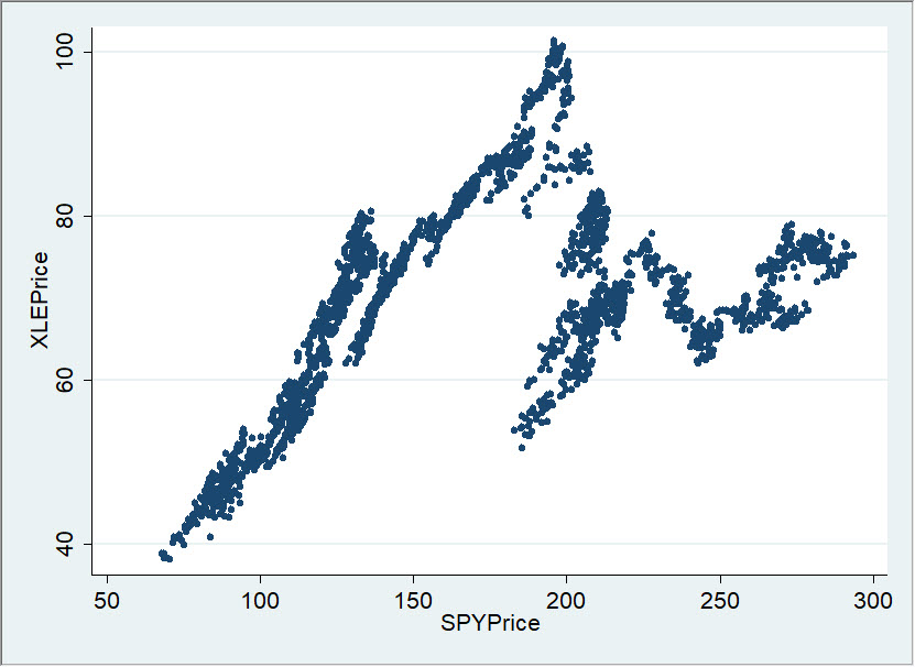
So how else could we look at the relationship between SPY and XLE? If we have daily data, each day we have a price for XLE and SPY. What if we plotted those prices together on a graph? In other words, we could make the vertical axis the XLE price, the horizontal SPY price, and plot a single point for each day. This graph would look like this:

Think about what this graph shows us: it shows us the relationship between the price (level) of the S&P 500 and the XLE on each trading day. Is there a clear relationship? It kind of seems like maybe higher prices in S&P 500 were associated with higher prices in the XLE up to about $175 on the S&P 500, and then the relationship breaks down.
Not incredibly compelling, but we’ve made a fairly serious error here. (Incidentally, it’s the error most technicians make when they look at correlation on charts, and most charting software actually builds this error in as a function!)
To find the error, ask yourself if we care more about price levels or about changes in prices. For different applications we might have different answers, but most often what we want to know is “what happens to market Y when market X goes up/down?” In other words, how to markets move together, or how do price changes in one market maybe influence another?
That’s the question we need to ask, and this chart does not answer it. I will, very soon, in a future blog post, and I’ll show you how to use this tool to understand relationships between all markets on all timeframes.


