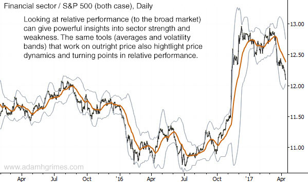
Chart of the day: Financial sector
- Post author:AdamHGrimes
- Post published:04/17/2017
- Post category:Chart of the Day
AdamHGrimes
Adam Grimes has over two decades of experience in the industry as a trader, analyst and system developer. The author of a best-selling trading book, he has traded for his own account, for a top prop firm, and spent several years at the New York Mercantile Exchange. He focuses on the intersection of quantitative analysis and discretionary trading, and has a talent for teaching and helping traders find their own way in the market.
You Might Also Like
This Post Has 3 Comments
Comments are closed.
I am slightly confused on this post. You are comparing the XLF to the S&P correct? If that is true then where is the price of the S&P? The orange ma is not the S&P price correct? So how are you comparing?? Or maybe I am missing something here 🙁
It is a chart of the financial sector divided by the S&P 500. When the chart is going up, the financial sector is outperforming the S&P 500 on a percentage basis, and when the chart is going down, the financial sector is underperforming on a percentage basis.
Oh I see, OK how do you divide the two assets? Does anyone know if that is easy to do in Tradestation?