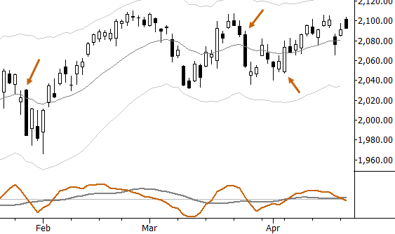
For intraday traders, trend days can offer outsized rewards. For some styles of traders, much of the work of trading is focused on capturing trend days, and most of the profits for the month may come from one or two trend days, with most of the other days showing small gains and losses that more or less net out. (This is not true for all intraday traders.) Many traders find the best results when they reduce trading activity on non-trend days (and might see even bigger improvements if they did not trade on non-trend days altogether), but it is vitally important to identify trend days when the do occur.
What do trend days look like?
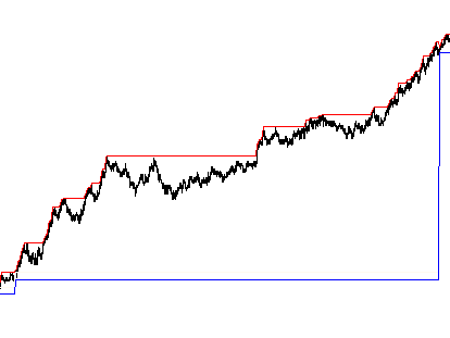
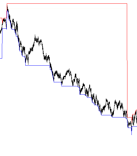
Over the years, I’ve worked on various ways to identify trend days and to predict when conditions are ripe for a trend day. This is not as easy as it sounds. Subjectively, it is easy. Here are a few trend days in the S&P futures. Trend days generally:
- Open and close at opposite ends of the day.
- See few major intraday reversals. Most trend days are clean trends.
- Have a larger range than other days.
- Occur about once a month.

Here are a few examples of trend days on 1 minute bars. Note minimal retracements against the trend:


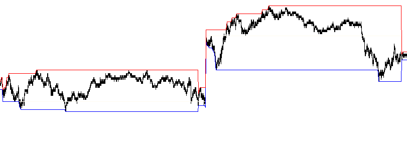
You’re probably getting the point, but contrast those last two charts with these. These are “not trend” days in the S&P:

Subjectively, it’s pretty easy to label trend or not trend days. As far as predicting trend days, there are a number of things that can be useful. (That’s a future blog post.) The focus today is on identifying and labeling trend days objectively. I’ve worked on this off and on for many years with varying degrees of success. Ideas like taking largest range of past 10 days and saying the body of the candle has to >85% of the day’s range–ideas like that work, but I recently stumbled across a simpler way that might be better.
On my trading platform I have a chart that runs 1 minute ES bars with an audio alert every time the market makes a new high or low of the day. You’d be surprised how much information you can get from this simple idea. Without looking at the screen, I know if “she” says “S&P High” a lot, we’re having a strong market day. Also, if she is quiet and then starts saying “S&P Low” a lot, something happened. This is a great way to build some market intuition, and a really useful tool for reading the market when you can’t stare at the screen every day.
A new (?) way to measure intraday trend strength
The breakthrough came when I thought “let’s just count how many times one minute ES bars make new highs or low on the day during the regular session. What would that look like?” You can find what that looks like in the spreadsheet at the end of this post, and it looks pretty interesting. The columns are:
- Date
- NH: The number of 1 minute ES bars that make “new highs” on the day. Note that this has nothing to do with A/D style new highs.
- NL: Number of 1 minute ES bars that make new lows on the day.
- SignedTrend: NH – NL. This will be large and positive if there were more highs than lows, large and negative if many new lows, and smaller if the day made both highs and lows frequently.
- Trend: The absolute value of SignedTrend, and maybe a measure of trend day. This number ranges from 0-64 in this sample (5 years of 1 minute data).
- Label: I made breaks at 99th, 95th, 90th, and 75th percentiles, and labeled “strongest trend”, “strong trend”, “trend”, and “possible trend”, respectively.
I’m not sure these labels are exactly right, and there could be more work to do here. For instance, only looking at the net number might miss some detail–there could be a better way to look at this, but I do like the simplicity of this approach. Any complication will have to add a lot of value, in my opinion, to be worth moving away from the simplicity of the data. Maybe the break points aren’t in the right place for my labels? There are other ideas like that to consider, but I offer this here for you to look at and think about. It’s also likely that someone has done something like this before, but I don’t remember seeing this. There are only so many ways to slice the data, but sometimes simplest is best. Sometimes simplicity can be very elusive. At the very least, it’s an interesting perspective on measuring intraday trend strength. I’ll follow up with another post on this in the future, and look forward to some of your thoughts and perspectives in the comments.
[gview file=”https://adamhgrimes.com/wp-content/uploads/2015/04/ES-Trend-Days.xls”]
I like the idea that any measure should be relatively simple, and this one fits that criteria. Of course, part 2 will be more interesting. Is there any way to predict from an intra-day reading of this measure that a trend day is in the works? Personally, starting around 11:30 am I look at the ratio of gainers to losers. If it is greater than 3-to-1 or less than 1-to-3, there is a good chance that a trend day is in progress. I wait until then to try to eliminate morning reversals. Unfortunately, my approach misses some trend days because the ratio never catches a trend day until too late in the day. Other times it issues a “false positive” in that the advancers/decliners ratio is pretty skewed but price doesn’t trend and there is an afternoon reversal. So I have stops in place for those situations.
The net of all that is a system that makes me some money on average but is almost more trouble than it is worth.
What you say here makes good sense. I find this interesting, though: “The net of all that is a system that makes me some money on average but is almost more trouble than it is worth.”
So you have a system that works for you? I would calculate better stats on it, and see if I could trade it with discipline and correct position size. A system that appears to be “almost more trouble that it’s worth” can suddenly look very good if combined with proper position sizing.
If you have something that works, you’ve done a lot of the hard work. See what happens if you apply it with discipline and correct position sizing. I think you might be pleasantly surprised…
Hi Adam, Thanks a lot for the spreadsheet!
I found it very interesting that Nh and Nl follow almost identical distributions with Nl being a little more fat tailed (expected). The 99% threshold is v close to 45-50 in both cases, and the difference is very close to Normal. This suggests that there is limited “skew” on a realised basis on trend days , the market trends equally violently in both directions (can we take advantage of option skew as a result?)
What happens if the trend day consists of two big spikes within one minute candles and the market chops around the rest of the time? So you would have Nh = 2 , Nl = 0 and you would identify this as a trend day. With one minute candles this is not so likely today, but that might change as markets evolve (or even in other asset classes) .
I don’t think we can ignore the range of the day when we characterize a trend day. e.g. an inside day would very rarely qualify as a trend day (even if NH-NL is very high or low) . It would be nice to see the correlation between the “Trend” variable and the “Range” variable – might eliminate false positives.
PS : a suggestion , maybe you’ve already done this. To standardize maybe it makes sense to divide the numbers by the number of bars in the day? Different markets may have different time horizons.
Thank you for your work on this. I had done some of this work, but you also pointed out a few new things to think about. Let me do that for a few days, and I’ll post a follow up.
I think this tool could be used, for instance, to track trend strength in different sessions (Asia, Europe, US) for currencies and some active commodities. I wonder if we might find some interesting connections and trends there, but I’d worry about sample size.
Good stuff. Thank you!
I generally agree with the concepts you have shared. Intraday traders should be using the Daily/Hourly vs their trigger entry Hourly/minute charts to trade. Trend days occur when the higher time frame is bound to have a reaction at the price level, hence you have the strength of the higher timeframe to trade the trend trade on the smaller timeframe.
Many times I ask other traders, where is price within the higher timeframe trends? Congestion is a killer, unless the price levels of S/R are clear enough to take inbetween trades.
Traders should be sitting on their hands 80% of the time, to put that into perspective, you should only be trading 20% of the time in your entire trading career life versus price action.
yes yes… very good points. Thank you!
Hm, I find it difficult to add insight w/o having access to 1min data, so apologies for generic statements…
Although I also agree on the beauty of the simplicity in the definition, I wonder whether to add some measure of the size of the shadows would add a valuable filter. Your very first point was “open and close at opposite ends”, so something like open below 10% and close above 90% of range seems not too much complication imho and would potentially remove a few not so nice daily candles.
Furthermore, I’d like to see a trend over the full range of the day, so something like separating the day into 5 quintiles and check whether it makes Nh or Nl in each quintile could be helpful – I guess that the “strong” and “strongest” take care of that themselves b/c it is hard to believe that on many days 35+ highs/lows occur in only 1.5h.
While writing this, I wonder what a trend day really is… I think my thoughts are around “clean directional daily moves”, which by definition would exclude intraday reversals, while you do not exclude them explicitly by your definition.
Finally a short question: what indicator do you use in the charts above?
Good ideas and I like the idea of looking over the range of the full day. Many trend days do have significant periods of consolidation… one of the standard patterns is strong trend in the morning, flat in the afternoon, and another strong trend into close… I’m not sure what we’d see from looking at different slices of the day but it is interesting. (I tried something like this initially, looking at 1 hour slices. It didnt look, at first glance, as interesting as the daily measure, but there definitely could have been something I missed.)
Thank you for sharing your thoughts on this!
The “indicator” is simply the high and low the day. 🙂 I find that a pretty useful tool to plot when I’m daytrading–keep it simple!