One of the recurring themes in my work is that most of the technical tools most people use do not show an actual edge in the market–in other words, as hard is it may be to say, most things most people do simply do not work. In particular, there are a few technical conditions we hear discussed in the media frequently; I can think of four offhand: any market is “finding support” at its X-day moving average, the ominous-sounding “Hindenburg Omen”, and the “Death Cross” and “Golden Cross”. What all of these have in common is that they are easy to explain, easy to show visually, and most of them have catchy names. Unfortunately, they are all meaningless–they have, at best, questionable statistical significance.
The Russell 2000 is nearing a potential “Death Cross”, as reported yesterday:
The Russell 2000, which consists of small-cap stocks, is approaching a key technical level, dubbed the “death cross,” that has market-watchers wary. Its 200-day moving average is close to breaking through its 50-day moving average on the upside, which signals a bear market may be on the horizon.
Laying aside concerns about anticipating technical events (personally, I’ve lost some money that way–we’re usually better off waiting for the signal), or that it is much more accurate to think of the 50-day breaking through the 200 to the downside, we should ask the key question: is the Death Cross really a “key technical level”? Let’s ask the market itself and see what the data has to say.
Using the Russell 2000 cash index (6613 trading days, going back to 6/24/1988), we find 19 cases of the Death Cross. A reasonable way to test the Death Cross is to take all of the events that have happened, and to see what the market has done following those events. We need to ask some questions and make some decisions like: how far after the event should we look? Should we look at every day or just hit a few spots? What is the correct measure of performance? For this quick test, let’s look at what happens to the market at a few spots following the Death Cross, up to one year out. I will use 5, 20, 60, 90, and 252 trading day windows, which correspond roughly to one week, one month, one quarter, one half year, and a full calendar year. This is not an exhaustive test ((for instance, we could have a distortion due to a weird event 20 days following one of the events, while 19 and 21 days would have shown a very different picture)), but it’s good enough for a first look. At least, by looking at a range like this we avoid the error of simplistic analysis that is so common: people will say things like “following the Death Cross, the Russell 2000 was up, on average, x% a month later” but we are left to ask what happens over other time windows and why a month was the only period examined.
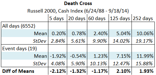
There is another important mistake to dodge here. For instance, this is a completely faulty analysis of a technical event: “Market XYZ was up/down x%, on average, following the event.” Something important is missing from that thought process–we have to compare the event to the baseline of the market, so we have to say “Market XYZ was up/down x% over/under its baseline return following the event.” In other words, we have to look at what the market normally does, and compare post-event action (condition) to that normal (unconditional) market movement. Only if the market was absolutely flat (i.e., had an average daily return ((return, in this case, simply means percent change)) of zero) would it be valid to compare the event to zero. The Russell does not have a zero baseline, as the following table shows:

If we look at returns following every trading day in the history of the Russell 2000, we find it is up, on average, 10.06% a year later. You can see the table above for statistics for other periods, which are not zero. Now, let’s compare this with returns following the Death Crosses:

When you look at that chart, focus your attention on the bottom line, which shows what the Russell 2000 did, relative to its unconditional (baseline) return. For instance, looking at the entire history of the Russell, we find it is up, on average. 0.2% one week later. Following the Death Cross, it is down, on average, -1.92%, meaning that it underperformed its baseline return by 2.12%. This is a statistically significant effect. So, here is the first interesting point: the Death Cross actually does show a statistically significant sell signal in the Russell 2000 one week later. However, this effect decays; the key question here is how large is the effect, relative to the variation for the period? A year out, we are seeing standard deviations greater than 15.0%, against a very small positive effect of 1.93%. So, what we can say from this test is that we do find a statistically significant, very short-term sell signal in the Russell 2000 in the data examined. This sell signal appears to be strong for a week, and then decays and we see no longer term significance. Interesting.
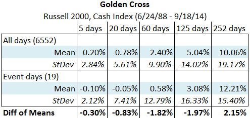
Where do we go from here? Well, first, I’d flip the test and look at the Golden Cross:

Here, we do not have any statistically significant effects at all; this is not necessarily a condemnation of the test (perhaps there is a reason the effect would not by symmetrical), but it certainly calls for further study. What other questions should we ask? It is entirely possible to find a valid signal just due to chance, so we’d be wise to repeat this test with other assets and other timeframes. We also might dig a bit deeper and look at each of the events, though we should be careful of doing too much work like that because it is easy to “curve fit” and select what we want to see. Still, actually looking into the data can help to build a deeper understanding of how the market looks. A summary test is only that: a very broad, rough, and blunt summary that may miss much significant detail.
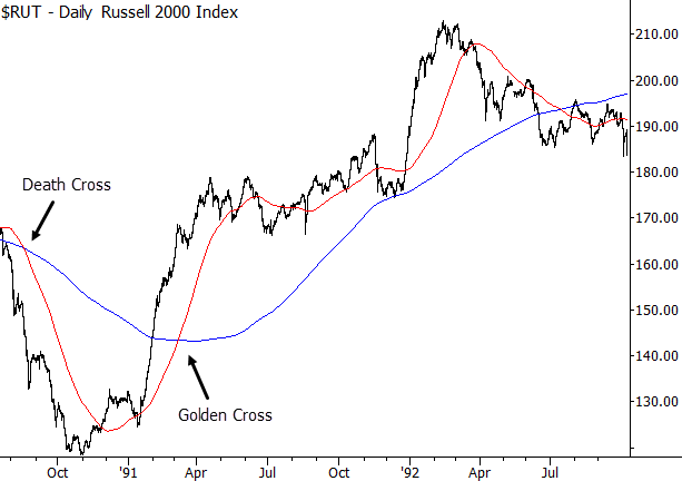
Another question that I find very interesting is “why do people focus so much attention on mediocre or, in some cases, absolutely meaningless technical tools?” One reason is probably due to cognitive bias. For instance, one of the largest one week selloffs following a Death Cross in the Russell was in 2008; anyone who identified it then and remembers the strong selloff is likely to have some emotions associated with that event. Furthermore, the signals certainly can look convincing on a chart:

It would be easy to find a few charts like that, and “show” that these crosses work very well, but this is simply a case of choosing good examples. As I’ve written before, much of the discipline of traditional technical analysis is visual, not quantitative, so technical analysts are prone to these types of errors, even with the best of intentions. The only defense against these errors is using the tools of statistics to take a proper look at the data and to consider the effects in the cold, hard light of quantitative analysis. In the case of the Death Cross, there does not appear to be any reason to focus on this event, and it appears to have no long-term significance for the market.
Pingback: Friday links: flexible asset allocations | Abnormal Returns
Pingback: A Dash of InsightWeighing the Week Ahead: Do Market Divergences Signal a Warning for Stock Investors? -