[dc]L[/dc]ast week I shared a new data visualization that looked at short and long term performance of sectors in context of volatility. This week, I’d like to share another tool that we use in our analysis for my Waverly Advisors weekly research reports. For many years, I have always reviewed the performance of many different markets after each trading day. This builds a sense of relative performance (and, by the way, some useful intuition about short-term relationships and shifting correlations), and I have found a way to present weekly performance that makes it easy to compare relationships across various markets.
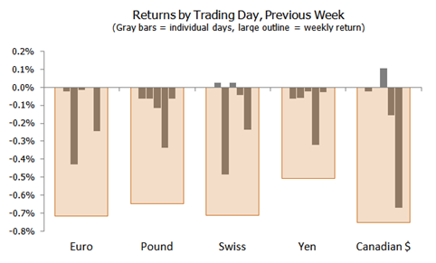
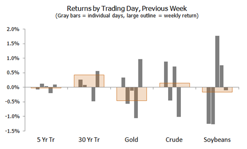
The charts below show small gray bars, each of which represents one day, Monday through Friday. These bars are overlaid on a large orange bar that shows the overall weekly performance for this market. (This analysis is also interesting when repeated on a volatility-adjusted basis.) Certain themes become readily apparent: strength in Asian stocks; correlation between stocks in Europe and the Americas, and far looser correlations with Asia; outperformance of EM stocks; US Dollar strength last week; volatility in Soybeans; etc.
These are tools, and they are powerful tools for understanding relationships and tendencies between markets. In these quiet summer months, when markets are largely quiescent and trading opportunities might be few and far between, consider spending some time exploring new ways to visualize and present market data. This can be time well spent, especially if it deepens your understanding of how markets move and work together, and can point toward hidden risks and opportunities in markets.


