This is what "risk off" looks like in stocks

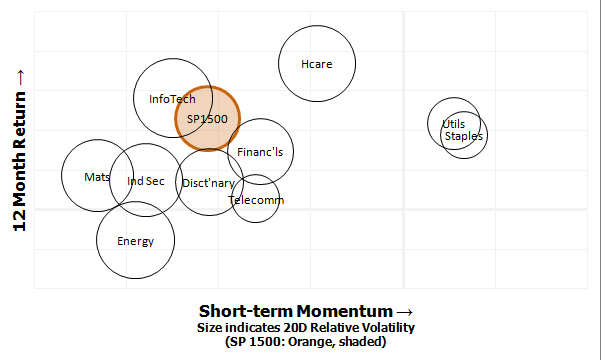
The chart above shows the 12 month return (vertical axis) against the shorter-term momentum (horizontal), for the major sectors of the S&P 1500. We can clearly see that the only two sectors showing any remaining positive momentum are the defensive Utilities and Staples, as investors have retreated from risk ("risk off") and moved toward the perceived safety of these defensive names. It's almost funny to see how far Energy and Materials (obvious connections to crude and gold) have retreated to the left edge of the chart. Just an interesting visualization that gives another perspective on last week's market psychology, but it's also a reminder that watching sector strength and flows can give a better read on sentiment than most sentiment indicators and surveys. The week ahead should also be interesting.


