In my last post, I showed a quick test of a simple system applied to the futures markets. The point of that post was to show how a simple quantitative methodology can show us something about the market, and to apply the quantitative methodology to a trading idea which we know has an edge. This is a useful illustration of the quantitative technique and also a good lesson how we might think about the market’s movements. In this post, we’ll learn something perhaps even more important, about a number of other markets. Those of you with “chart reading expert” letters behind your names better hold on to your hats… I’m going to challenge one of the core assumptions of traditional technical analysis by the time we’re done with this post!
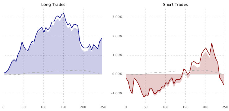
First, let’s take a quick look at the test applied to futures markets again:

Just as a refresher: The system test is a test of a breakout (going with) of the 50 day highs and lows, with a 20 day “dead period” between entries. The dotted line is the “baseline” return for this set of futures markets over this timeframe–essentially the “buy and hold” return. The solid colored line is the “signal return”, which shows what happens for each of 252 trading days (roughly a year) after the signal event, and the shaded area is the difference between the baseline and signal returns. We call this the “excess” return and it is one measure of the strength of the signal. We do see some asymmetry here, but both buys and sells appear to have a pretty good edge out to 50 trading days. (Of course, we can slice this data set in many more ways to really understand what’s going on here, but let’s keep it high-level for now.) Now, let’s apply the same system to a set of individual stocks:

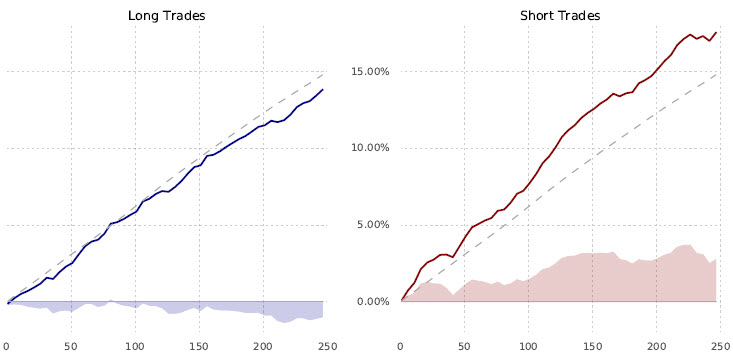
This chart looks very different. For one reason, the baseline return for this set of stocks over this time period was about 15% per year. Take a minute to look at the chart, maybe focusing on the shaded area, and we see something very interesting: there is still an edge to this system. This table does not show significance tests, but there is a statistically significant edge to both the buys and the sells in stocks. However… and this is a huge however… the edge goes the wrong way. Buying stocks that make 50 day highs leads to significant underperformance; shorting stocks that make 50 day lows is also a great way to lose money. Hold this idea in mind, and let’s look at the same idea applied to the currency markets:

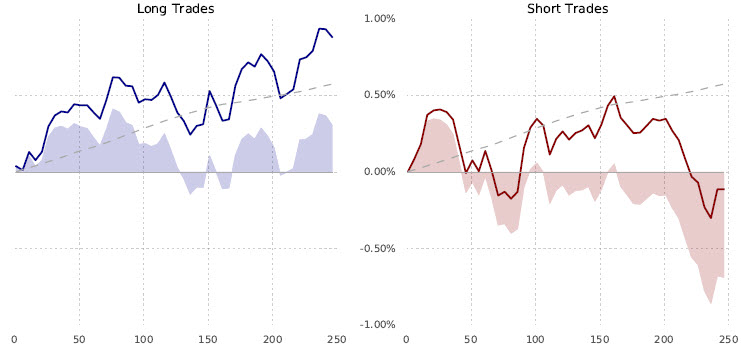
First of all, adjust for the scale of the y-axis. Notice that the futures chart is +/- 1%, while the stock chart was +15%! This is a tremendous difference, so you can’t just compare the charts without making that adjustment. We can see the signal chops on both sides of the baseline return in currencies, perhaps suggesting that this is a signal that does not have any real edge in the currency market. In fact, this is a pretty good example of what “no edge” looks like from this methodology in this sample. Trading channel breakouts in currencies seems to be just as good as flipping that proverbial coin–no edge.
What can we learn from this?
One of the core assumptions of traditional technical analysis is that you can apply any technical tool to any market, any timeframe, and get the same results. In other words, apply, say a 14 period RSI to monthly stock charts or a 150 tick EURUSD charts–the claim is that it is the same and you will see roughly the same results. This is “backed up” by some facile misunderstandings and hand waving (often misquoting real mathematicians like Mandelbrot) that markets are fractal and patterns repeat… and, anyway, it is up to the individual trader to find what works for himself. Well, perhaps that is true. We certainly have a lot of books that say so.
On the other hand, we have strong evidence from quantitative system developers that this might not be the same. We have CTA trend followers in futures, but when was the last time you saw someone running an algorithmic trend following (long/short) system on stocks? That 50 period channel breakout does work on futures–want to spend a few months trading 50 minute breakouts of 1 minute bars on the S&P 500 futures? (No, you don’t.) I’ve shown you a few simple test of a very simple tendency that strongly suggests (I’ll avoid the word “prove” though these results are consistent with what I’ve seen from more than a decade of this type of testing) that all asset classes do not trade the same. There are significant differences in followthrough and mean reversion in different asset classes. If I can show you that it is true on a such a basic level, how could we expect technical tools to have similar performance on different assets? It is, to say the least, illogical an inconsistent.
Another aside here, which I hope does not sound snide… I’m truly trying to protect you and your money… but notice that many people will build “technofundamental” stock systems that combine simple tools from both disciplines. These sound so good and logical: I want to buy companies with earnings stability, low debt (wrong), a strong balance sheet (pick your metric and hope you understand GAAP), and also stocks that are making new 50 day highs above the 200 day average. Well, though this is logical, it certainly puts you on the wrong side of the market–buying stocks that make N day highs leads to significant underperformance. That, to me, calls into question any approach that relies on this as a piece of the puzzle, but if we were to do away with those approaches probably more than half of the combined technical/fundamental approaches would vanish in the blink of an eye. That, my friends, would probably be a good thing.
This should lead us to ask deeper questions: why do you so many people say that all tools work the same on all timeframes? What work have they done to show this is true? How have they quantified the edges? Why are concepts like this taught over and over, and repeated until people think they are true? Where is the evidence? Or, even, where the skeptical approach that asks these questions?
Doing work like this should challenge you. If it doesn’t, we’re not learning anything and we are not growing–there’s no point. Having our ideas and concepts challenged is painful. It can be discouraging, and it can lead an analyst becoming very cynical and distrusting. But, the end result is worth it. To steal from Socrates: the unexamined trading system is certainly not worth trading. Develop the tools. Develop the mindset, and do your own work to truly understand the edges and tendencies in the markets and patterns you trade.
I think it’s in Adam’s Book… ‘If you would be a real seeker of truth, it is necessary that at least once in your life you doubt, as far as possible, all things.’ (Descartes) I went through this process just two years ago after coming across Adam’s work and his Waverly Advisors research (also Nassim Taleb’s books on randomness), and boy – it’s worth the journey! (though painful… >_< )
Thank you… and, yes… it truly can be a painful process, especially at first.
Good post Adam. I know it’s only early days but I look forward to your “quant” analysis of simple and complex pullbacks. Do they indeed translate across all markets? The challenge I assume is coding to recognise the price patterns. False breakouts I assume would be far simpler.
There are many ways to structure this and breakouts can actually be pretty complicated because you have to “teach” the code to recognize a breakout level. Subjectively we do this so easily and so well, but it’s not just as simple as N day highs. That’s easy to test via code, but much harder to create something that faithfully represents what we would do in actual trading.
Interesting stuff – I am curious for the stock breakouts, if you normalized returns against standard deviation if the breakouts would still be under-performing on that basis
The direction is wrong… so normalizing for volatility doesn’t really help in that case. Direction is wrong and that’s kind of an insurmountable problem in my opinion. (I think your intuition is correct in that we can and should also look at signal std vs baseline.)
I see – I’d read the chart as the breakouts made money, just not as much as the baseline
Another great post, thank Adam!
I might not be reading the graphs correctly, but in the stock example, it says “… shorting stocks that make 50 day lows is also a great way to lose money”. However, in the short trades graph, the signal line return is above the baseline return and the shaded area is positive. Doesn’t this mean the strategy did better than the baseline return on the short side?
Yes… and if you were short you would have been losing money.
Something always works, the secret in using technical analysis is knowing what will work in the future.