Volatility Compression
[dc]I[/dc] will write more about this in the future, but I want to introduce you to an important concept called volatility compression. From a theoretical perspective, markets tend to operate in one of two modes: in mean reversion mode extremes are quickly reversed. Traders buy dips and sell spikes, markets tend to be more or less rangebound, and price action is ruled by a very large random component. In range expansion mode, markets make directional movements. Feedback loops develop that fuel further extremes. (For instance, in a declining market, stops on long positions may be hit, which creates more selling, causing shorts to become even more aggressive.) Price action in range expansion tends to be more predictable, as it driven by a clear buying and selling imbalance.
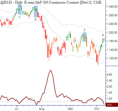
There are many ways to measure volatility. Each of these ways defines something slightly different, and each method has its own idiosyncrasies and limitations. For now, let's leave all theoretical concerns behind and just define volatility as the range covered in an average daily session. (Technically, I am using average true range in this example, which also includes any gap from the previous day's close to the current day's range. This is a minor technical refinement that is not overly significant.) Consider the following chart, which shows a daily chart of the E-mini S&P 500 futures, covering only regular session hours (9:30 AM - 4:00 PM New York time):

The dark red line underneath the price bars shows the ratio of the 5 day to 60 day (approximately one-quarter) ATR, with a reference line at 1.0. When the red line is under the reference line, the short-term volatility has contracted compared to the longer-term volatility. It is important to note that this is a relative measure that automatically adapts for the "baseline" level in any market. (Most good technical tools do this.)
I have marked the areas where the market was in short-term volatility compression with numbered blue boxes on the price bars. We normally expect that a directional move might emerge from these areas. This can be a multi-day thrust, or a strong trend day that opens and closes at opposite ends of the range. Note that there is not necessarily any clear directional bias from this tool; it serves a more important purpose, which is to quantify the most likely emerging volatility conditions / regime shift. Consider each of the boxes on this chart:
- This example is probably best categorized as a losing trade. No strong move developed after the condition triggered. No technical tool works all the time; the best we can do is to quantify tendencies.
- This is a good example of the way the best trades work. A strong trend day (shaved candle) followed the condition, which led to a two-week meltdown.
- Another strong trend day followed this area of compression, but there was no multi-day extension.
- We are once again in an area of volatility compression.
Please do remember that this extremely crude example serves only to illustrate the underlying tendency. In actual trading, other qualifying filters can increase the edge, and there are better ways to actually define the compression. Regardless, there is a clear lesson here for equity traders over the next few days: treat these markets as being in "breakout mode", meaning that you do not want to be on the wrong side of a breakout. Up or down, we don't know, but do not be buying weakness or shorting into strength--far better to "go with" these moves than to try to fade them. I am holding significant long exposure, and will be very quick to trim if the market is weak off the open. (Note that opening down is not the same thing.) On the other hand, I will be more reluctant to take profits on longs if the market breaks out to the upside. This is an example of how using an underlying tendency in the broad market can inform trade decisions in individual names, whether or not you intend to trade the actual setup itself.
(For reference, Toby Crabel uses several variations of this idea in Day Trading With Short Term Price Patterns and Opening Range Breakout

. Linda Raschke gives a few more variations, centered around ratios of Historical Volatility instead of ATR in Street Smarts: High Probability Short-Term Trading Strategies

. My forthcoming book will also feature a number of studies and trading ideas driven by range expansion following volatility compression.)
(Disclosure: I hold long positions in HLF and MAKO.)


