That trend indicator, is it helping or hurting?
Continuing from my previous post on moving averages, let's take a look at using a moving average as a trend indicator. Again, here is some material from the unpublished part of my book, on using the slope of a moving average as a trend indicator, and a look at a standard triple moving average trend indicator.
There are many books and trading methodologies that suggest that some kind of moving average–derived trend indicator can be a useful tool. The idea usually presented is that, in an uptrend, the upswings will be larger than the downswings, so traders should use a tool to identify the uptrend and then trade only with that trend. Because these ideas are so common in the trading literature, it is worth our time to investigate them here.
What are we looking for in a trend indicator?
First, think about what you would need to see from a trend indicator to make it useful. Though there could be different answers to this question, I suggest that they all are probably some variation of this: long trades should work better when the indicator shows an uptrend, and the downtrend condition should produce a more favorable environment for short trades. A simple way to test this would be to identify the trend indicator and then categorize all days according to whether the indicator labels them uptrend, downtrend, or neutral. (Note that if you are testing this mathematically, you need to assign the current bar’s return to the previous condition. For instance, imagine a situation where a large up day turns the trend indicator to an uptrend. If you include that day in the uptrend designation, you will assume that you were holding a long position from the previous day’s close, which is possible only if you knew what was going to happen the next day in advance. This is a small, but critical, adjustment [and a reference to this potential error].) Once we have categorized the days according to trend condition, we can measure the mean return and volatility for each group. If the trend indicator provides useful information, we should be able to see some difference between the two groups. Ideally, the uptrend days would have a higher mean return and perhaps a higher probability of closing up than in the downtrend days.
Slope of a single moving average
Consider a very simple trend indicator: the slope of a moving average. Immediately, we face the ubiquitous moving average question: “What length of moving average?” By changing the length of the moving average, we can usually make a trend flip to either up or down on almost any bar, so there is an arbitrary element to this definition. The 50-period average is commonly used in this capacity, so we will limit our testing to this one choice. [Many other lengths were tested, but only the 50 is presented here.] Another issue to consider is that, though a trader can easily identify the slope of a moving average visually, doing so in a structured, quantitative manner is a little bit more difficult. In this case, we draw a linear regression line through the last five data points, equally weighted, of the average itself, and use the slope of that linear regression line as the trend indicator.
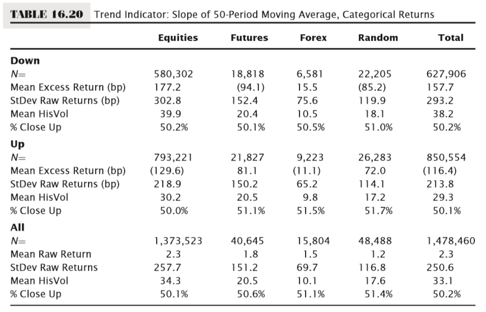
Table 16.20 shows the results of a test of a 50-period moving average slope trend indicator; it shows excess returns (in this case, excess return is the raw return for the signal group minus the raw return for all bars) for the up and down trend conditions relative to all days in this test. (Note that “All” excludes days categorized as neutral when the slope of the average was flat.) In addition, we have calculated two measures of volatility: the standard deviation of raw (not excess) returns, and the mean of the 20-day historical volatility readings for each set. Last, the percentage of days that close up is calculated for each category.

The results are not impressive for this trend indicator. Considering the random column first to better understand the baseline, we do see a negative excess return for the downtrend and a positive return for the uptrend condition, with a slightly higher chance of close up (51.7 percent of days close up in uptrend condition versus 51.4 percent for all days. (This is not statistically significant.) Volatility is slightly higher for the downtrend, but roughly in line across all groups. Turning to equities, we find something surprising: the downtrend shows a very large, nearly 2 percent, positive excess return, while the uptrend shows well over a 1 percent negative excess return; this is precisely the opposite of what we should see if the uptrend indicator is valid. In fact, for equities, this suggests we might be better off taking long trades in the downtrend condition because we would be aligned with a favorable statistical tailwind. Futures show a situation that is more like what we would expect, with a fairly large negative excess return for downtrend, and a large positive excess return for uptrend. Forex, paradoxically enough, looks more like equities, but the actual excess returns are very small, and are not statistically significant.
Lag kills
How can this be? If you try this experiment yourself, put a 50-period moving average on a chart, and just eyeball it, you will see that the slope of the moving average identifies great trend trades. It will catch every extended trend trade and will keep you in the trade for the whole move—actually, for the whole move and then some, and there’s the rub. The problem is the lag, the same problem that any derived indicator faces. Whether based on moving averages, trend lines, linear regression lines, or extrapolations of existing data, they can respond to changes in the direction of momentum of prices only after those changes have happened. A moving average slope indicator will also get whipsawed frequently when the market is flat and the average is rapidly flipping up and down. It is possible to introduce a band around the moving average to filter some of this noise, but this will be at the expense of making valid signals come even later.

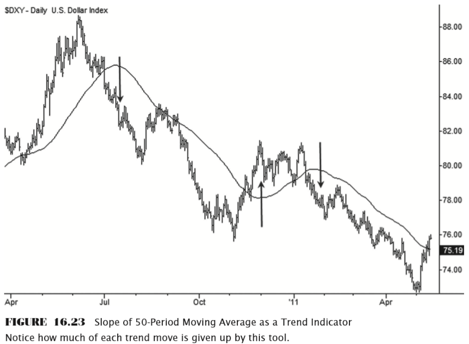
Figure 16.23 illustrates the problem with a 50-period moving average applied to a daily chart of the U.S. Dollar Index. It would have been slightly profitable to trade this simple trend indicator on this particular chart, but notice how much of the move is given up before the indicator flips. The chart begins with the market in an uptrend (moving average sloping up), and nearly one-third of the entire chart has to be retraced before the moving average flips down. Once the market bottoms in November, a substantial rally ensues before the trend indicator flips up. This lag, coupled with the fact that markets tend to make sharp reversals from both bottoms and tops, greatly reduces the utility of this tool as a trend indicator.
Multiple moving averages
Another common idea is to use the position of two or more moving averages to confirm a trend change. For example, three moving averages of different lengths could be applied to a chart, and the market could be assumed to be in an uptrend when the averages are in the correct order, meaning that the shortest average would be above the medium-length average and both of those would be above the longer-term moving average, with the reverse conditions being used for a downtrend. This type of plan allows for significant stretches of time when the trend is undefined; for instance, when the medium-length average is above the longer-term average, but the shortest average is in between the two. This, like all moving average crosses, is attractive visually because the eye is always drawn to big winners, to the clear trends that this tool catches. However, like all moving average crosses, the whipsaws erode all profits in most markets, leaving the tool with no quantifiable edge. In addition, more moving averages usually introduce more lag, with no measurable improvement compared to a simple moving average crossover.
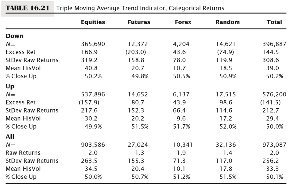
One of the most popular moving average trend indicators today is based on simple 10-, 20-, and 50-period moving averages. Traders using this tool are told to take long trades only when it indicates an uptrend and to short only when it indicates a downtrend. It is reasonable to ask how the market behaves in both of those conditions. Table 16.21 shows that traders using this tool in Equities (and it is primarily used by stock traders) will consistently find themselves on the wrong side of the market, fighting the underlying statistical tendency. Simply put, stocks are more likely to go down when this tool flags an uptrend, and up when it flags a downtrend—traders using it as prescribed are doing exactly the wrong thing. For the other asset classes, the message is mixed. There is possibly an edge in futures, particularly on the short side, and forex looks more random than the actual randomly generated test set. At least in this sample of markets, this test suggests that traders relying on this trend tool or on tools derived from it are likely to have a difficult time overcoming these headwinds.


