The volatility game

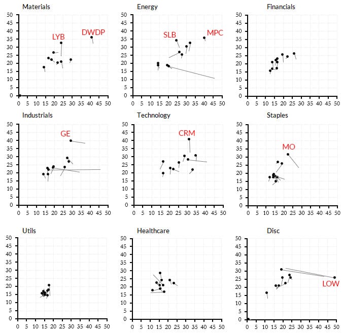
Take a look at the table of charts below. Each smaller chart shows the 10 largest stocks for that S&P 500 sector. They are graphed with historical (also called realized or statistical) volatility on the horizontal, and implied volatility on the vertical.
The dot is the current value, and the tail shows the movement over the past month. (On my screen I can hover over each dot and find out what stock it is. I have marked some of the more interesting datapoints with tickers for you.)

Implied volatility is, more or less, a forecast of how volatile the options market thinks the stock will be in the future. (It is also a measure of supply/demand in the options, but that's not an entirely different thing.)
Historical volatility shows much much the stock has moved around in the recent past.
If the stock is moving up in the graph, then it means that the options market is essentially pricing in more risk for that name. We typically see this in front of earnings, but also see it on a sector-wide basis. Notice that Tech and Financials are both seeing stocks move upward (higher implieds), but Tech is also seeing a bump in realized volatility (many of the tails slope to the upper right.)
This is a visualization I consult several times each week. (You can build your own graphs on these ideas.) What do I learn from this presentation? At a glance:
- Which sectors, overall are more or less volatile?
- Which sectors are seeing big moves in implieds?
- Is the market fragmented (each sector for itself) or moving in unison. (We get some idea about dispersion/correlation of volatility.)
- Are there any big standout names I need to know about? Any pops in implieds that aren't explained by earnings? If so, I better find out what's going on.
- Overall, is realized volatility increasing or decreasing?
- Overall, are implieds increasing or decreasing?
Most options traders think about the relationship of historical/implied volatility, but this visualization may show you some things you can't see any other way.


