Sell in May?
[dc]I[/dc] wanted to share a few thoughts and some analysis that we published in our research a week ago, looking at the supposed "sell in May…" effect. There are a few lessons here, ranging from how to think about the market statistically, to how to factor that analysis into practical trading. First, here's a little clip from a research report I published a few weeks ago:
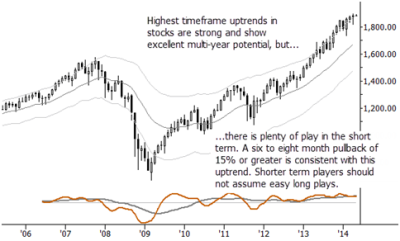
The bottom line is that markets are in a holding pattern as we enter a potentially seasonally soft time period. Conflicting macro and economic influences confound the bulls at every turn, but the bigger picture is strongly bullish. Longer term investors virtually have to be heavily long, but active management and/or appropriate hedges are a good option for most traders and investors.

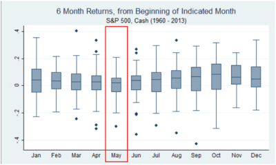
If you are unfamiliar with the chart above, this is a standard statistical chart called a boxplot. Each box, in this case, shows the total return for the S&P 500, for positions initiated on the first of the given month. (In other words, Jan shows the return from 1/1/XX to 6/30/XX for every year.) Probably the most important piece of information here is the median return, which is shown by the horizontal line within the shaded box. (The shaded box itself shows the range of the "middle 50" percent of the values. In other words, the range from the first to third quartiles of data.) The whiskers and points outside the whiskers give some idea of outliers and overall range of the data, but you can see from this chart that the return for six months following May tends to be a bit lower than the rest of the year, though still positive.
What do you do with this information? Well, first, let me just drop a blatant plug for the research I write and publish every day with Waverly Advisors. In that research, we blend technical patterns, bigger picture context like this (which, I would argue, is another form of technical analysis, though it is far removed from "standard" TA), and an overall awareness of the macroeconomic and geopolitical environment to manage risk and find trades. We do offer several versions of the research, depending on your focus and timeframe, and are happy to extend the offer of a risk free trial to anyone reading this blog. If you'd like to check it out, more information is available here, and you can contact sales@waverlyadvisors.com to set up a trial.
Now, as far as application, the message is that this can be a difficult time for stocks, but this does not contradict holding long positions. We are looking at a very constructive situation in most indexes (domestic and foreign) in the longer term; so many people are loudly calling for a crash, but this is just the normal "noise and b.s." that any rational investor has to learn to tune out. (And, by the way, is an argument for limiting your exposure to opinionated commentators.) Depending on your timeframe, maybe you focus on that big picture and ignore "minor swings of 10% or so". If, on the other hand, you're a short-term trader, there's plenty of play on both the long and the short side within a broad consolidation. Last thought: in recent years, summer (i.e., low volatility, low volume stock trading) has come earlier and earlier. Maybe we are already looking at the beginning of summertime market conditions?


