Five things we can do with charts… that work
[dc]I[/dc] have written a lot this week, much of what I wrote calling for critical attention to traditional technical analysis. I thought it might make sense to end the week by stepping back, putting things together, and showing some tools and ideas on charts that do work. So, here are five simple ways that anyone--technical or fundamental, long or short term--can use charts as valuable trading and risk management tools. One important thing to keep in mind is that markets do change, and much of the work of trading is in finding those changes. In other words, don't assume that whatever is going on at the left side of the chart has to off the right side, but there is enough continuity often enough that charts can be very useful. Here are five ways:
1. See if a market is trending
One of the easiest ways to use a chart is simply to tell if a market is trending. You can squint if looking at a chart on a computer screen (I often do), or imagine printing it out, putting it on the wall, walking across the room, and then asking "is this trending?" Now, of course there is no guarantee that a trending market will continue trending, but, as far as understanding the current environment in any market, this is a good, simple tool.
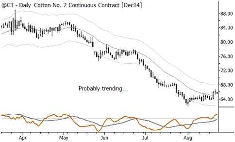
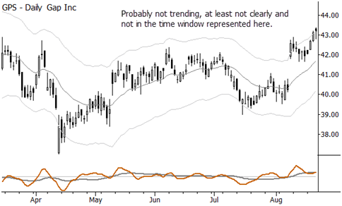
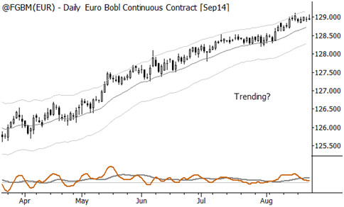
2. Learn something about the character of a market
Is a market quiet and complacent, or crazy and volatile? Are there a lot of overnight gaps that might be a risk? Does it trade consistently or with stops and starts? Are there wide bars (which might offer traders on lower timeframes opportunity) or small bars? Like trends, these things do change, so don't necessarily assume that you will see patterns that continue forever, but it is possible to get a very good, quick first-level read on the character of a market simply by looking at a chart.
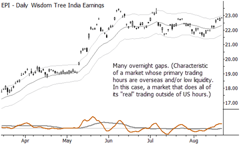
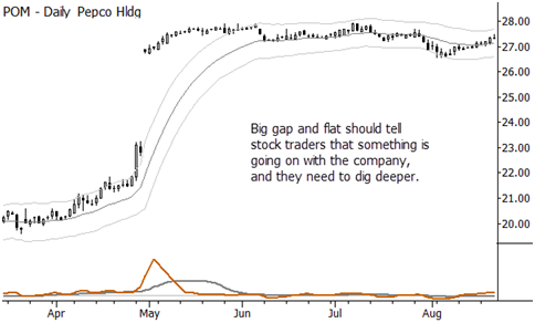
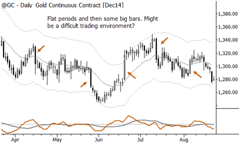
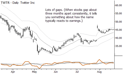
3. Understand something about risk and volatility
Traders need to think in percentages. A $0.50 move on a $10 stock does not have the same significance as a $0.50 move on a $100 stock. Percentages are a better way to think than points, in most cases, and thinking in terms of volatility is even better. (Volatility, in this sense, can simply be thought of as "how big the moves in the market usually are.) This is one thing that charts excel at: because the presentation is visual, everything automatically scales for both volatility and price. Add that to a general read on the character of the market, and we have some good first-level risk management lessons here. (No charts needed here, but go back and think about the previous charts in this context. Even better, think about every chart you ever see from now on in this context.)
4. Know where to place stops
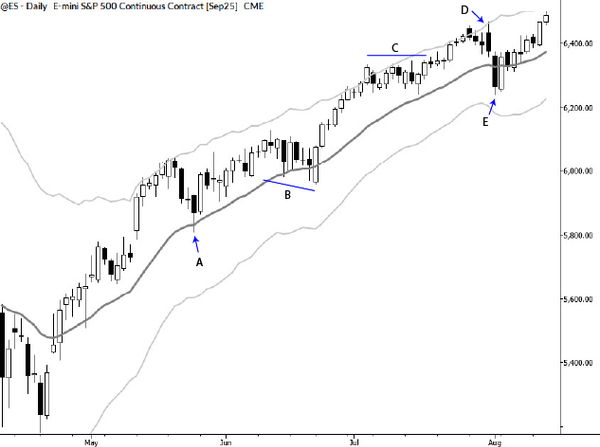
One of the problems facing traders is where to place stops. Too many traders still use "old school" stock picker stops that are 10% away from the entry price. Now, maybe that's better than nothing; at least you have a price where you know you're wrong and that's worth something, but we can do better. With charts, we can do better, easily. Because charts scale and show proportion so well, with a little bit of work it's easy to tell where you might put stops. Not too tight, and not too wide, but there's usually a wide band where they might make sense.
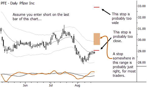
5. Find volatility compression
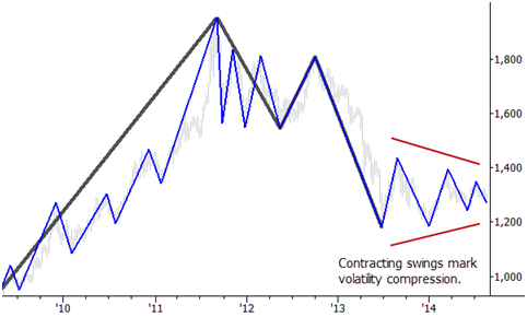
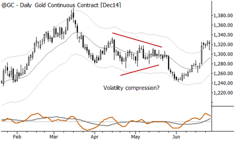
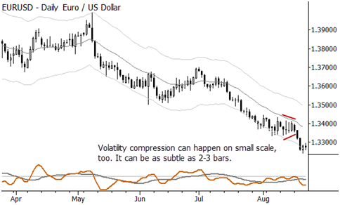
In most cases, I think most chart patterns are at least somewhat overrated. However, volatility compression is something that every trader needs to be aware of. (Volatility compression is the tendency of markets to make clean, directional moves (breakouts) after volatility contracts and coils.) There are at least three reasons this matters: one, there are some good trading opportunities. Two, trading within volatility compression is really rough because price movement tends to be more random; it's usually better to wait for a breakout. Three, changing volatility is a serious risk. Volatility itself is not the risk that people think it is—it's very easy to compensate for high volatility with a small position size, but shifts in volatility can cause a lot of damage, both emotionally and financially. When you get into a quiet stock that becomes a volatile stock… ouch!
Understanding volatility compression can clue us in on the normal behavior and characteristics of volatility, and can help us effectively get into the rhythm of that cycle. On a chart, volatility compression usually shows up as a triangle or a period of contracting swings, or as one or more inside bars. When a market is quiet, be alert for a possible sharp expansion of volatility.
