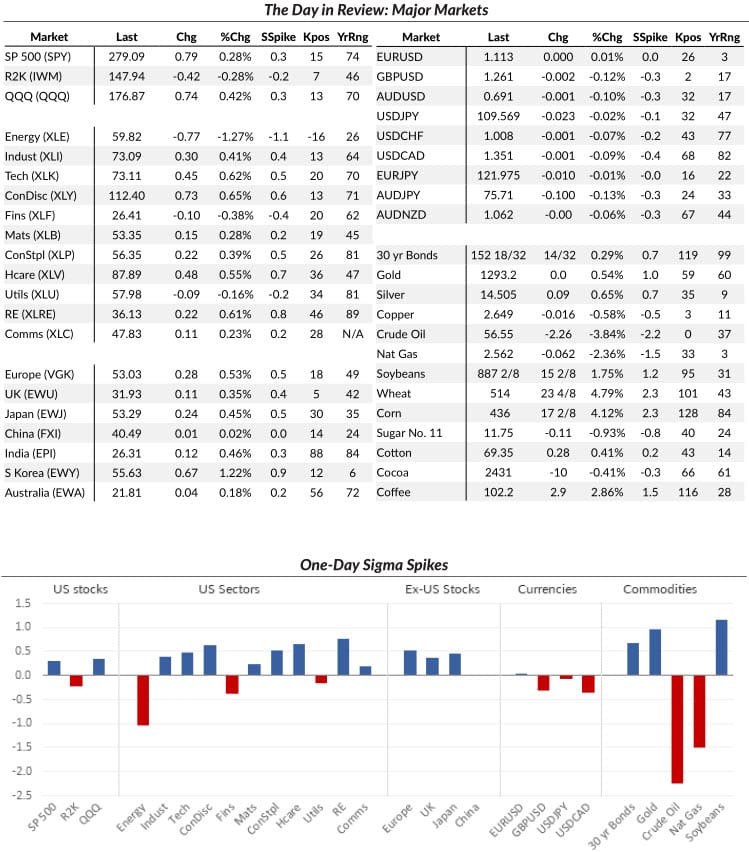
A daily market dashboard


I am a big fan of data visualizations that help me see what is going on in world markets. Over the years, I've created many versions of these, but the ones I have now are finely crafted tools that strike a great balance between depth and breadth.
Early in my development as a trader, I had a handful of markets on a daily summary. (Which I filled out by hand with a pencil every day--a good idea for developing traders!) Over the past decade, I've built summary pages for my institutional and hedge fund clients, and now offer the summary above to all my clients every day.
I knew I was on to something when I found myself generating the data tables first, and then doing my market analysis using the tools; this summary page is now the first step in my end of day homework, every single day.
You can get it from me, of course, but you can also create your own. More than anything, I want you to think about the importance of having a daily summary that looks at a wide range of world markets. I've also found the following specific points to be helpful:
- Separate by asset classes. Look at enough variations that you can see subtle differences, but be careful of looking at things that are basically the same. (And example of this might be the semiconductor index and tech.)
- Focus on changes. It's probably a good idea (it is) to have the closing price for the day, but, more than that, you want to see the change from the previous day.
- I would suggest looking at the change is a raw change, as a percent change, and on some volatility-adjusted measure. (The last is critically important, and it's why summaries from financial media sources are completely inadequate. These measures aren't suitable for mass consumption... but the masses will never truly understand the markets. This is an "insider's" view.)
- You also want some bigger-picture representation. I get this by looking at where each market is within its daily Keltner channel (Kpos on the table) and within a trailing 52 week range.
- Last, numbers are good, but a graph showing the change in a concise format can be even better. You'll get information and intuition here that you do not get any other way.


